Modern Websites: 30 Inspiring Examples (2025)
Creating a good modern website goes beyond using the latest web design trend that is popular among UI/UX web designers. Web design statistics show that the main reason why visitors leave a website is due to a non-responsive design.
While designing an aesthetically-pleasing modern website is essential, you must prioritize responsive web designs over spectacular art elements. Having a mobile-optimized website design is brilliant considering that mobile devices account for over 60% of Internet traffic.
This article covers the 30 best modern website design examples that you can use to create a new site or freshen up an existing one.
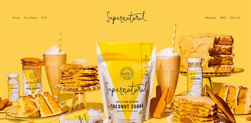
Supernatural is a natural-based brand offering organic baking and food supplements to its customers. This modern website does not shy away from bold colors, displaying Rubber Ducky Yellow, Cloudy Azure, and predominantly Bright Sun.
The Bright Sun color background blends well with the food items and products Supernatural displays as its hero image, fueling visitors' taste buds.
Excerpts from its Instagram page in images and videos are displayed, providing visitors with an idea of what its Instagram page offers.
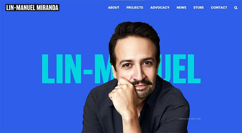
Lin-Manuel Miranda is an award-winning composer, lyricist, actor, and an active supporter of initiatives that increase the representation of people of color in art and government.
His modern website design displays a centralized image of Lin-Manuel in a Royal Blue background covering part of a key text of his name.
Miranda’s modern website has an interesting look with its well-designed sections full of quality images, videos, and animations. The footer section displays the same navigation options as the header menu, with an arrow icon fixed to the bottom that takes users back to the top.
Animal Music Studios has a team that offers music, sound design, and audio post capabilities. This website displays multiple background videos in two frames that merge, one of its top modern design ideas.
The social media icons of this modern website are pinned to the right-hand side of the homepage, making it easily accessible to visitors alike. I love its extensive gallery that displays its different videos in a three-column layout, giving viewers an unusual viewing experience.
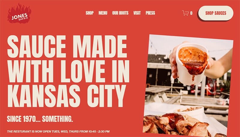
Jones Bar-B-Q is a Kansas City-based grill restaurant with its unique sauce made from scratch, its secret ingredient. As modern as you expect from any website, the Jones Bar-B-Q website displays the colors Jasper and Metallic Copper from its sauce.
Interchanging White and Jasper as its font colors, this modern website leaves little room for white space. Displayed on a white background in its Featured In section are logos of top brands, including Eaters, and Woman’s Day, serving as social proof.
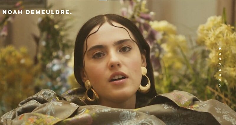
Noah Demeuldre is an art director based in London and Belfast. Her website combines some of the modern website design trends, making it stand out among other modern website examples.
The first feature to catch users' attention is the hidden CTA and texts that become visible when the cursor moves around the hero video of Noah.
Noah’s modern website uses an anchor menu at the side to help users move through the site. There is a parallax scrolling effect feature that makes every scroll more remarkable than the last.

Legacy Homes is a luxurious home brand poised to help its clients find comfort and luxury in their home choices. This modern website displays a hero video of some of its best home offerings to lure visitors to its site.
The three-column home gallery displays several home design options with their names alongside to help visitors make informed choices.
I love how it takes visitors through its process of designing a home, making their processes bold like its CTA buttons on its website’s homepage.
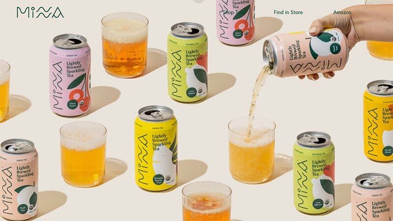
Minna is a tea brewing company using only organic and non-gmo products, with no sugars or added sweeteners to provide its customers with a refreshing taste. Well-arranged and serving as its hero image are images of its canned products with a hand pouring one into a glass cup.
This modern website puts its graphic elements to best use, displaying high-quality images of its products. There is a section for each of its products, with the can colors serving as the background colors for each section.
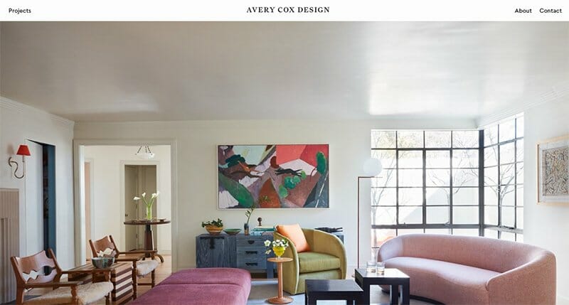
Avery Cox Design gives a feeling of homeliness from the quality of interior-based images displayed on its web page. I love how the full-width hero image stands out and gives way to other astonishing images as users scroll through the home page.
A Texas-based interior design studio focusing on luxury residential and hospitality projects, the Avery Cox Design website is not shy to showcase luxury. I love the quoted text from Jordan Frank, making good use of the white space just between two sets of full-width images.
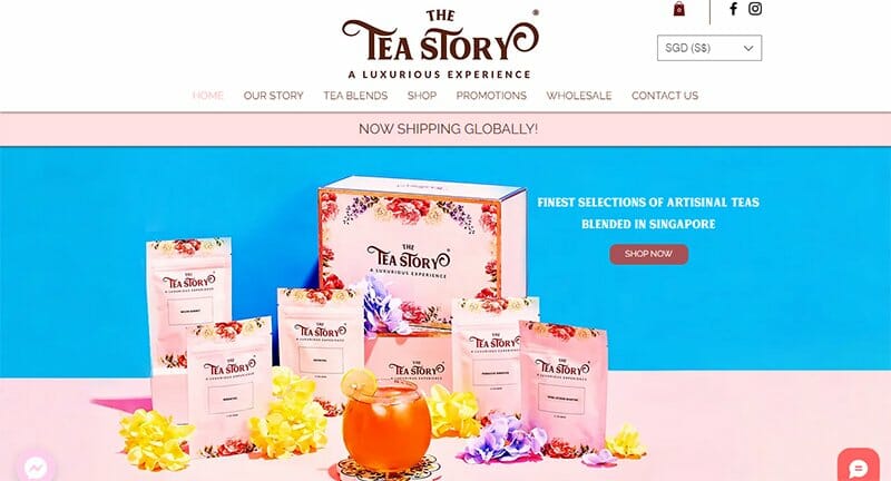
The Tea Story offers a luxurious experience to its customers via its various tea blends. This modern website uses flowers and high-quality images for its artistic mark.
Unlike other modern website examples, The Tea Story offers visitors access to two chat features. One is powered by Messenger while the other is a live chat with us feature. Both ensure visitors have a point of contact with the brand.
I love the Flowery-designed testimonial section displaying a slideshow of top reviews from some of its satisfied customers.
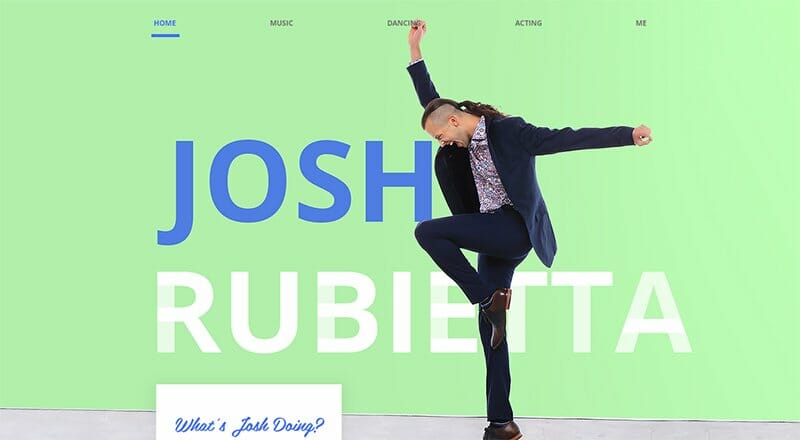
Josh Rubietta is a musician, actor, and dancer with his hero image answering the question of what Josh is doing in blue color text and white background. A near-centralized image of Josh dancing and smiling greets visitors when they access Josh’s modern website.
He structures his website to accommodate all aspects of its crafts with different sections and CTA buttons directing visitors to his dancing, music, and acting pages.
Social media icons linking to Josh’s pages, subscription, and contact forms are all available in the footer section amidst a moving Ball Blue color background.
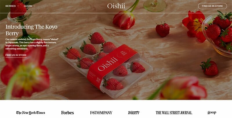
Oishii is a visionary farming company in the business of combining Japanese tradition with cutting-edge technology. There is no doubt the products this brand offers from its modern website design, as images of berries are visible everywhere.
The homepage of the Oishii modern website shows a video of berries and a lady eating one, with a pause feature to control the motion video. I love how the website displays all shades of berries.

Izzy Wheels was founded by Irish sisters Ailbhe and Izzy, with a lot of history leading to the setup of this wheel-based business. This modern website displays bold colors, animations, and illustrations, making its web design catchy to visitors.
Full of custom illustrations, the Izzy Wheels web design showcases no shortage of art, with quality images of wheels on display everywhere.
You can’t miss out on the displayed logos from top brands like Vogue in its testimonials section, Izzy Wheels show its collaboration with Disney on its web page.
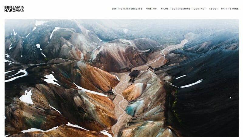
Benjamin Hardman’s minimalist website is an excellent example of a clean design. An Iceland-based photographer, Benjamin displays images of natural ice forms in a slideshow format on his site’s homepage.
This modern website design trend gives a chilly feeling, with the header menu the only navigation feature available on display.
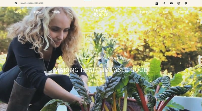
Mikaela Reuben uses a human connection to intuitively meet her client’s needs, rooted in helping each person find their path to optimal health. Her chosen web design for her website is modern and simple, displaying a video of herself on one of her farms.
She displays images of her past clients in her testimonials section, with links embedded in the pictures, popping up a review page for each picture when clicked.
Her social media icons are fixed to the header menu alongside a search feature that allows users to search for different recipes.
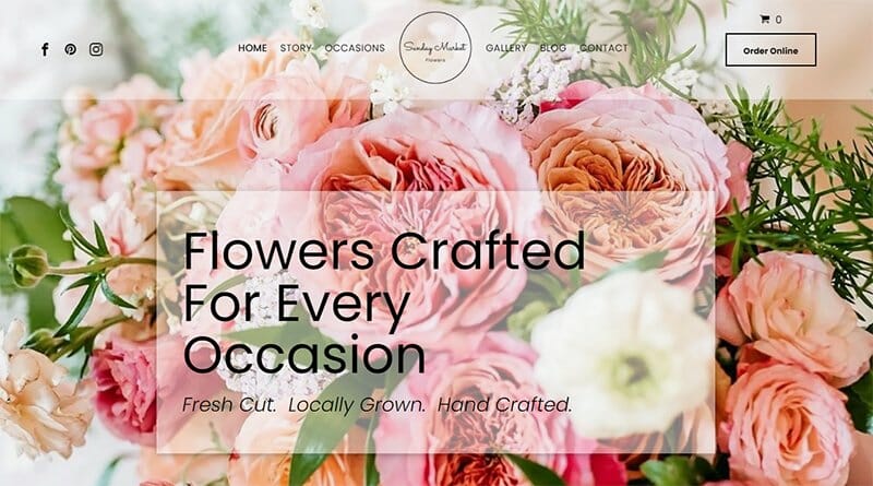
Flowers crafted for every occasion is the theme for the Sunday Market Flowers brand, with images of flowers taking center stage on its modern website.
Sunday Market Flowers’ circular logo is at the center of its header and footer section, standing as the divider between two sets of navigation options.
I love how its CTA buttons stand out with its black-and-white color scheme, making the Order Online texts more visible to visitors.
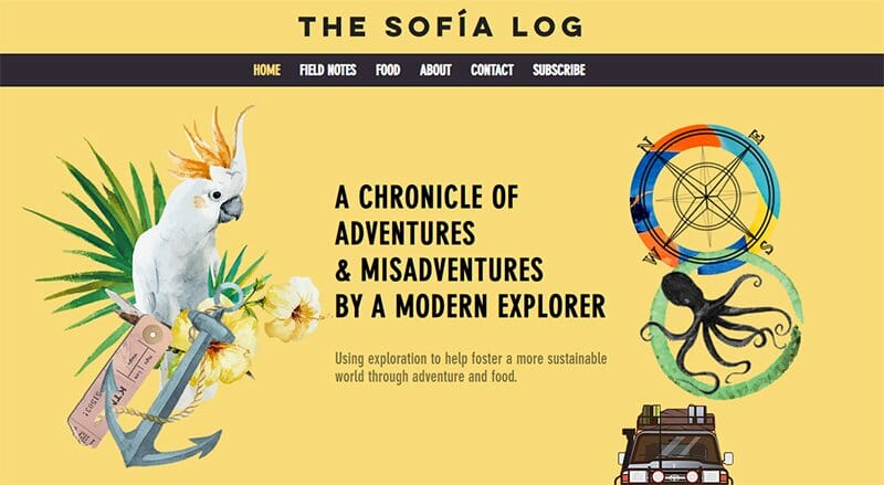
Sofia Hollingsworth is the name behind the Sofia Log brand, a lover of food and adventure. Her modern website on an extensive Jasmine background displays animated images, and illustrations, speaking to her love for adventure and the outdoors.
I love how she displays high-quality images of her sojourn in the outdoors in a slideshow format, taking site visitors along with her.

Implant Center of Miami provides the highest services of dental implants to its patients for $1,789 with no hidden cost. In keeping with the brand’s image, a hero image of a doctor smiling with the city of Miami in the background welcomes visitors to its modern site.
An accessibility icon and a Messenger-powered chat feature at both the left and right-hand corners of the homepage help guarantee the best user experience.
I love how images of its specialists are displayed on its home page. There is a CTA button that provides more information about the Implant Center of Miami’s dental specialists.
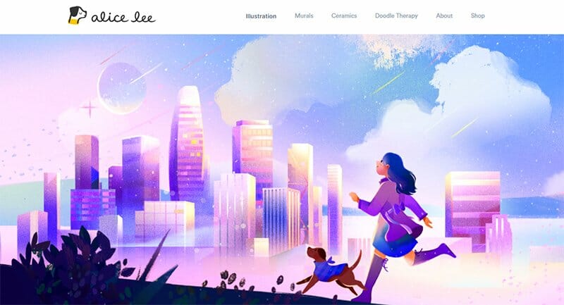
Alice Lee is an independent illustrator and muralist known for creating work with heart, purpose, and originality. Her modern website design allows people access to her work, displayed in a three-column layout.
Full of animated images, Alice’s modern website hero image uses playful cursors, leading to dynamic scrolling when the cursor moves across her homepage.
Her modern website design is an illustrative library section that allows site visitors access to an in-depth view of her custom illustrations.
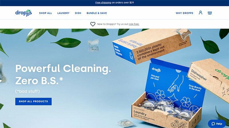
Dropps is a company that offers its customers household cleaning products toxic-free and less harmful to the environment. For a brand that pushes the green ideology, Dropp's modern website primarily displays the Blueberry Blue color.
The CTA buttons on Dropp’s modern website stand out in its Blueberry Blue colored background complementing the unique font used for text.
I love the client testimonials section as it displays before and after images, divided by a Blueberry Blue color line of household items Dropps cleaned. There is a CTA button labeled Shop household, allowing visitors to buy the same Dropps product used, a thoughtful addition.
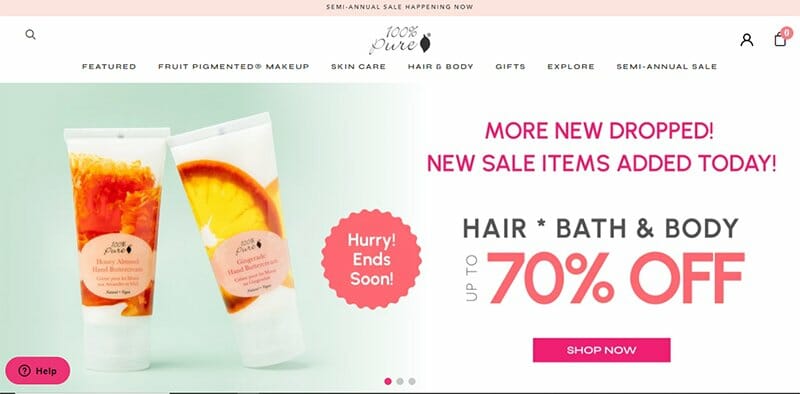
100% Pure has a purely modern website design, with slideshow images of its best deals as the center of attraction on the site. The home page of the 100% Pure website serves as its product page, displaying its products in a five-column layout structure.
There are excerpts from the 100% Pure blog page on display, with links attached to them, allowing visitors access to the blog. I love the Zendesk-powered help desk feature pinned to the bottom left side in Cerise Pink, providing ready answers to visitors’ questions.
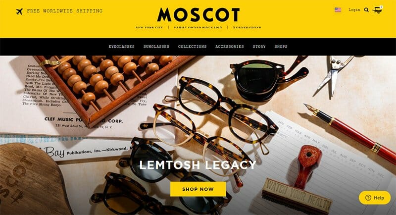
Moscot is a business brand with over 108 years of eyewear expertise and dedication to crafting quality frames. In making images more apparent to people, this modern website uses bold colors for the same effect as its modern website design.
The Bright Gold color stands out in the Mascot's modern website, visible just above the header menu, as texts, background for CTA’s, and wheel icons.
Moscot uses a background video with texts over it displaying top reviews from notable brands. The video element ensures people don’t miss out on valuable information.
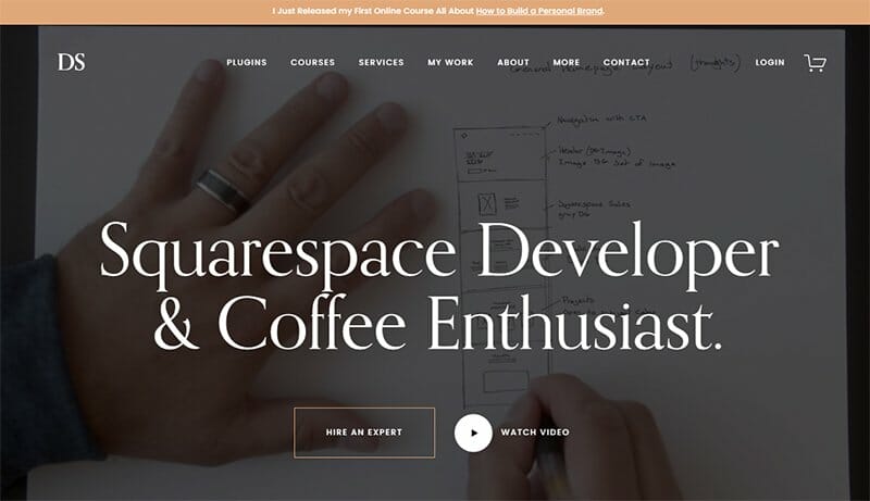
Devon Stank is an expert in web development and web design, focusing majorly on the website builder Squarespace. As expected, its modern website is a great example of one of the best modern website design trends.
A background video first greets people on his landing page, with clear CTA buttons offering them the choice to hire an expert or watch the video.
Strong typography and quality imagery are among Devon’s modern website's best features, making the dull black background look more exciting for visitors.
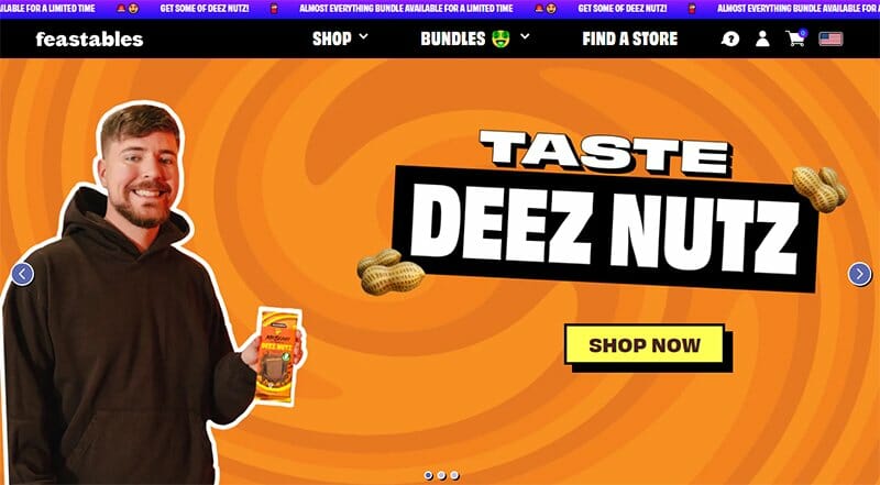
Feastables' modern website design is bold, designed to take visitors away from their comfort zone into an entirely new world of creativity. The color trends displayed on the Feastables sites give every shade and color you can think of, one of the best web design trends.
Strong typography is displayed over the Feastables' modern website, as text, header, and text for its CTA buttons, among other design elements.
The “Find Us In” section is a needed inclusion, listing out all the top stores where you can find Feastables products with an option to view more.
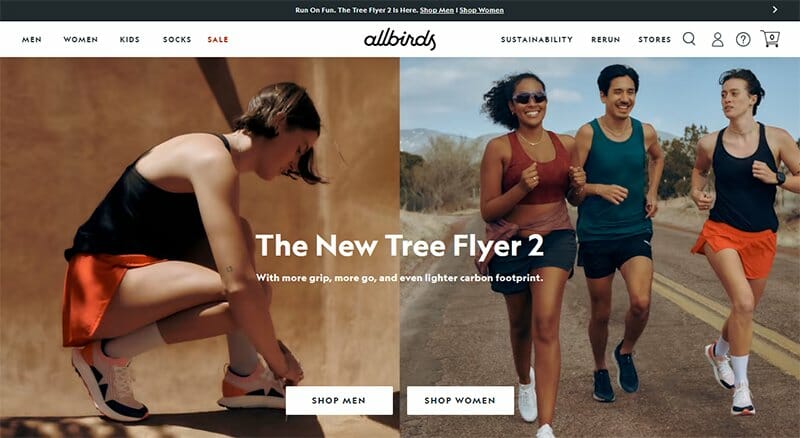
Allbirds is a sustainability-based footwear company, offering quality footwear with more grip, and a lighter carbon footprint. This modern website uses quality images of both feet and footwear to pass its message.
CTA’s and texts are a major part of Allbirds’ modern website design. The stories section adds a personal touch to the Allbirds’ brand, helping tell a compelling story about what the brand is about and its offerings.
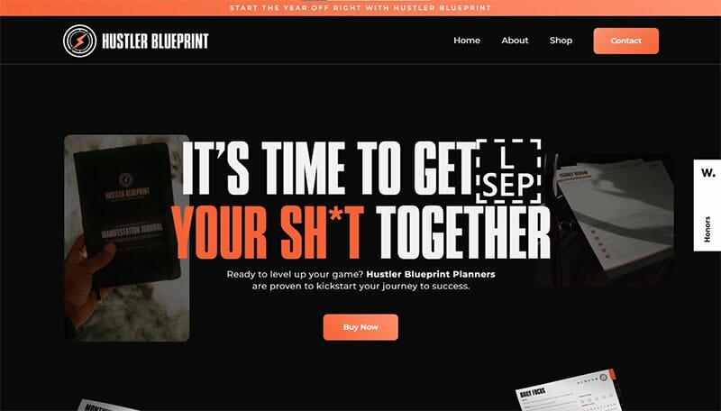
Hustler Blueprint is a company with a mission to provide high-quality, guided products that promote productivity and mental health. The website conveys its mission in its modern website design by displaying only the highest quality imagery and fonts.
Pinned to the middle of the right-hand side is the Hustler Blueprint planner that offers visitors a ready template accessible by purchase. I love how the design elements used for this modern website design combine to create a beautiful and professional-looking website.
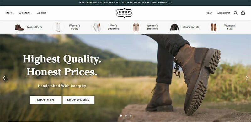
Thursday Boot Co. is a fashion boots company offering comfort, durability, versatility, and honest pricing to its customers. The header menu section is well-arranged, distinguishing between men’s and women’s wear, making it easy for visitors to find their preferred items.
I love how the CTA buttons are displayed side-by-side options for both men and women. Website visitors do not need to search far to find what they are looking for. The What People are Saying section displays logos of what top brands are saying about the company.
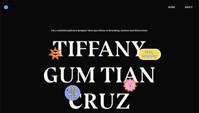
Tiffany Cruz is a multidisciplinary designer and paranormal enthusiast based in New York with a portfolio that aims to take users on a mystical journey.
Her modern website homepage displays her name in white bold text amidst a black background, with a touch of animation on certain letters.
Tiffany encourages users to click on any of the numbers displayed, with texts serving as a guide for their personalized fortune experience.
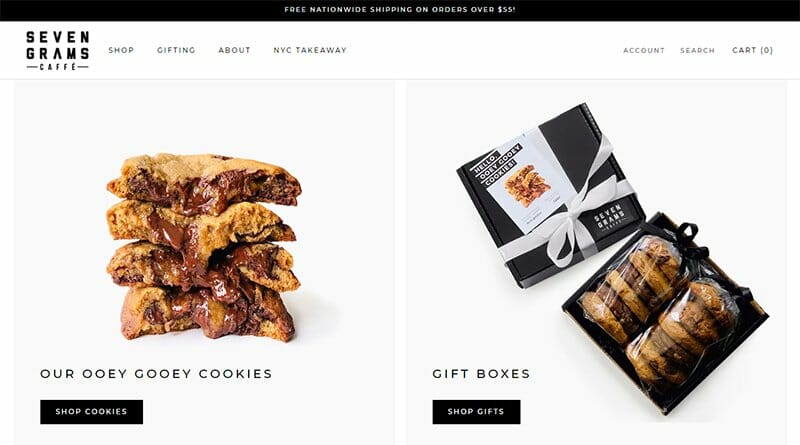
Seven Grams Caffe is a small independent business that takes pride in its great coffee and sensational cookies. This modern website displays two images of its cookies and gift box with clear CTA’s urging visitors to shop both.
The accessibility feature is one of its best qualities, allowing visitors to make changes to its website layout for the best user experience.
I love its testimonials section that displays logos of clients just above a slideshow of top reviews about the brand. The mouth-watering video of a cookie makes this section more visually appealing to visitors.
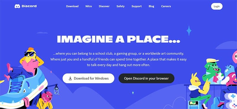
Discord is a voice, video, and text communication service that aims to create a unique space for everyone to find belonging. Having helped hundreds of millions of people communicate better, Discord serves as a modern web design inspiration to others.
Using a modern website design to build its online presence, Discord displays animated images around its webpage, with the Warm Blue color from its logo prominent.
I love the unique typography displayed on Discord’s modern website, making its easy-to-read content more appealing to visitors.
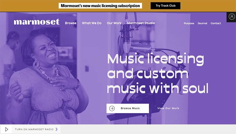
Marmoset is a company offering music for brands, TVs, trailers, podcasts, and any other entertainment media. This company uses a Wisteria color scheme to cover up its hero image of a lady singing.
The white color fonts visible on the hero image, highlighting texts on the Marmoset modern website, are one of its top design elements. I love how the Wisteria color is prominent on the site, serving as the background color for its CTA buttons.
Modern Websites FAQs
Design is key and is at the heart of every modern website. Keeping up with modern web design trends helps you establish your business as a force to be reckoned with. Custom illustrations, full-page headers, parallax scrolling, playful cursors, and bold and stylish typography are the top modern web design trends making the round.
Several tips are available for you to draw inspiration from in creating your modern website design, but they often converge on similar views. Using clean design principles, high-quality images, minimal white spaces, and legible typography are some tips to consider.
Creating a modern website involves a series of processes, including defining the scope and goals, and choosing a clean website design. Many modern website design examples and templates are available to assist you in creating your website design. You must have an idea of what you want before you start.


