13 Best Multi-Page Website Examples of 2025
Creating a multi-page website helps you optimize your site’s performance across search engines. Whether you want to create a new website or re-design your website, using a multi-page design increases your online visibility.
A multi-page website design allows you to extensively detail your products and helps you leverage SEO such that users can discover your brand from diverse entry points.
To achieve this, you need the service of a professional web developer, and hiring one can be expensive. Alternatively, use the best website builders like Squarespace and Wix to build your multi-page site and attract traffic like never before.
This article checks out the 13 best multi-page websites you can use as inspiration to create and re-design your website.
Let's dive in.
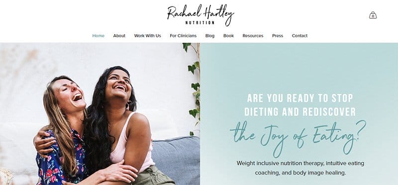
Rachael Hartley is a dietitian and a nutrition therapist passionate about helping people nurture a healthier relationship with food. She tells this by featuring nutrition-related content on her webpage.
At the top of this web page is a centered position of navigations, including the stylish logo serving as transitions to other page content.
Rachael Hartley's page treats visitors to a split-page design displaying a smiling stock image and a CTA sitting on the pale-blue lily background. Each page speaks well of her brand values.
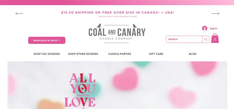
Coal and Canary is an award-winning candle-producing company that creates hand-poured luxury wood wick candles for every occasion and everyday use.
Unlike other multiple pages with time-consuming page content, this multi-page design stands out with concise page content and a user-friendly experience. I like that every content maintains the same visual outlook across all mobile devices, including on smaller screens.
The consistent use of white and shades of pink backgrounds creates a comforting feeling for users on the page. Potential clients can use the header to make a purchase and the footer navigation to explore other pages of the brand.

Est Creative is a portfolio website owned by Emily, a professional blogger and copywriter with over 15 years of experience. Her multi-page portfolio narrates every bit of her expertise, setting the tone for an upfront conviction.
You can't help but fall for the strong command of target keywords and highly engaging content syncing with every design and color of the page. The brand logos and client testimonials are great social proofs for a result-based service offering.
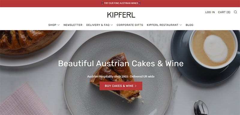
Kipferl offers a selection of quality and handmade cakes from the famous Sachertorte and Apfelstrudel to the gluten-free poppy seed cake in the U.K.
This multi-page is beautiful, exhausting its homepage with clean quality images of cakes, product information, and red-colored CTAs.
Kipferl, one of the great examples of a multi-page, sticks to limited content but employs a drop-down menu bar to help visitors dive deeper. The footer navigation is your one-way ticket to navigating additional pages of the website.
What I find attractive about this website is the white and quill gray color scheme harmonizing the interactive designs with the goodness of great visual contrast.
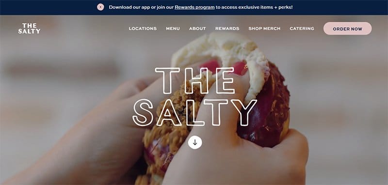
The Salty Donut is a U.S based restaurant that offers different flavors of donuts and coffee with a splash of good vibes.
This food-based website tells everything they serve, starting from the auto-play video displayed in the hero section to office locations, down to the menu list. Each of them is visually appealing and truly represents the brand.
The Salty Donut isn't just a meal place but an experience, and the navy blue, white, and seashell site color aligns perfectly with the experience.
Interested visitors can download their App to make orders, subscribe to their mailing list, and reach out to them through the social media links.
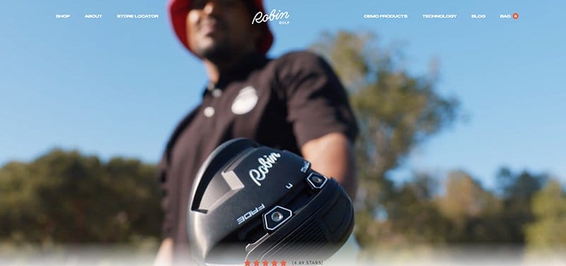
Robin Golf is an eCommerce website that prides itself as the best plug for stylish, quality, and affordable golf equipment with excellent service delivery.
The first catchy element on this multi-page website is the hero video, welcoming visitors to the page while promoting diversity and inclusion in golf. I like how the video format gives a top-notch description of the brand and impacts the customer's experience on arrival.
Below the hero section are features of five-star rated golf kits and testimonials serving as social proof to potential customers. I love the great use of colors, micro-interactions, and navigations leading to different pages of the web.
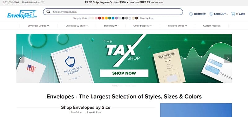
Envelopes' multi-page website is aesthetically pleasing, welcoming visitors with slides of imagery fonts and blends of color schemes. I like that every element has a place in this multi-page layout.
At the non-sticky header menu are arrays of traditional navigation with drop-down menus displaying relevant keywords based on their service offering.
A search bar and responsive color codes are alternatives for product-based searches, making it easy for users to find what they want.
Scrolling through the site, you will find patterns of products in thumbnails serving as smooth transitions to separate pages on the website. Everything about this site proves that a multi-page website can be simple yet effective.
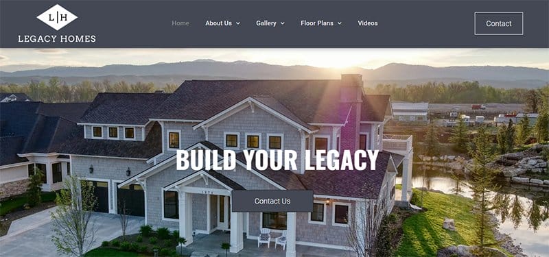
Legacy Homes of Idaho is an emerging custom home builder in Boise, Idaho, focused on quality and style. This real estate website opens with an attractive visual tour of a home, followed by bold typography showcasing the expertise of the brand.
If you are looking for inspiration for your real estate website, Legacy Homes of Idaho is your one-stop solution. Navigating this modern multi-page website takes you through arrays of visually appealing home images, each separated by visible white spaces.
Each of the images features a responsive design, which causes it to animate with a hover effect and allows users to access full details with a click.
You can’t help but get fascinated by its use of illustrations representing different architectural designs, and its use of no-frills navigation.
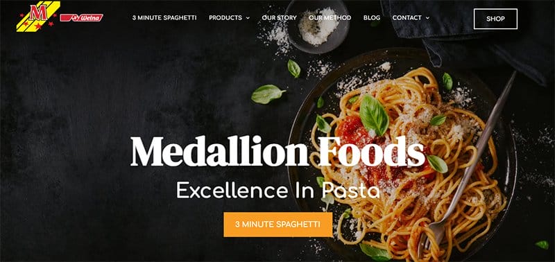
Medallion Foods is a clean and easy multi-page template with design-packed ideas for you to get your food-based website spun up.
The first thing that grabs your attention on this multi-page site is the mouth-watering food image representing the brand’s product in the hero section.
Taking center stage on the hero image is the creative use of stylish fonts, alternatively serving as a mission statement and a call-to-action button. I love how Medallion Foods uses bright colors to complement the primary colors of the site.
My favorite aspect of this multi-page website is the parallax effect that impacts the user interface, making the website more appealing and engaging.
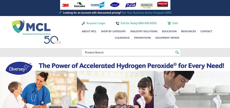
MCL Sustainable Cleaning Solutions is a Canada-based green-cleaning wholesale company dedicated to providing environmentally friendly cleaning solutions and personal protective equipment.
Rather than maneuvering the restrictions around a single page website, MCL uses a multi-page to capture user’s attention and demonstrate the height of professionalism and expertise.
The appearance of this multi-page website gives the illusion of a one-page web having all the information on the same page. Clicking on the engulfing header menu and grids of thumbnails reveals fresh content from other pages of the website.
What’s handy about this website is the use of slick image sliders to control the view of images and the smooth transitions of CTAs.
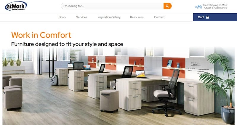
atWork Office Furniture is a one-stop shop for all office interiors and furniture needs, designed to fit your style and space. Instead of using a single-page website design, a multi-page is well suited for an online furniture store.
Specifically, it provides a range of all product launches, office information, and testimonials, and this multi-page aligns perfectly. The first noticeable element on this multi-page is a clean, full-width hero image of furniture and bold fonts at the top of the image.
Upon scrolling, you will discover several high-quality images, each following engaging text and bold CTAs, helping users keep a narrow focus at a time. The footer on an extensive white background embodies their contact details and links to multiple pages of the site.

Wilsigns is a signage firm that offers on-demand services in sign painting, printing, and advertisement to clientele nationwide. This multi-page website opens with animated images of sign craftsmen, communicating the beauty and essence of signwriting in modern marketing.
Unlike many multi-page websites with traditional navigation, Wilsigns hides its navigation in a hamburger menu to give the site a coordinated visual outlook.
You can’t miss the YouTube embedded videos showcasing its brand awareness, legendary expertise, and social proofs above the footer of the page. What I like about this website is the use of minimalist designs that leave an impression on visitors.
Interested visitors can use the footer section to access quick links, shop without hassle, and get relevant information about the brand.
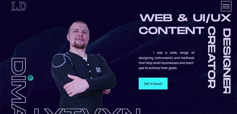
Dima Lytvyn is a result-oriented web designer and a UI/UX content creator with a passion for helping startups achieve their business goals. He narrates this by using a multi-page portfolio to display his services in an attention-grabbing manner.
His portfolio employs a long scrolling, responsive hamburger menu bar and transitioning CTAs. Other visual design elements employed in his multi-page website include user-centered designs and interactive visual content that aims to sustain the interest of users.
I like how he uses a blend of color schemes to enhance the immersive view of the visual elements on display.
Multi-page Website Examples FAQ
A multi-page website is a type of website that features more than one page within a website menu. In a multiple-page website, each page has its unique URL and enables developers to optimize them with an appropriate meta description for visibility. A one-page website, on the other hand, has only one page with a friendly interface for mobile users with smaller screens.
Most websites like eCommerce sites, online stores, and blogs employ multi-page designs because it allows them to separate content and help users explore their preferred content. If you are a business owner looking to showcase your products and generate leads, a multi-page gives you the best solution.
Standard multi-page websites offer many search engine optimization benefits. One of the advantages is that it allows you to build a good SEO strategy. Specifically, it allows you to target keywords that are relevant to your business or audience. As a result, you will be able to add fresh content to your page with ease and also attract more traffic to your website.
Compared to single-page websites, multi-page websites tend to take as many landing pages as possible. As a result, multi-page websites are time-consuming, as they take time to load due to excessive content on the site. Multi-pages have high-cost maintenance and are less user-friendly on mobile versions like small mobile devices, unlike one-page websites.