40 Best Sleek Website Design Examples of 2025
Are you searching for sleek and modern website design inspiration to use to make your site more visually appealing? The easiest way to create a sleek and smoking-hot web design is to draw ideas and tips from the best sleek websites you can find.
Hiring professional web designers to create a sleek website design may take a toll on your budget. A better alternative is to use website builders like Wix and Squarespace to create the masterpiece that you want.
This article covers the 40 best sleek website examples which you can check out to get inspiration when creating or redesigning your website.
Let's get started.
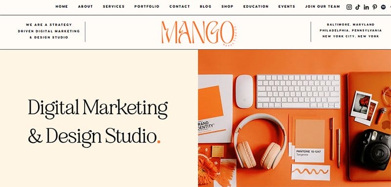
Mango Marketing Co. is a women-led digital marketing and design studio. The company’s mission is to elevate women-owned businesses through marketing strategy, website design, brand design, branding photography, content creation, and social media strategy.
What's fascinating about this modern website design is the looping video element at the center of the page, which offers an aesthetic appeal to site visitors.
As you explore the site’s content, you will love the combination of high-quality and colorful pictures with interactive text to create an engaging user experience.
I like how the site's visual hierarchy displays ample use of every negative space, making the site appear visually appealing and sleek. What's handy is the display of logos of top partners to boost credibility and increase social proof.
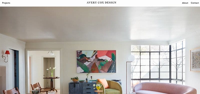
Avery Cox Design is a Texas-based interior design studio focusing on luxury residential and hospitality projects. The brand crafts thoughtful custom interiors with a spirit of warmth, playfulness, and theatricality.
The first attractive element is a high-quality image of a well-equipped living room with luxury accessories and furniture that gives the space a relaxing outlook.
Up scrolling, you will see multiple high-resolution images of the brand's work samples, which is a testament to their professionalism. The parallax scrolling feature gives the Avery Cox Design website an elegant and sophisticated outlook.

Devon Stank's website is full of multiple amazing and eye-catching design elements that will get visitors glued to the screen.
Welcoming visitors to this modern website is an embedded background video displaying a documentary about the brand's activities. Clicking the white colored “Watch Video” CTA button will grant you full access to the video content.
The black background plays a vital role in ensuring that every design element like high-quality images, videos, engaging texts, and CTA buttons is visually appealing.

Zhoosh's website features multiple attractive and engaging elements that make it stand out among sleek and modern website design examples.
Welcoming visitors to this sleek website design is a stunning text and video feature embedded with a slider feature to grab potential clients' attention.
You can use the sticky hamburger navigation bar to check out various aspects of the website before making any decisions.
Interested visitors can click the transparent “Schedule A Free Consult” CTA button to check out a well-structured presentation and a link to get a free consultation.
I like how the site features stylish fonts to make the testimonial section visually appealing and attractive to visitors.
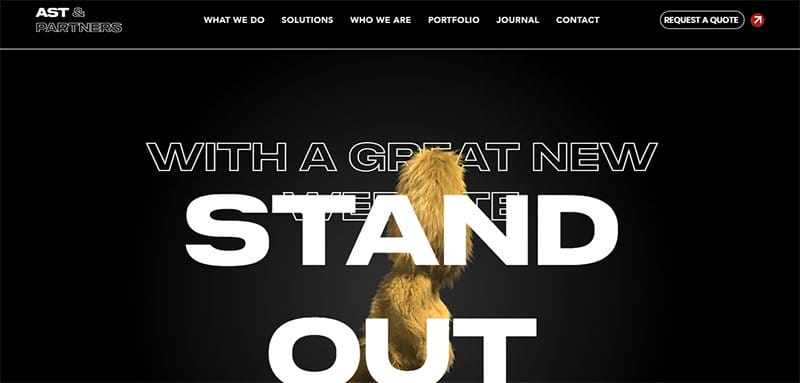
AST & Partners is a top-notch studio that specializes in high-end web design and development, bespoke website creation, and comprehensive digital marketing strategies, including SEO, PPC, and branding.
The first catchy element you will observe on arrival is a looping video of a mascot running with embedded easy-to-read content about the brand.
This sleek website’s black background helps to make the brand's main message easy to spot on the landing page, even for people with visual impairments. The parallax scrolling effect plays a vital role in creating an engaging experience for visitors and potential customers.
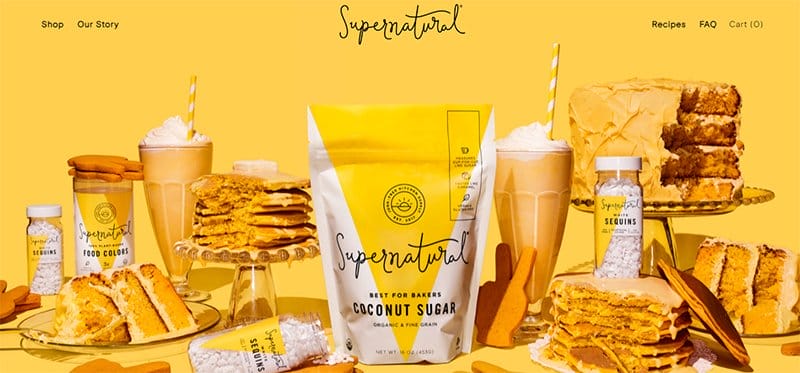
Supernatural takes great satisfaction in inspiring culinary innovation in the kitchen by providing vibrant ingredients that let chefs show off their skills.
The homepage design of the sleek and user-friendly website is visually appealing, displaying still and moving images to catch visitors' attention.
As you explore the site content, one sure element that will grab your attention is the white, blue, rubber ducky yellow, bright sun, and black color palette.
I love how different backgrounds on the site serve as design inspiration to site visitors, keeping users engaged in their colorful display.
Animal Music Studios is a creative company that offers original music compositions from its team of artists, songwriters, composers, and producers.
Welcoming visitors to the best modern website design site is a split-page video feature that displays multiple contents to entertain visitors in its hero section.
A parallax scrolling feature is visible as visitors scroll through the homepage, adding to the site’s design aesthetics and making the content more visually appealing. I love how this sleek website features high-quality photographs and videos in a three-column structure.
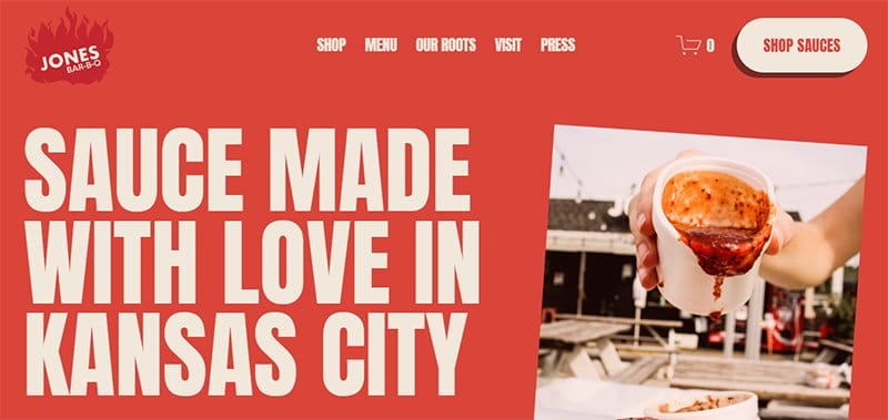
The Jones Bar-B-Q is the barbecue and sauce center of the Jones sisters, two aspiring entrepreneurs spreading their love for the sauce in Kansas City.
This stunning and food-based website stands out with its distinct layout alongside high-quality images, bold texts, motion graphics, and eye-catching CTA buttons.
You cannot but love how the stylish fonts and images of the restaurant's food options and sauce are visible throughout the website for a polished appearance.
As you explore the content further, you must take advantage of the catalog of top publication brand logos that have featured content about Jones Bar-B-Q.
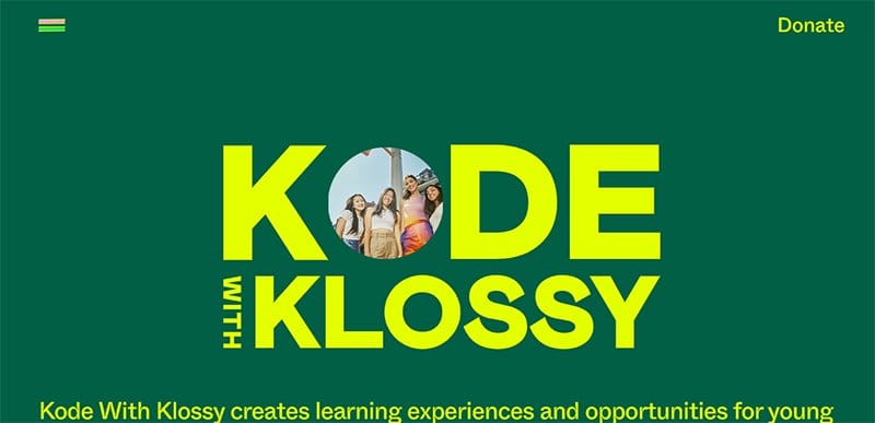
Kode With Klossy creates learning experiences and opportunities for young women and gender-expansive youth.
Welcoming visitors to the sleek website is the brand name displayed in bold text with an embedded image at the center of the hero section.
You can use the multi-colored sticky navigation bar that displays a full-screen menu to explore various aspects of the page. The dominant colors on this web page include teal-ish green, blossom pink, deep teal, sunny yellow, white, and black.

New Wave Magazine is an independent platform bridging the gap between established and emerging creatives. The first catchy element on this homepage is a video playing automatically and taking up the whole above-a-fold section.
Interested visitors can click the high-resolution images or text in the blog section to check out some engaging fashion-based content. The drop-down mage navigation bar serves as a portal to explore various aspects of this magazine’s website.
I like how this magazine website displays ample use of its white space to make its contents visually appealing to visitors.

Fonville Winans Photography’s website is based on this internationally renowned photographer whose remarkable black and white images captured the soul of Louisiana.
Welcoming visitors to this outstanding photography website is a slider show displaying multiple retro images in an automated format for seamless exploration and engagement.
This sleek photography website has a stunning outlook with multiple outstanding elements like retro and black-and-white photos in various aspects of the page.
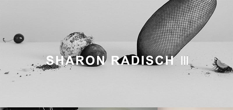
Sharon Radisch is a photographer, creative director, and artist who focuses on creating content based on the latest trends.
This sleek fashion and photography-based website has a minimalistic design layout and features multiple standout features like high-quality images with responsive elements and engaging texts.
You cannot but love the smooth arrangement of Sharon Radisch's past projects in a two-column layout with thumbnail features for seamless accessibility and exploration.
Clicking any of the black-colored social media icons is your one-way ticket to exploring various contents with restrictions.

DA Creative’s priority focuses on understanding the specific needs of each client and making sure they apply them throughout the entire design process.
The parallax scrolling effect on this sleek website makes examples on desktop and mobile devices seamless and engaging. I love how the pages feature text of different sizes to communicate various information to visitors and get them to make necessary decisions.
This portfolio site uses a multiple fluid grid layout to display various contents in a visually appealing fashion which encourages visitors to explore without any hassle.
The icing on the cake for me is the moving text feature which displays the various services DA Creative offers.
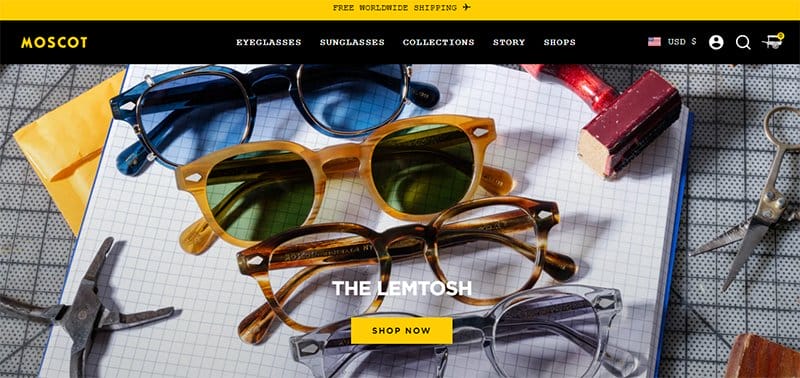
MOSCOT Eyewear offers top-notch and high-quality sunglasses, eyeglasses, and other accessories. The card design layout makes it easy for visitors to access the product types and quality without going through the stress of visiting multiple pages.
I love how the best seller section uses a slide show effect to make the product display more appealing and intriguing to potential customers.
What's handy about this fashion-based sleek website is the embedded background videos in the testimonial section to give the content life and make it more convincing.
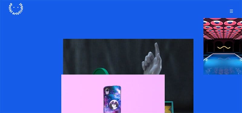
Daniel Aristizabal is a professional art director and digital artist, bringing forward new technologies to create stunning and inspiring artworks.
Interested visitors and potential clients can click any of the social media sticky widgets on the web page to access Daniel Aristizabal's online profile for more content.
The blue-colored site’s background gives this sleek and user-friendly website a stunning and unique outlook and makes the design ideas pop. A standout feature on this portfolio site is the bright colors on the grid section, creating an immersive experience for visitors.
As you explore the page content, you will love how the project content pops up upon scrolling, displaying bold colors and videos that tell a compelling story.

Dopple Press features a bright color scheme that cuts across the whole screen of the different devices that potential customers can use to access the page.
From custom-loading logo animation to branding animations, everything about the design screams modern and stylish.
This webpage is an excellent example of a site that features a strategic use of color combinations to communicate several benefits to the target audience. I like how the page uses a responsive element in the menu section on the top left side of the home page.
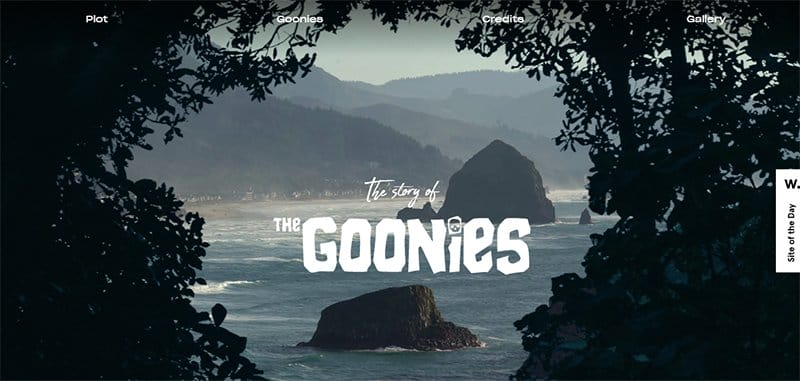
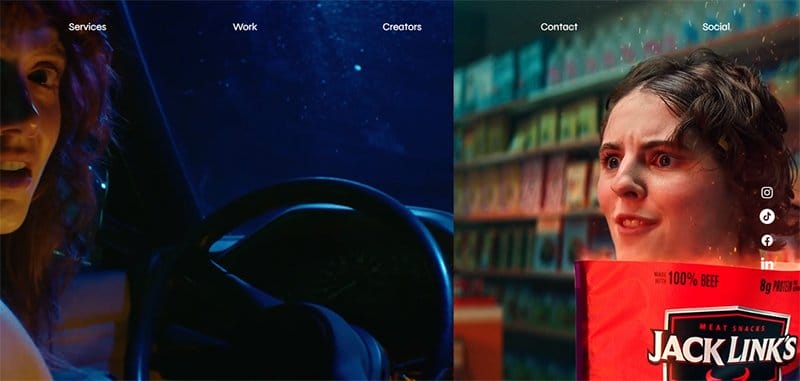
The Goonies website is an adventure story-based website that narrates how a group of children spend their last weekend in the Goon Docks area of Astoria, Oregon.
Welcoming visitors to this stunning web page is a high-quality image of an isolated island with text written in stylish fonts.
The dynamic scrolling and background music feature gives this webpage an outstanding outlook and encourages visitors to explore the site’s content.
This one-page website features multiple high-quality images with a thumbnail feature that grants visitors access to explore various contents on the page.

Marmoset is a meticulously curated music licensing, award-winning music production, and unique artist collaborations. Welcoming visitors to this sleek website is a purple-plated image of a guitar player with the caption “Music Licensing and Custom Songs with Character.”
I like how the site's visual hierarchy displays ample use of every negative space, making the site appear visually appealing and sleek.
The blacked-colored site footer features various details like a certification logo, links to site pages, email addresses, and social media icons for further exploration.
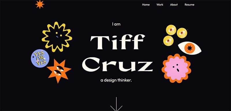
Tiffany Cruz is a New York-based multidisciplinary designer and paranormal enthusiast. This sleek site features modern trends and responsive design elements, which makes the process of exploring the site’s contents fun and worthwhile.
As you explore this engaging platform, you will love how the site’s dark mode design makes other colorful visual elements appealing.
Interested website visitors can use the mega navigation menu with responsive features to explore the web pages without stress.
There is no doubt that the card area of the site that responds upon scrolling and has a thumbnail feature encourages an interactive browsing experience.
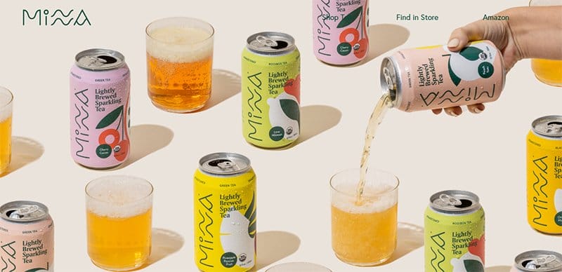
Minna is a brand of refreshing tea that doesn't use any additional sugars or sweeteners to enhance the flavor of its tea.
I love how images of its branded tea can with glasses filled with its content take center stage in the site’s hero section. The Sherwood green-colored CTA button features vital contents like a vertically structured navigation bar, social media icons, and a newsletter column.
What's handy about this webpage is how the colors of Minna's unique cans represent different backgrounds for its product sections.
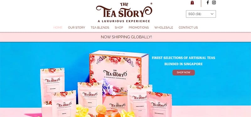
The Tea Story website has a bright and colorful layout with multiple stunning elements that give the webpage a fun and friendly vibe.
Visitors and potential customers can use the sticky navigation bar with a drop-down feature to explore various aspects of the website. I like how a chat tablet pops up from the sticky live chat widget while you are scrolling across the page.
The colorful layout of this stunning website gives it a relaxing and fun vibe with multiple elements and compelling elements.

Josh Rubietta’s website opens the floor with a stunning background picture of him dancing and having the time of his life.
This multi-page website welcomes visitors with an energetic image of Josh Rubietta and his name engraved on the washed-out green background in the hero section.
I love how the parallax scrolling feature on this web page makes the stunning design element sync in a visually appealing fashion.
His portfolio page features content about his music and acting career. Visitors can click each heading to explore these areas.

Oishii is a visionary farming company with a passion for fruit. The company uses indoor vertical farming techniques to grow produce.
Welcoming visitors to this webpage is a looping video element that features multiple berries with a short text about the brand's achievements and activities. I love how the webpage uses a zig-zag design layout to display high-quality images of various products.
Just above the footer section of the home page, visitors get a sneak peek at the brand’s Instagram page featuring linked images and videos.

Sunday Market Flowers is a local Santa Rosa florist specializing in garden-inspired floral arrangements. Welcoming visitors or potential customers to this sleep flowers-based website is a full-width image of a bouquet with the caption “Flowers Crafted For Every Occasion.”
I love how the transparent navigation bar becomes solid when online customers scroll down, making it possible to see the content on the bar.
The bio section is full of engaging texts that compel visitors to click the transparent “Order Now” CTA button with a hover effect.
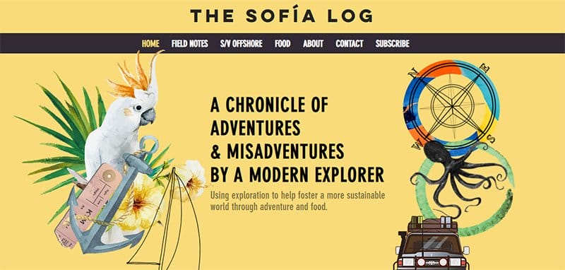
Sofia Hollingsworth is an adventurer and foodie who takes her culinary skills outside. The Sofia Log website is sleek, featuring animated graphics and illustrations against a Jasmine backdrop.
I love the page that features a slide show display of Sofia’s latest blog post with a thumbnail feature for seamless exploration.
My favorite aspect of this sleek website is the design of the Instagram section with a responsive element that makes its content visually appealing and attention-grabbing.
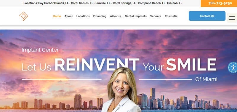
Implant Center of Miami provides dental implant services to its patients for $1,789, visible on a clear white background. Welcoming visitors to this sleek website design is a hero image of a dentist smiling with the city of Miami colorfully lit in the background.
You cannot miss the accessibility icon and a messenger-powered chat feature designed to improve the overall user experience and make navigation seamless and worthwhile.
What's handy for me about this sleek website design is the catalog of top publication brand logos that have featured content about this dental clinic.
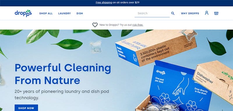
Dropps is a pop-based cleaning solution that offers convenience and excellence regarding its delivery. The first catchy element you will see on this stunning and modern website is a high-resolution graphic design displaying content about the dish pod technology.
I love how the client's testimonial section uses engaging texts, high-quality images, and a slideshow format to make their message more convincing and appealing to visitors.
This sleek website displays an ample use of its white spaces which gives the page an elegant and clean outlook.

Ivy Chen is a skilled fashion and graphic design enthusiast who loves creating mind-blowing illustrations to tell stories and pass the right message to the ideal audience.
This stunning web page is a great example of a modern website design element that uses dynamic scrolling to tell a story. Each segment of the site is full of attractive and jaw-dropping design elements that make it stand out among modern websites.
My favorite aspect of Ivy Chen’s portfolio website is the scroll-triggered animation feature that makes specific animated elements pop up upon exploring while others stay constant.

The New Denim Project is a third-generation family-owned textile company established in 1956 that focuses on natural fibers and circular manufacturing.
I love how this sleek website design example features unique card-based layouts in different sections of the page. You cannot but love the strategic use of the page's negative space to make the key messages and other easy-to-read content appealing to visitors.
I like images of models wearing the brand's finished product that pop up as you scroll across the product section.

Alicia Lee is from San Francisco-based independent illustrator and muralist who is currently the artist-in-residence at Pebblebed and a member of Clayroom SF.
Welcoming visitors to this stunning website is a colorful illustration displaying a girl running with a dog on the homepage’s hero section. This illustration turns up the gauge by featuring a responsive design element that gives life to the artwork upon scrolling.
As you explore this sleek website further, you will see illustrations of a card design layout in multiple grid sections.

Discord’s website features multiple engaging content like high-resolution illustrations, descriptive text, and responsive CTA buttons.
The first thing you will notice is the stylish use of illustrations to make the page content visually appealing and engaging to their target audience.
You can download the Discord custom Windows app by clicking the white colored “Download For Windows” CTA button in the hero section. Use the mega navigation bar to explore various aspects and make specific decisions about the site.
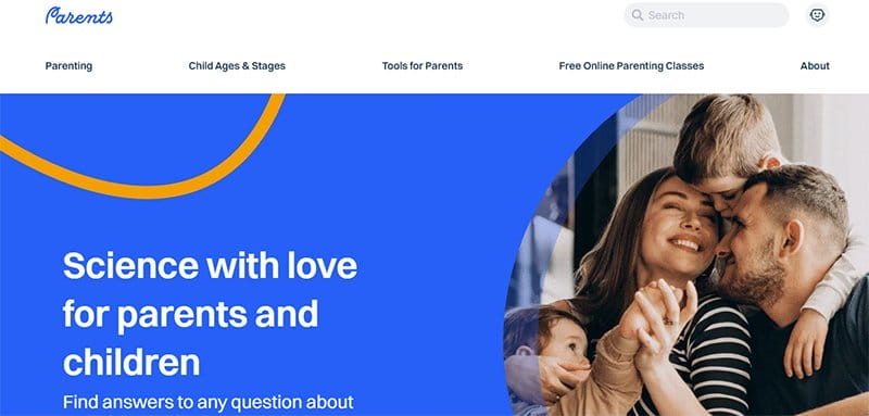
Parents is a platform that offers fast and practical science-backed solutions, along with free online parenting masterclasses created by certified parenting experts.
You can use the search function on the white-colored mega navigation bar on the right side to locate items on the page. A significant feature of this stunning webpage is the multiple layers of images and texts in columns and grid layouts.
Clicking on any of these images is your one-way ticket to exploring various aspects of the page without restrictions and getting deep information about parenting.

PTECT has more than 50 years of combined experience offering full and correct advice to ensure their clients are properly protected in the worst-case scenario.
I love how the black background of this sleek insurance-based website helps boost its beauty and makes its colorful elements visually appealing at first glance.
Interested visitors can fill out the contact form on the site footer to reach the brand's representatives. The teal-colored “Contact” CTA button is a shortcut to archive seamless and fast interactions with PTECT customer service officials.

100% Pure is a nature-based beauty company that prides itself on producing its beauty products from natural fruits and green tea.
Welcoming visitors to this stunning webpage is an image slideshow that automatically displays its best offerings in different slides. This natural beauty website uses modern design aesthetics, especially cool fonts, to complement its high-quality product photos.
You will love the combination of engaging and catchy texts, high-resolution images, and interesting video content in various aspects of the page.

Feastables is the brainchild of Mr Beast, a professional YouTuber and influencer. This snack bar brand is making waves in the US because of its unique flavor.
This sleek food-based website features multiple colorful elements which make it stand out and fun to explore. I love how you cannot miss the multiple high-quality images, flashy texts with stylish fonts, graphic designs, and multiple motion graphic elements.
The black-colored sticky navigation bar is your one-way ticket to exploring various aspects of the site without breaking a sweat.

Bath House presents itself as an environment where people can look, feel, and perform at their best and optimal level, offering an outstanding indoor experience.
This sleek website design features a dark layout, sticking to a predominantly black-and-white color scheme for its website design. Interested visitors use the sticky hamburger navigation bar to explore various contents on the web page.
Each high-quality image on the webpage gives potential clients a sneak peek into the full experience when they visit the venue.
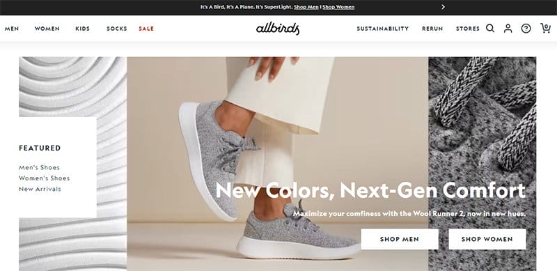
Allbirds offers lightweight, bouncy, and wildly comfortable men's, women's, and kids' footwear that makes every outing feel effortless.
Welcoming visitors to this online store webpage are high-quality images that display various sections of their product with the caption “New Colors, Next-Gen Comfort.”
Clicking the shop icon on the white-colored sticky navigation is your one-way ticket to access the eCommerce section of the page.
I love the display of new arrivals in a separate section in an interactive carousel feature, sticking to a three-column slideshow display.

Hustle Blueprint is a platform that helps provide high-quality, guided products that promote productivity and mental health.
The dynamic scrolling feature of this sleek website gives it a sophisticated and fun outlook and encourages visitors to explore the rest of its contents.
As you explore the site content, you will find various attractive elements and bold text that will grab your attention. This productivity website has a dark color scheme and uses dominant colors like white, black, and orange.
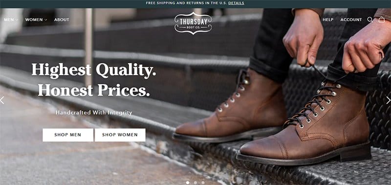
Thursday Boot Co. is a leading shoe brand that sells high-quality products at affordable prices. Welcoming visitors to this stunning fashion webpage is an image slideshow that automatically displays the brand's best offerings and high-quality products engagingly.
You can use the search function on the white-colored mega navigation bar on the right side of the page to locate items on the page.
I love how the webpage categorizes its content based on gender. Each image has a responsive element that causes it to change the photo on display when you scroll.
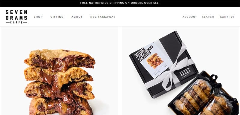
Seven Grams Caffe's website doubles as an online store that showcases its products to its target audience.
I love how the website welcomes visitors to its store page with a split page design element displaying two high-quality images with responsive qualities. Clicking on any of these images is your one-stop shop to access the store section for further exploration and purchase.
The white-colored sticky navigation bar with a drop-down feature plays a vital role in ensuring that visitors can easily travel across the page.
Sleek Website Design Examples FAQ
When creating a sleek and modern web design, use clean and organized design principles, use high-quality images that capture your target audience's attention, make use of typography in creating an engaging user experience, keep white space minimal so pages load quickly without sacrificing readability or eye appeal, and add CTA buttons sparingly.
The top modern website design trends you can use to make your website stand out include micro animations, illustrations, dark mode, monochromatic websites, modern minimalism, storytelling and interactive design, neomorphism design, rotating animations, non-traditional scrolling, embedded videos, gradient color schemes, and UX-driven diagonal lines.
A sleek website typically costs between $5,000 to $10,000 but can reach $20,000 depending on the number of site pages and the amount of customization. This price range largely depends on the fees charged by website designers. On the flip side, you can go for a more affordable option with website builders like Wix and Squarespace.


