The 35 Best Website Design Ideas To Inspire You 2025
Are you searching for the best web design ideas to create your dream website? Whether you want to design a personal blog, eCommerce store, or business website, this article is full of creative inspiration you can leverage for your website design.
The best website design examples are aesthetically pleasing, mobile-friendly, and use responsive designs to attract their target audience.
You don’t have to hire web designers or design agencies to create a stunning visual design for your own website. The best website builders like Squarespace and Wix provide design tools and a rich library of website templates.
This article covers the bravest design ideas you can use as inspiration to design your own site.
Let’s get started.
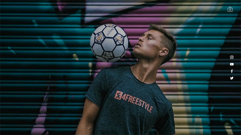
Tobias Becs is a professional freestyle footballer who travels the world promoting and developing the beautiful sport and art form football freestyle and street football.
Below the hero section is a catalog of engaging videos displayed in a fluid grid layout with a thumbnail feature that allows visitors to seamlessly explore his content.
The recurrent themes of Tobias' website design are high-quality photos and videos which make it simple for users to access his content. His social media pages are linked at the side, conveniently located on the right side of his homepage.

Beautiful Destinations is a multi-award-winning strategic, creative, and content studio with one of the world’s largest and most influential online travel communities.
Welcoming visitors to this webpage is an embedded video format that introduces visitors to the brand activities. I like how the white-colored drop-down menu features change to orange upon scrolling.
The latest work section features multiple automated features displaying high-quality content with a thumbnail effect for further exploration.

Lumio is an award-winning bestseller, sold in more than 200 retailers across 30-plus countries. I love how the website uses multiple large images to display the site’s content in an attractive and visually engaging fashion.
You cannot but love how elegant the site display section is, featuring multiple technological and innovative poetic based teck to encourage visitors to make a purchase.
My favorite aspect is the news section which features an automated slide show of multiple brand products linking the news page for further exploration.
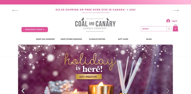
Coal and Canary was started as a hobby between two best friends who were simply learning a fun new hobby together.
I love how the Raspberry Pink color stands out as the site’s predominant color, visible as the background color for multiple CTA buttons and unique sections.
My favorite aspect of the webpage is the high-quality graphic design in the hero section that moves in a loop via the automated slider feature.
Interested visitors cannot miss the bold contact feature that is visible and pinned to the homepage, serving as the site’s online communication channel.
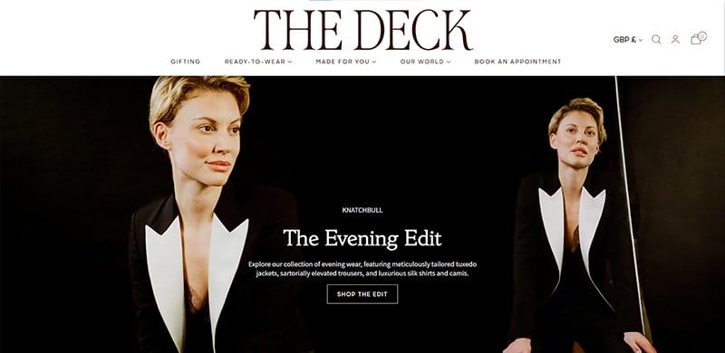
The Deck is a fashion-based brand that sells high-quality official clothing for women at affordable prices.
Welcoming visitors is a slideshow displaying various stunning clothing items that are up for sale with a transparent CTA button to access the shopping page.
The display section features high-quality images with a responsive design element that changes upon scrolling. I like how the web page features multiple logos of top publication brands that have featured content about the brand.

Legacy Homes of Idaho is a construction-based page that offers clients a seamless and pocket-friendly building experience.
I like how the first thing you will see on arrival is embedded video content that displays an interesting documentary about the brand. Using striking and distinctive typefaces such as its CTA buttons, visitors can view the full process of creating a home at Legacy Homes.
Interested visitors can check out the multiple-column layout displaying images of home design options to encourage visitors to build their legacies.
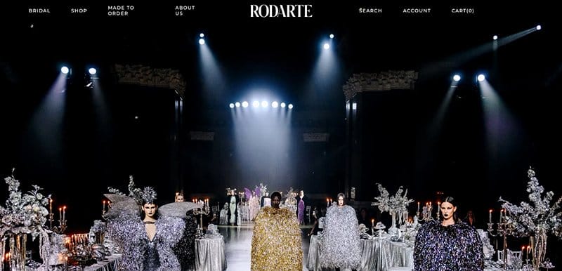
Rodarte is a fashion-based brand founded in Los Angeles, California in 2005 by Kate and Laura Mulleavy.
I like how the sticky navigation bar arranges its content in a user-friendly fashion by displaying the brand’s logo at the center and other elements on each side.
The display section features multiple eye-catching clothing items with a slider for seamless navigation and exploration.
What’s handy about this webpage is the simplicity of the structure featuring multiple videos in a fluid grid layout that encourages exploration of Rodarte’s online profile.

Spera Special Events is a destination wedding planner/designer based in New Orleans, Louisiana, and South Walton County, Florida.
Welcoming visitors to this stunning web page is a high-quality image of a photo shoot section and an embedded looping video on an ongoing event.
I love how autistic and elegant the testimonial section is, featuring high-quality images, engaging texts, and a slider feature to spice it all up.
The white-colored site footer displays multiple engaging contents like a vertical menu bar, Instagram icon, email, and location address.
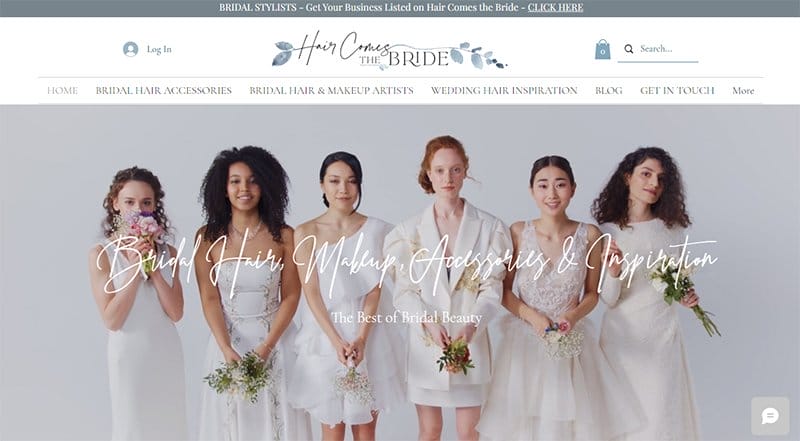
Hair Comes The Bride’s webpage offers the perfect bridal accessories, hair stylists, makeup artists, and inspiration from the best stylists.
The first catchy design element of this webpage is the stunning video of brides across different races. I love how the site uses stylish text to display its contents attractively.
This beautiful website uses a parallax scrolling effect to give users an engaging experience. You can’t help but love how it manages every available white space to give the webpage an elegant outlook.
I love how this fashion-based website features high-quality images blending well with the site’s soft color scheme, giving the site a gentle and welcoming look.
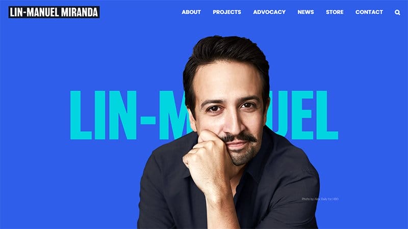
Lin-Manuel Miranda is a Pulitzer Prize, Grammy, Emmy, Tony Award-winning composer, lyricist, and actor.
The first catchy element you will see on arrival is a centralized image of Lin-Manuel Miranda against a Royal Blue background with his name hanging behind.
I love the display of images of Miranda’s featured projects in a consistent two-column layout with little or no negative space. You can use the search function on the mega navigation bar to locate various items and explore other stunning design elements.

Binging with Babish is Andrew Rea’s initiative which is one part chef, one part filmmaker, and a generous dash of irreverent YouTube personality.
The parallax scrolling feature gives the webpage a professional outlook and makes it easy for visitors and fans to slide across the webpage.
I love how the webpage features multiple eye-catching contents like descriptive icons and distorted-shaped images. The ample use of white spaces makes the contents visible.
Interested visitors can check out the three-column grid layout displaying cooking-based content for exploration and learning.

Brick Canvas is a yoga-based brand that offers the most comprehensive group fitness and hot room programming in Utah and Salt Lake Counties.
I love how the webpage features multiple straight line filters to structure the site’s content and make it easy for visitors to seamlessly explore its contents.
You cannot miss a CTA button prompting visitors to access the new app on their mobile devices is visible at the right corner of the home page. Adding to the site’s design aesthetics are white lines used to distinguish between sections of the homepage.

Japan Mobility’s mission is to foster trust and build relationships to create an environment where the values of a diverse and exciting world are realized.
I love the display of deep carmine as the site’s main color, visible as the backdrop for the bold navigation elements and CTA buttons.
What’s handy about this webpage is the stylish combination of eye-catching elements like illustrations, embedded video content, and animations to get visitors glued to the screen.
The gradient-colored site footer features vital information about the brand such as location address, email, newsletter column, and social media icons.

Medallion Foods is a food-based brand that has been in business since 1996 and is known for its superior customer service, a 100 percent fill rate, and timely deliveries.
Welcoming visitors to this food-based web page is a stunning image of a well-cooked pasta with the brand name hanging at the center of the hero section.
I love how the webpage features multiple eye-catching contents like descriptive icons and distorted-shaped images. The ample use of white spaces makes the contents visible.
Visible and pinned to the bottom right corner of the hero section are social media icons, easily identifiable in their White color.
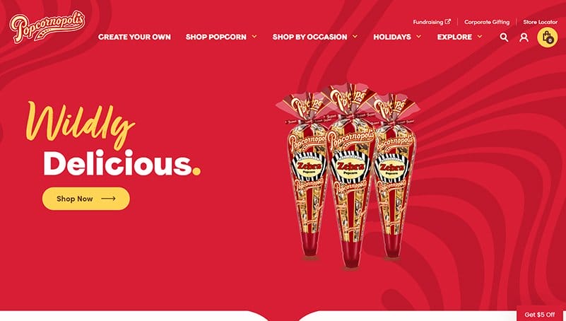
Popcornopolis is a great place to find some eCommerce inspiration for your online store. This eCommerce website provides a rich blend of web design styles including bold and minimal designs that are visually appealing to site visitors.
You can't help but love the use of an on-brand color palette to increase brand awareness. This online store uses a red-and-white color scheme. The availability of a search function makes it easy for website visitors to easily find the product or information they need on the site.
I love how Popcornopolis uses a testimonial section in the form of a slider to display reviews from top brands like Forbes and Business Insider.

Banyak Surf Adventure is one of the best homepage design examples that prospective customers will easily love. I love how this web page uses an island and underwater theme that communicates its brand identity to site visitors.
This travel and adventure website uses a responsive design to provide an optimal experience for potential customers. You can’t help but love how Banyak Surf Adventure uses high-quality images throughout its web pages to display its surfing and vacation activities.
There is a booking section that visitors can use to book a surf tourism slot ahead. The footer section contains contact details like email, phone number, and Facebook and Instagram icons.
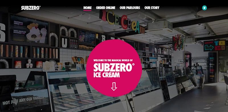
Subzero is a great example of an eCommerce store with stunning design elements that give it a unique web presence. The first design element visitors see on visiting the site is the interior image of Subzero’s ice cream shop.
This unique website uses elegant fonts and custom illustrations of different ice cream flavors encouraging visitors to explore the home page.
I love the use of a fixed navigation bar and a shopping cart feature that remains glued to the top of the page while you scroll.
Subzero uses image sliders to display pictures of its ice cream shops and to highlight its key achievements throughout the years.

Bugatti Smartwatches has one of the best website designs you can use as inspiration to create your dream site. I love how the first image site visitors see is one of this brand’s smartwatches.
This luxury site uses a parallax scroll effect that takes different movement positions as users scroll down the site. You can’t help but love the black-and-white color scheme that makes every text, design icon, and image stand out.
The use of multiple images of smartwatches adds beauty to the website design. There are huge red calls to action that turn white as you hover over it.
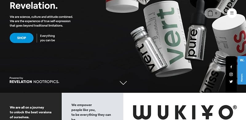
Wukiyo is an innovative supplement company that creates highly advanced cognitive enhancement products designed to help people unlock their best versions.
The use of bold minimalist typography is a defining design element of this supplement website. I love how the first thing you see on visiting the site are images of Wukiyo’s cognitive enhancement products.
This beautiful website uses a hamburger menu to ease navigation for visitors. Three social media icons link to Wukiyo’s Facebook, Instagram, and Twitter accounts.
Wukiyo uses a blue and white color scheme for its call-to-actions. You will find information about the corporate HQ address and phone number.
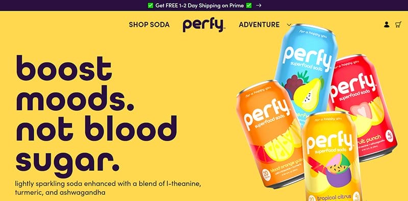
Perfy is a producer of low-sugar, low-carb, and healthy soda drinks. This colorful website displays images of its different soda flavors and uses a punchy headline to draw users’ attention.
The use of bright color schemes that reflect the colors of Perfy’s soda makes the site visually appealing. You will find the use of Naples Yellow, Pinkish Red, Pink Sherbet, Dark Purple, Vivid Tangerine, and Peachy Pink on the site.
I love the positioning of Perfy’s shopping cart icon at the top right side of the screen. When you click on the icon, an attractive shopping cart drawer pops out, encouraging you to move to checkout and complete your purchase.
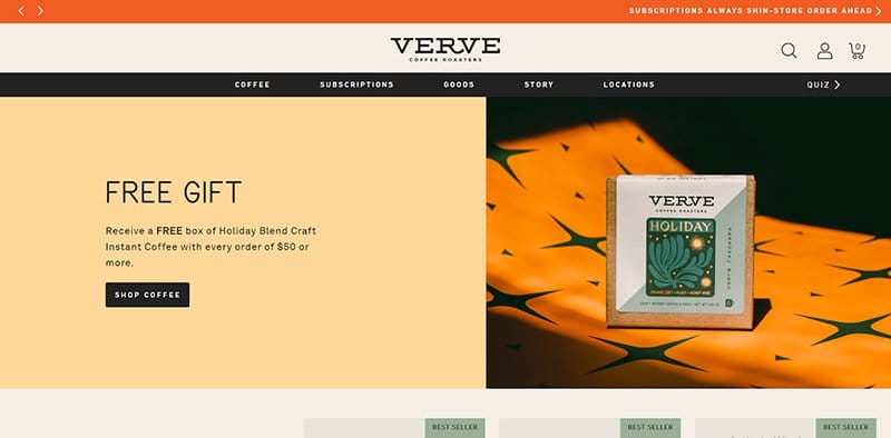
Verve Coffee Roasters is an award-winning coffee brand with various locations in different parts of the United States.
Welcoming visitors to this webpage is a split page feature displaying a holiday themed graphic design and a free gift coupon at the left side of the page.
You can slide across the webpage via the sticky navigation bar with a drop-down effect that displays additional features upon scrolling.
I love how intentional and intricate this website’s design process is because of the use of engaging elements like thumbnail features, slideshows, and a back-to-the-top button.

11Sight is an advertising brand that believes in the impact of video content in convincing its client's target audience to make desired decisions.
The first catchy element you will see on arrival is a responsive design element featuring three device mockups that change their direction upon scrolling.
I like how the site’s content like high-quality images, descriptive icons, and engaging texts pop up as you navigate the site.
The testimonial section at the base of the page features multiple heartwarming contents in a different column that serves as a great source of social proof.

Nordic Eye is a Danish Venture and Growth capital firm based in Copenhagen that focuses on investing in growth companies within the tech and lifestyle business sectors.
I like how the first thing you see on this stunning website is an introductory video displaying basic information and ways visitors can benefit from what they offer.
This corporate website design features two dominant colors which include medium forest green and white which gives it a stunning and professional outlook.
What’s handy for me about this landing page design that makes it visually mapping on various desktop and mobile devices is its ample use of white spaces.

Alinea Invest is a fintech investment company that combines the ability of artificial intelligence to boost a client’s net worth
The first mind-blowing factor that got my attention about this webpage is the gradient background feature that gives the page fun to explore. Interested visitors can click the app store logo at the top left corner of the page to download the app on different mobile devices.
Below the hero section are different logos of top publication brands that give the visitors a sense of confidence in Alinea Invest’s ability to deliver.
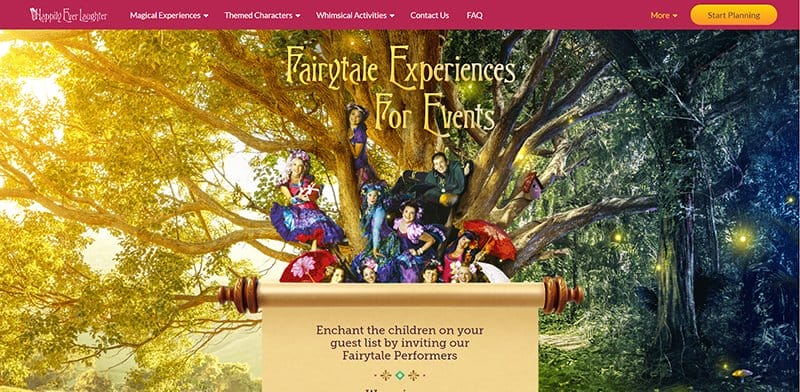
Happily Ever Laughter is a fairy tale-based website full of amazing content that’s visually appealing and gets visitors scrolling across the pages.
This beautiful web page features mystical themes displaying fairies, goblins and other creatures that sires up childhood memories.
The center of the page contains vital information about the brand including an embedded YouTube video that displays the brand's performance.
You cannot but love the arrangement of the brand's achievements with badges, five-star reviews, and logos of top brands.
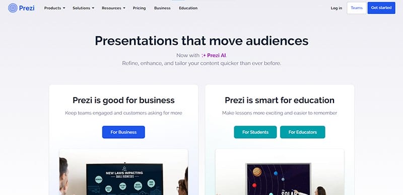
Prezi is a presentation-based brand that allows users to use eye-catching and engaging content to grab potential clients' attention.
The site’s presentations section has a responsive design element that pops up when you scroll which makes it inviting and compelling for visitors.
I like how each display section features a deep blue colored “Get Started” call-to-action button to check out its content.
The combination of white and dark backgrounds gives the stunning webpage a unique outlook and helps to give the multiple design elements a fun and appealing display.

Melanie Daveid’s one-page website has a minimalist and autistic layout which gives the page a professional feel that gets visitors glued to the site.
I like how the hero section features subtle animations that go in a continuous loop with multiple eye-catching contents and the brand’s name written in bold white text.
The site’s copywriting is minimalistic but its contents strike every nerve and give visitors a balanced view of what the brand offers to its clients.
I love the pitch-black background that gives life to every detail on the page including the large or small text, and every every line and dot.
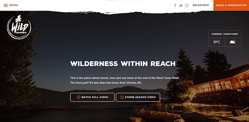
Wild Renfrew is a place where West Coasters come to feel the West Coast. This location is a gateway to ancient forests, epic hikes, and mighty surf.
The documentary video content in the site’s hero section welcomes visitors to the page and gives them a world view of the brand’s activities. I like how the brand's logo is hanging on the left side of the page to create awareness and boost professionalism.
This web page features two full-length column layouts displaying high-quality pictures and content about Wild Renfrew’s reservation packages.

HOTA’s mission is to be an iconic Gold Coast destination where art, entertainment, culture, and lifestyle meet and a place that locals love and visitors must see.
I love the vertical moving text feature on the side of the page that displays content about the brand in a looping format.
Below the hero section is a slide show feature that displays a sneak peek into the content the brand offers with an animated feature for attractiveness.
This colorful website features a hamburger mega navigation bar that encourages exploration and interaction from visitors.

Haus is a home appliance-based brand that offers the best in contemporary furniture, lighting, and homeware both online and from our East London shop in Victoria Park.
This stunning design website has a vertical sidebar that functions as a navigation menu that encourages visitors' exploration. At the top of the sidebar is the brand logo that helps visitors recognize they are in the right place.
This minimalist website features multiple high-quality images with a thumbnail feature that links to the shop page for further exploration.

Bathhouse offers elite-level treatments for those who want to look, feel, and perform their very best. I love how the unique zig-zag design layout features high-quality images, engaging and descriptive texts, and multiple CTA buttons to encourage client response.
This great website design is unique with its dark layout, sticking to a predominantly black-and-white color scheme for its website design.
Interested visitors can use the header menu to seamlessly navigate the website because it displays links to social network accounts and a hamburger menu.

Adrienne Raquel is a photographer and creative director working between New York and Los Angeles. She has worked with top brands like YSL Beaute, GQ, Apple, Savage Fenty, Rolling Stone, MAC Cosmetics, Cactus Jack, Playboy, and Vanity Fair.
The neon black colored background gives this unique fashion-based website an elegant and sophisticated outlook and makes the overlapping element visible. As you scroll across, you will see multiple grid images that are high-quality graphic designs from top brands.
Each of these images has a responsive and thumbnail feature and clicking any of them leads visitors to a unique info page for further exploration.

Match Media Group offers innovative advertising solutions that reach highly engaged audiences across industry-leading sites and apps to help you meet your marketing objectives.
I like how the hero section of a mobile phone mockup displays multiple dating site logos in a looping format. Interested visitors can click the black-colored “Advertise With Us” CTA button with a hover feature to take advantage of the brand's services.
My favorite aspect of this webpage is the About section which features multiple engaging content about different brands with their logos for credibility.

Scott Tearman is the brains behind the success of Armor Shield Exteriors. He has over 20 years of experience in the roofing business.
This unique construction webpage has a colorful design layout featuring Ferrari Red, Scarlet, and Royal Blue as its dominant color scheme.
The service section features multiple grid layouts with a responsive design element that makes exploring fun and engaging.
Interested visitors can check out the testimonial section that features heartwarming customer reviews in bold gray colored texts and images to make it compelling.
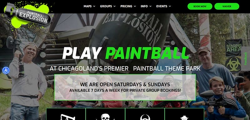
Paintball Explosion is Chicagoland’s premier paintball theme park modeled after the most popular video games like Call of Duty and Modern Warfare.
What is handy about this energetic webpage is the parallax scrolling feature and the live-action image background that’s on display as you scroll across the page.
I like how the site uses high quality graphic design to display upcoming events in an angle column layout. The website design features a bright and energetic layout featuring Barberry, Black, Malachite, and White as its dominant colors.
Web Designs FAQs
The essential web design elements that make up a website include a header, CTA button, hero section, footer, slider, search, menu, breadcrumbs, form, cards, videos, progress Indicator, and URL icon.
Design elements that make a good website stand out include featuring vital elements like high-quality images, consistent color schemes, clear fonts, ample white space, sliders, looping videos, responsive designs, animations, and illustrations.
Building a website is costly, depending on what you aim to achieve and what kind of design element you want to present. On average, you will spend about $200 to build a website, with an ongoing cost of around $50 per month for maintenance.
The best platforms to find website design inspiration include SiteInspire, Awwwards, Lapa, CSS Nectar, Best Website Gallery, Behance, Designspiration, Dribbble, Webflow Showcase, Commerce Cream, Pinterest, and Instagram.
The top web design trends you can apply when building your custom website side that fits your brand include experimental navigation, scrolling effects, kinetic typography, structured typography, brutalism, colorful gradients, layering, text-only, animated illustrations, ultra-minimalism, and mixing horizontal and vertical text.


