20 Excellent Website Redesign Examples (Before & After)
Is your website experiencing a drop in traffic and user engagement, or do you want to increase conversions? Redesigning your website properly can help you turn your struggling site into a traffic magnet and high-converting one.
Hiring professional web designers may be expensive. A better alternative is using the best website builders like Wix and Squarespace, which offer beautiful design templates and elements to give your site an excellent makeover.
This article covers the 20 outstanding website redesign examples that you can use as inspiration to create your own website.
Let's dive right in.
Before
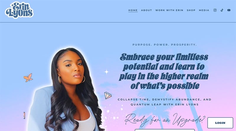
After

Erin Lyons is a channeler and spirit medium. Inspired by the 2020 global pandemic, Erin Lyons started using the internet to help people.
I love how the old web page features multiple colorful and engaging content. The flawless website design plan makes the existing site more stunning than the previous version.
This spirituality website uses design elements like the gradient background color, animated hero section, and transparent images to create a visually appealing website layout.
A white-colored, rounded-rectangular-shaped “Course Login” CTA button at the lower right corner directs members to a login form.
Before
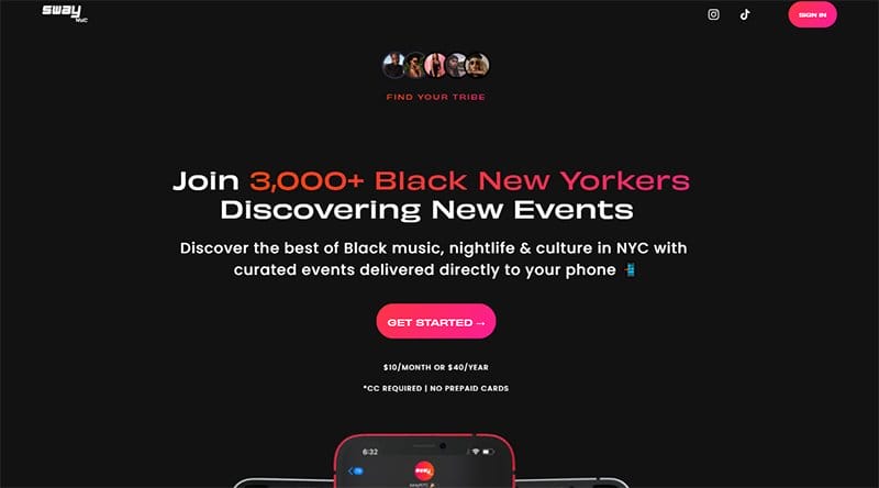
After

SwayNYC is a platform that offers the best black music, nightlife, and culture in New York, with curated events delivered directly to users' phones.
I love how there is a significant shift in the page's color scheme from an all-black background to white, which makes the page's contents visually appealing and engaging.
The first catchy element of this stunning web page is a motion text feature that displays content about the brand's activities with a phone-based mockup.
Upon scrolling, you will love the heartwarming content in the testimonial section with a slider feature and a “Read More” link that encourages further exploration.
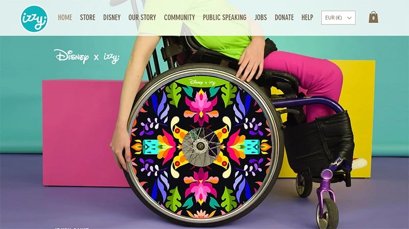
Before
After
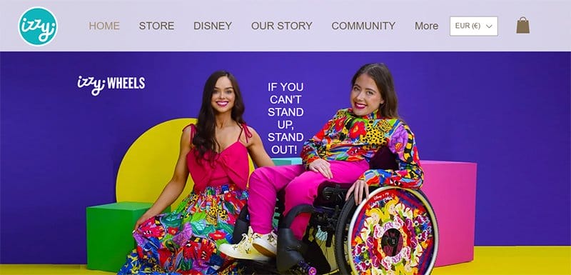
Ailbhe and Izzy founded Izzy Wheels, a company that sells stylish wheelchairs. The previous Izzy Wheels website featured colorful and eye-catching content to keep visitors glued to their screens.
Compared to the new webpage, you will observe many structural differences and changes in the promotional images.
I like how the home page features the pictorial format of their wheel collection in varying colors and art styles.
The site features a YouTube video that conveys what they are all about to the mind of a visitor. You can find logos and testimonials from well-known organizations at the bottom of their web pages that serve as social proof.
Before
After
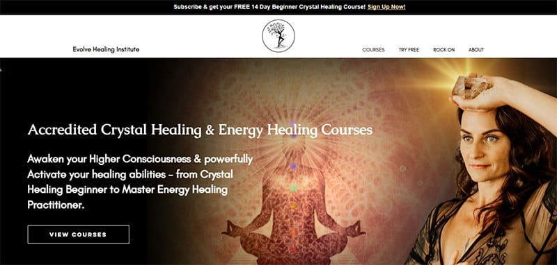
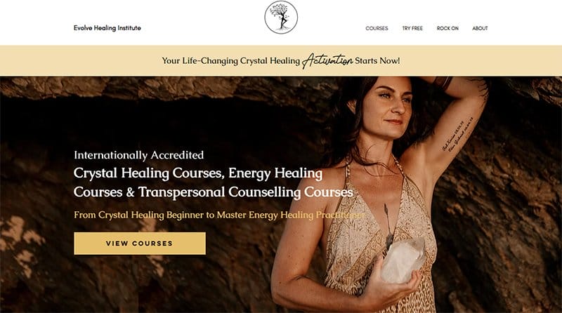
Evolve Healing Institute was created by Kate Mantellowho, who has a passion for spiritual healing via the therapy of crystals.
While exploring the old webpage, you cannot help but love its dynamic and minimalistic content, which provides easy navigation and accessibility.
The home page welcomes visitors with a hero image and a mouth-watering offer to learn the principles behind crystal healing by clicking the Apache-colored call-to-action button.
I like how the website color scheme features exotic colors like peach yellow, black, apache, and white to give the page an elegant outlook.
Before

After

De Baere Wholesale Bakery was created by Ric De Baere, a World Champion Master Patisserie Chef with a mission to supply high-quality baked goods nationwide.
The previous website features many lively and interactive elements, like high-quality images, engaging texts, and multiple CTA buttons.
I love how smooth the parallax scrolling feature makes the design elements on this stunning bakery website. The displays section features the band's best products in a grid column layout with multiple high-quality images and a thumbnail feature for further exploration.
Before

After

OGI Eyewear offers stylish and quality eyewear to its customers across different parts of the world. This eyewear's previous website design embraced a colorful and energetic approach, featuring sticky navigation and multiple illustrations to give off a fun and lively feel.
I like how the web page features stunning, high-quality images displaying people wearing the brand's products to get visitors' attention.
You can check out the engaging YouTube video at the center of the page to better understand the brand's products and the best ways to wear them. A live simulation allows users to try out different frames before purchasing.
Before

After
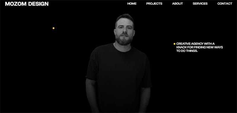
Mozom Boutique Studio from Israel is an award-winning Fiverr pro seller with a team with years of experience building custom websites.
There is no doubt that Mozom Design's website exudes a visually stunning aesthetic with its magazine-inspired design, captivating typography, and multiple stunning images. The brand decided to turn up the heat by redesigning the page and making it more engaging.
I like how the redesign project of the existing website features a horizontal and vertical scrolling effect, which helps improve the user journey and drive organic traffic.
The current site features a combination of impactful images and background videos online.
Before

After

Automata is a food-based blog that offers multiple recipes that food enthusiasts can use to prepare mouth-watering dishes.
Unlike the new website design, the old one features a large banner with the latest news in the center of the page, but the present site leverages multiple grid layouts.
Due to the page's redesign process, it features multiple high-quality images in a vertical line, which makes it mobile-friendly and creates a seamless browsing experience.
Interested visitors can get valuable insights about the brand and its contents by clicking the multiple peach-colored CTA buttons.
Before

After

Apeman Strong is a clothing brand that produces top-notch workout and sporting clothes for individuals of different ages and genders.
The unique color scheme was the sticking change that differentiated the previous website design layout from the existing one. You cannot but love the combination of black and neon yellow, but the present leverages on a white background.
I love how the webpage switches from a black to a white background to promote user friendliness and expose potential customers to the new design features.
Unlike the original website, this successfully redesigned website uses a grid layout to display multiple testimonials in the review section.
Before

After

Ruska is an innovative company in the pet segment that, through a 360-degree vision between Guardian, Pet, and Environment, develops products to facilitate the inclusion of pets in homes.
The landing page of the old site features user-friendly content to get website visitors to create a positive user experience and influence user behavior.
I love how the current website features multiple interactive elements and significant improvements that make it stand out from other pet-based websites.
Welcoming visitors to the main page is a stunning image of a dog with the brand's products floating on the hero section.
Upon exploring the home page, you will love the 3D design feature with captivating visuals displaying the brand's product in different shapes and structures.
Before

After

PivotPoint Retail Solutions, Inc. is a benefit corporation based in California. The brand values local shopping and locally-owned specialty retailers who provide incredible service, vitality, and commerce to our communities.
While observing the differences between the old and new landing pages, the first thing that got my attention was the differences in the structural arrangement.
The first notable element is the arrangement of the images and shapes in the hero section of the page, which helps improve the mobile experience.
I like how the brand's customization options include a parallax scrolling feature and a responsive design element, which makes all the site content fun to explore.
Before

After

Think with Things was officially born in 2014 as one of 7 winners of the Open Education Challenge. This brand’s goal is to make a difference in education on a global level by bringing the idea of hands-on learning through play and thinking with found objects.
I love how the new waits have a different color scheme from the old one, giving users a fresh and new perspective of the layout.
To increase user engagement and generating leads, this new site features a light green “Contact” CTA button that leads to the contact page.
Upon scrolling, you will love how each text goes to a high-quality image or video element to create a user-friendly experience.
You can use any social media icons on the sticky navigation bar or the site footer to access the brand's online profile.
Before

After

Zelie for She is an excellent example of an empowering fashion eCommerce store. Every collection is a different story, stories of travel, friendship, women, and empowerment of oneself.
The old Zelie for She interface featured a nested structure that, while beloved by seasoned users, proved daunting for newcomers.
This eCommerce website focuses on product descriptions using a full-screen layout and large, high-quality black-and-white photos to grab visitors' attention. There is a clean footer with outlined columns and a newsletter subscription to increase conversion rates.
Before

After

Meletius Coffee Roasters team strives to support its customers’ profitability and supply its services to various outlets.
This coffee-based previous website design embraced a colorful and energetic approach, featuring sticky navigation and multiple illustrations to give off a fun and lively feel.
Welcoming visitors to this new coffee webpage is a high-quality image of a cup of coffee with a black colored “Shop Now” CTA button, which leads to the eCommerce page.
I find the introductory video below the hero section of the page engaging and informative, displaying a customer arriving at one of the cafe's locations.
Before

After

Copper & Brass is an online stationery store that sells paper goods featuring beautiful illustrations of Black people and popular characters.
This unique eCommerce website is a perfect example of a web page needing a complete overhaul to fit in with the needs of its target audience.
I love how Copper & Brass' new website welcomes visitors with a sizeable green-colored banner featuring an ad for spring clearance sales in the hero section.
This banner plays the role of high-performing content and can attract more consumers to click the black-colored “Shop Now” CTA button.
Before
After
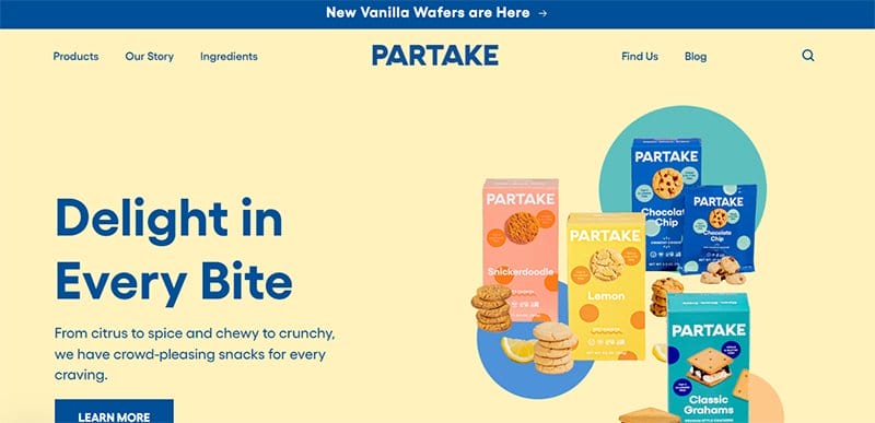
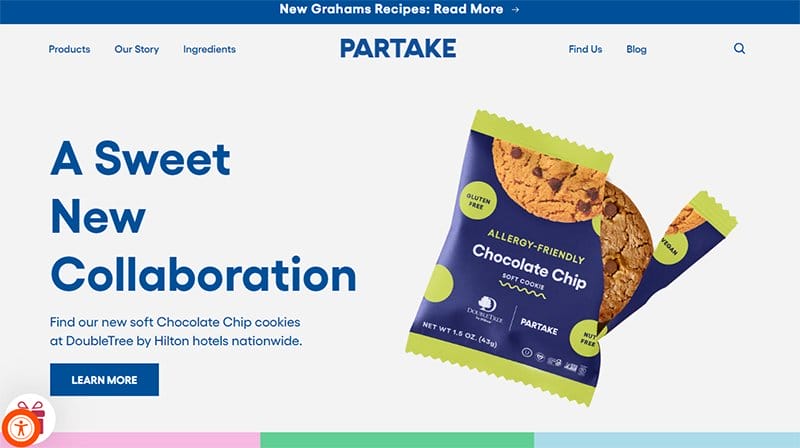
Partake Foods is an allergy-free cookie created by Denise Woodard. In earlier versions, Partake Foods' website emphasized brand-building through vibrant colors and unique typography.
Due to the need to boost the brand identity and increase sales, the marketing team devised a new website redesign plan to achieve these goals.
I love the minimalist yet elegant design layout with colorful and engaging content that uses texts, descriptive icons, and high-quality images.
The Instagram feed section contains eye-catching content to stir potential customers' interest in the product and encourage them to make significant purchases.
Before

After

Cowboy focuses on selling and leasing smart e-bikes to interested customers on its Shopify store.
This stunning webpage's previous design featured an engaging and energetic design layout with multiple stunning deco elements. To get visitors to take new action, the brand has chosen to redesign its webpage.
The hero section has an engaging and energetic background image of their new e-bike product with the caption “Shockingly Smooth” and a white-colored “Explore” CTA button.
This new web design element will encourage visitors to click the white-colored “Explore” CTA button to get more information about the brand.
Before

After

Rodarte is a fashion-based brand founded in Los Angeles, California, in 2005 by Kate and Laura Mulleavy.
I love how flashy and colorful the previous website was and how it displayed high-quality images of the brand's products in a stunning and visually appealing fashion.
Welcoming visitors to this trendy fashion-based website is the latest brand product with a dynamic modular grid layout that provides easy navigation and accessibility.
Clicking any of the “Shop Now ” transparent CTA buttons grants visitors access to the shop section for purchase.
Before

After

Allbirds emphasize sustainable practices in the production process of their goods. Comparing the previous webpage with the new one shows a successful redesign would go a long way in driving better traffic.
I love how the eCommerce store uses multiple slideshows to display its shoes engagingly and interactively to get customers' attention.
The white background plays a significant role in making all the high-quality product images pop and visually appealing. As you explore the page further, you will see a newsletter column available for form submissions and details of potential customers.
Before

After

Toyin Kolawole founded Pipcorn Heirloom Snacks, a women-owned, minority-owned family business.
While checking out the previous page, I loved the product pages, navigation elements, stylish use of the brand colors, and core values. Upon exploring the new page, I noticed substantial improvements.
The hero section of this online store welcomes visitors with a high-resolution video of a family having the time of their life and other individuals enjoying the brand's products.
I love the display of the company's top products and trending brands below the hero section in a slider layout. I love how the content in the banner on the page compels visitors to click the tale-colored “Shop Now” CTA button.
Website Redesigns FAQ
A website redesign is a high-level overhaul that involves significantly changing elements like your current website’s code, content, structure, and visuals to serve your visitors better.
The cost can range anywhere from $100 to $3,000. A simple custom website design from an agency can range from $10,000 to $30,000. Bigger and more complicated websites will cost between $40,000 to $75,000.
When redesigning your website, craft a branding strategy that suits your industry, choose simple navigation, employ a responsive design interface, optimize visual elements, incorporate social media buttons with care, aim for easy readability, design strong CTAs, leverage SEO best practices, aim for fast loading time, and consider adding email marketing elements.
Explore Further
- Examples of Bad Website Design
- How to Design a Website
- The Ultimate List of Web Design Statistics
- Best Dynamic Website Examples
- Best Sleek Website Design Examples
- User Interface Design Examples
- Best Colors For Websites
- Best Creative Web Design Ideas
- Best Website Design Ideas
- Simple & Minimal Websites