List of Big Companies That Use Wix
Do you know that there are over 8 million websites that use Wix, making it one of the most popular content management systems (CMS) in the world? (Builtwith)
Wix is a popular choice for many because of how easy it is to use for complete novices without any prior coding or design skills.
Whether you are a skilled website developer or a novice, the Wix Editor offers a wider range of tools and templates that make the website creation process seamless.
This article covers a list of 30 big companies that use Wix in different forms for their websites, landing pages, or microsites. You will pick up many web design tips and ideas from these big companies.
Let's get started.
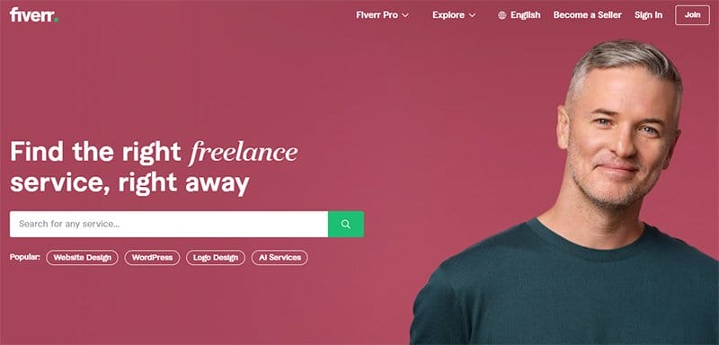
Fiverr is a professional website and freelance platform that connects skilled individuals with clients who require their services. The first catchy element on this user-friendly interface with a modern design is an automated slider featuring exciting content about the brand.
I like how stunning the images in the hero section are, featuring people across different races and cultures to represent their diverse audience.
This unique platform features a white-colored sticky navigation bar with a drop feature that features engaging content about the brand's activities.
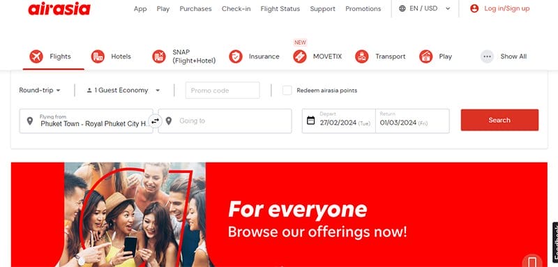
AirAsia is a platform for booking flights, managing travel plans, and accessing travel information to help customers achieve their travel plans.
I love how colorful and fun it is to explore this intuitive interface, which features high-quality images, engaging text, and lava red as its dominant color scheme.
The site's minimalist and sleek design encourages visitors and potential clients to explore its contents with their desktop or mobile devices.
I like how the travel and promotion section uses a single grid column layout to display vital site content featuring high-quality images with a thumbnail effect.

BarPay is a perfect example of a payment system for ordering and paying for hard drinks. Welcoming visitors and potential clients to this outstanding web page is a floating image of mobile phone mockups.
I love how the white background makes all the site content pop and visually appealing for website users who prefer a simple yet engaging website design.
Interested visitors, such as owners of a small business or large business owners, can click the colored “Get A Demo” CTA button to get on board.
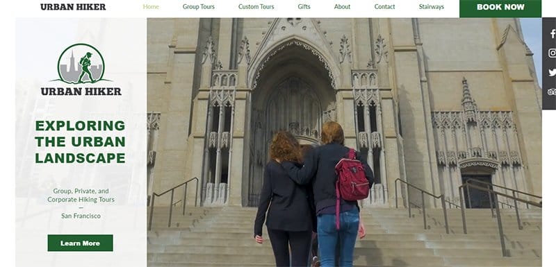
Urban Hiker's founder is Alexandra Kenin, who started the hiking initiative after her vacation to San Francisco. The first catchy element you will observe on arrival is a looping video content displaying past hiking events from participants.
Interested visitors can visit the testimonial section to get positive reviews about the brand from satisfied customers. I like how the web design features a sticky widget, displaying social media icons that link directly to the brand's online page.
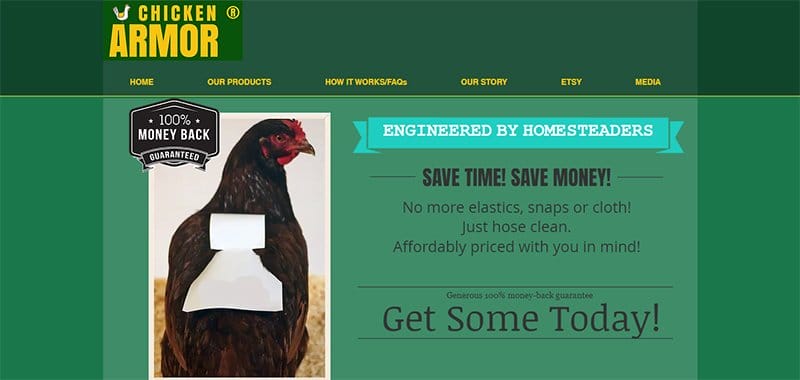
Chicken Armor is a YouTube channel started by Jill Bong in 2011. I love how simple and minimalist the website design features, simple yet informative content about the brand and all its activities.
Displaying multiple brand logos at the base of the page is a brilliant strategy to boost credibility and improve social proof.
This stunning web page features multiple eye-catching contents and a bright color scheme displaying colors like mikado yellow, deep green, green pea, dark jungle green, black, and white.
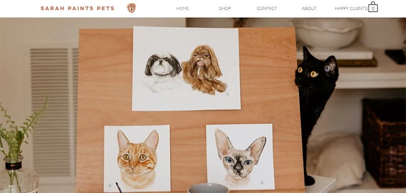
Sarah Paints Pets is a portfolio platform that centers its brand around beautifully looking dogs and cats. The parallax scrolling feature on the page makes its content visually appealing, such as photography-based content and high-quality images.
Upon scrolling, you will love the application of animated content and engaging text that sheds light on what the platform stands for.
What's handy about the page is multiple grid-column layouts to display high-quality images of pets. Clicking any of these images grants visitors access to a page to check out more photos.
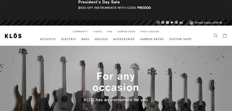
KLOS Guitars is an online store that sells top-notch guitars to customers worldwide at affordable prices. I love how this stunning web page created with Wix welcomes visitors with a high-resolution image of multiple guitars in an orderly fashion.
As you explore the page further, you will see other stunning elements, such as video content and high-quality photos. Visitors and potential clients can use the search function to locate items across the page.
The sticky navigation bar with a dropdown feature opens visitors to a world of mouthwatering guitar-based information and other relevant content about the brand.
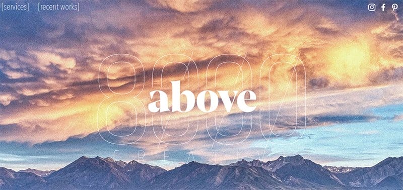
Above 8000 Creative is a boutique design and digital marketing agency based in Mammoth Lakes, California.
I love the gradient element featured in the hero section and the site footer, which gives the page a vibrant and sleek look.
The parallax scrolling feature on the page makes its content visually appealing. Notice how the bio section features a high-quality image of the founders Delaney and Mimi Council to make the page interactive and engaging to site visitors.

Food Fleet is a food delivery business started by Jeffrey Mora in 2012. This platform offers top-notch food delivery solutions like mobile food and beverage solutions for organizations or private event
I love how the page's white background is vital in ensuring all the site's content pops and is easy to read and explore.
My favorite aspect of the webpage is the use of a zig-zag layout arrangement, giving the page a well-structured view and outline.
Each high-quality image has a thumbnail feature, which encourages further navigation and exploration for visitors and potential clients.
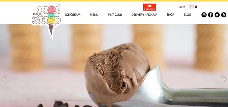
The Good Scope is a food-based brand that sells mouthwatering ice cream made in small batches, just 1.5 gallons at a time.
Welcoming visitors to the food-based web page is a slider feature displaying some of the brand's delicious products to get customers to visit the shop page.
Interested visitors can use the pink-colored “Let's Chat” live chat widget at the right side of the page to contact the brand's officials.
The light teal-colored footer houses vital information such as email address, toll-free number, location address, social media icons, opening hours, and a newsletter column.
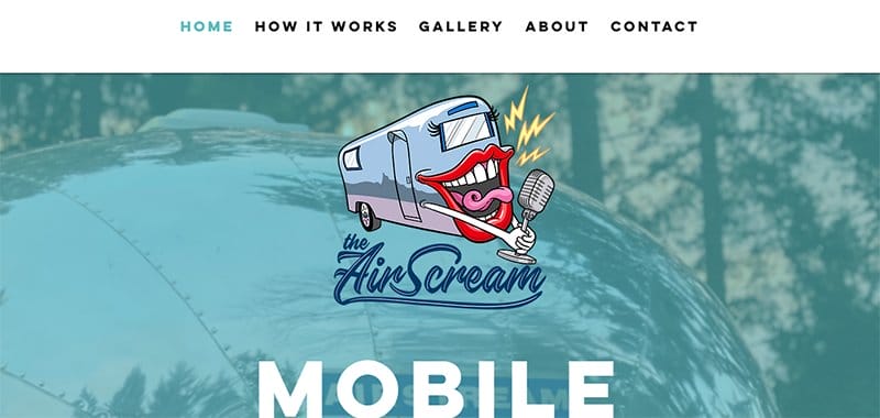
The AirScream is a mobile karaoke experience started by Kelli L Bielema in 2019. I like how the first catchy element you will see on arrival is a blurred image of the van with the caption “Mobile Karaoke in a Vintage Airstream.”
Interested visitors can visit the tael-colored site footer to submit their details in the contact form for seamless collaboration and engagement. You can use the white-colored sticky navigation to access various aspects of the page.
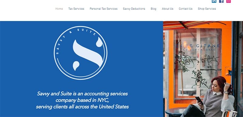
Savvy & Suite Ltd was founded by Yvette Sadovoy, who uses a combination of the science that comes with her Master's in Accounting to help her clients solve tax-related issues.
I love how the blog section uses a card design to carefully arrange its content with a thumbnail feature that encourages further exploration.
As you further explore the site’s content, you will see three unique certification logos from the tax and bookkeeping services, a social proof source.
The base of the page houses a short bio section that displays a high-resolution image of Yvette Sadovoy with a short text about what she does.

Real Life Trading is a stock day trader started by Jerremy Alexander Newsome in 2014 that offers courses and tips to individuals interested in learning the art of day trading.
I love how this unique trading platform starts with a high-quality CEO image and the caption “Achieve Financial Freedom” to inspire visitors to come on board.
Below the hero action are icons of top publications brands with featured content about the brand in their article or news.
As you explore the site further, you will see the proper arrangement of the different subscription plans in a card design layout.
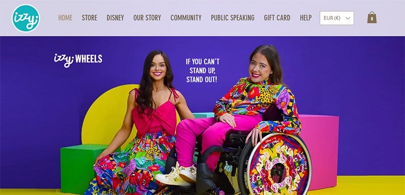
Ailbhe and Izzy are the founders of Izzy Wheels, a company that sells stylish wheelchairs at affordable prices to people who require them.
Welcoming visitors to this stunning and colorful eCommerce web page is a high-quality image of Ailbhe and Izzy with the caption “If You Can't Stand Up, Stand Out.”
The site features a YouTube video that conveys what they are all about to the mind of a visitor or potential client. You can find logos and testimonials from well-known organizations at the bottom of their web pages that serve as social proof.
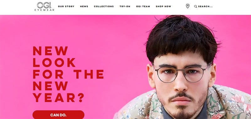
OGI Eyewear offers stylish and quality eyewear to its customers across different parts of the world. I like how the web page features stunning, high-quality images and illustrations displaying people wearing the brand's products to get visitors' attention.
Below the hero section are catalogs of the brand's collections in a double-column grid layout with a thumbnail feature for further exploration.
You can check out the engaging YouTube video at the center of the page to better understand the brand's products and the best ways to wear them.
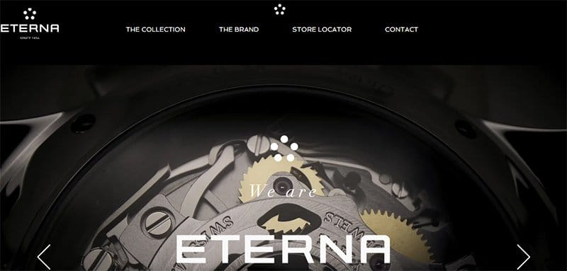
Eterna is a luxury wristwatch brand that has its origin in the Swiss watchmaking Tradition. On arrival, the first catchy element you will see is a slider feature displaying vital content about the brand's history and some of its activities.
I like how the black background makes all the page content eye-catching, visually appealing, and fun to explore.
You will love the arrangement of the brand’s watches in different categories. Each of these images comes with a thumbnail feature, creating a fun and user-friendly experience.
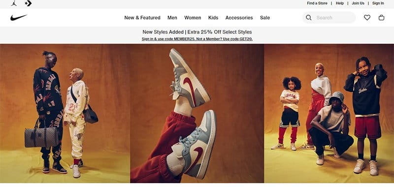
Nike is a sport-based fashion company that markets and designs apparel, footwear, sports equipment, and other accessories.
This stunning webpage has multiple useful tools that make it stand out from many big companies, like a search bar on the white sticky navigation bar.
As you explore the site's content further, you will love how the page displays some of their latest products with high-quality images.
Some of these images come in black and white, while some have a bright color scheme with a thumbnail feature that encourages further exploration.
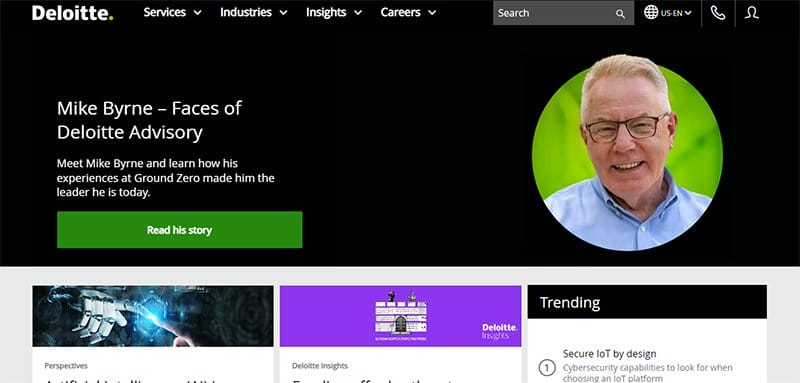
Deloitte is a global brand that provides tax and advisory services to its clients, like audit, consulting, and risk management services.
This unique platform features a black-colored sticky navigation bar with a drop feature that features engaging content about the brand's activities.
The white-colored site footer features vital information about the brand, which helps visitors distinguish it from other large companies.
These contents include links to pages like client stories, about pages, contact pages, and social media icons that link to the brand's online profile.
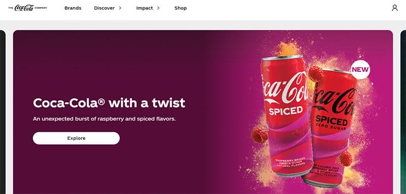
Coca-Cola is a food-based brand famous for its iconic drink, which serves millions worldwide. I like how the first thing you will see on arrival is an automated slideshow displaying stunning graphic designs featuring content about the brand to get visitors' attention.
Interested visitors can use the search feature on the mega navigation bar to explore content across the web pages. I love how the display section uses a slideshow feature to display some of the brand's top products with price tags for interested visitors to purchase at will.
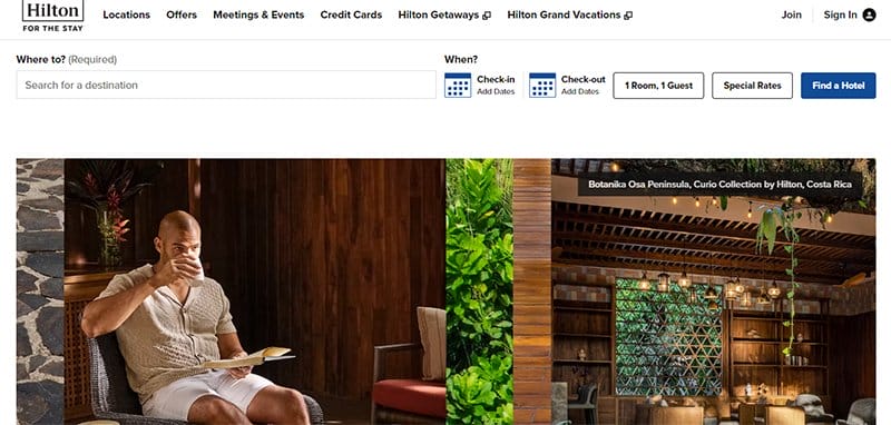
Hilton is a hospitality-focused company that's popular for offering excellent services to its customers. This hotel brand has over 5,700 properties across 113 countries and territories.
Kicking off this minimalist page design is a split screen of two high-quality images of the hotel to give visitors a sneak peek into what Hilton offers.
I love how the white background makes all the site content pop and visually appealing for website users who prefer a simple yet engaging website design.
As you explore the page further, you will see multiple high-quality images in different card design layouts and a thumbnail feature.
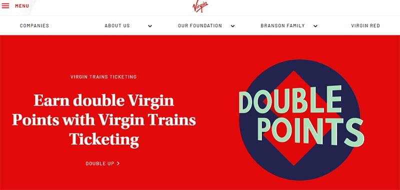
Virgin is an aviation-based company with multiple airlines across the world. Richard Nicholas Branson is the brain behind The Virgin Group.
The graphic image in the hero section features a thumbnail effect, which, upon clicking, transports visitors to a unique page where they can get more brand information.
I like how the display section uses slider features to showcase logos of various Virgin companies in different parts of the world.
Virgin's web page features multiple engaging content. However, what stands out is the bright color scheme featuring white, Wisp pink, black, and lava red as its dominant colors.
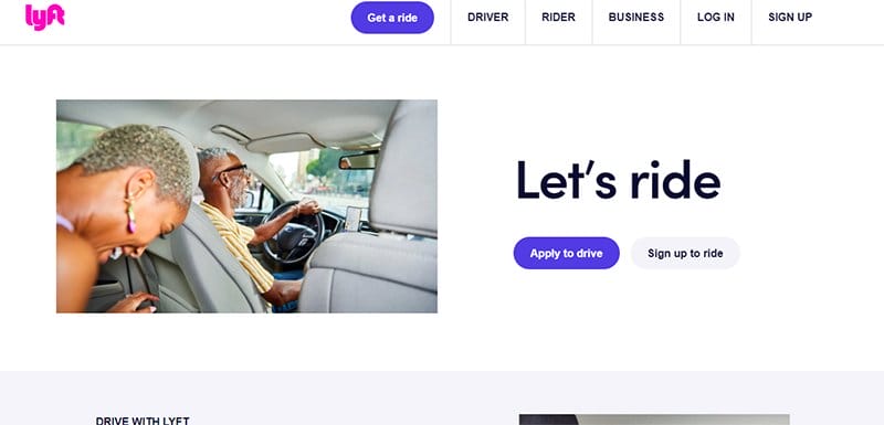
Lyft is one of the fastest-growing companies that offers mobility as a service. This outstanding company uses a ride-share system that helps reduce cars and traffic on the road.
I like how the page's testimonial section features multiple heartwarming customer reviews in a slider format. Interested visitors who want to drive can click the blue colored “Apply To Drive” CTA button in the hero section to get on board.
As you explore the content further, you will see logos of some of the biggest companies in the world that are partners with the brand. This feature is a brilliant strategy to boost credibility and improve social proof.
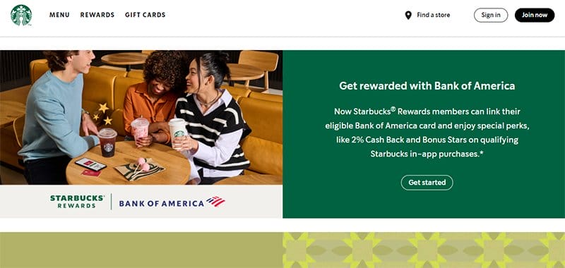
Starbucks is a coffee-based brand known for its innovation, simplicity, effectiveness, and excellent customer service.
Kicking off this food-based web page is a split-page design layout featuring young people enjoying some of the brand's products with new information about discounts.
Upon scrolling, you will love how the page has a fluid grid design layout to display some of its top products with a transparent CTA button.
I love how colorful and fun it is to explore this intuitive interface, which features high-quality images and engaging text. Green smoke, faded orange, and blush pink as its dominant color scheme.
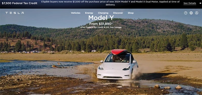
Tesla is a vehicle and clean energy company founded by Elon Musk. This trading company offers top-notch electric vouchers that are taking the world by storm.
On arrival, the first catchy element you will observe is a looping video content displaying contact information about the brand and how people enjoy its product.
As you scroll across the page, you will see multiple full-size, high-resolution images, which gives visitors a sneak peek into the brand’s products.
This unique platform features a transparent sticky navigation bar with a drop feature that features engaging content about the brand's activities.
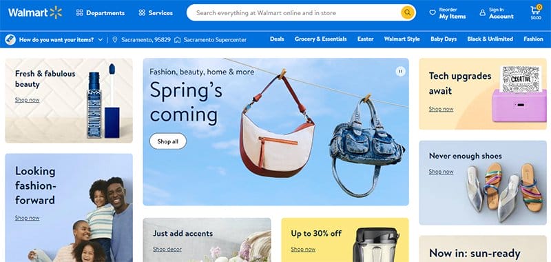
Walmart is one of the world’s largest retail corporations that sells products across different categories at affordable prices and uses Wix for some of its subsidiary websites.
Welcoming visitors to this outstanding web page is a slider feature that features some of the store’s latest hot products to compel visitors to buy.
Clicking the white-colored “Shop All” CTA button grants visitors access to the shop page, with unlimited access to various eye-catching items.
The search bar on the blue-colored sticky navigation bar gives the page a unique feel from other online stores and makes it easy for visitors to locate various items seamlessly.
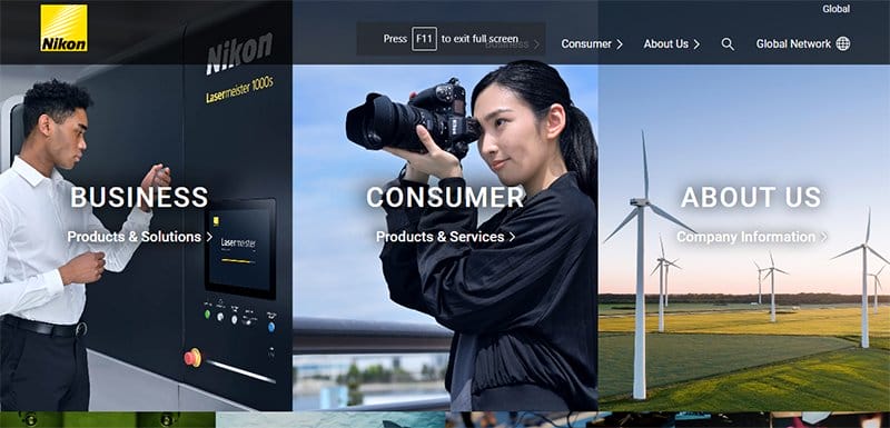
Nikon is a Japanese optics and photographic equipment manufacturer headquartered in Tokyo, Japan. I like how the site welcomes visitors to its home page with a three-column layout featuring three high-quality images with a page title for clarity.
Clicking any of these images is your one-way ticket to exploring further content about the brand and how it benefits its customers.
Visitors can use the white-colored sticky back-to-the-top button to glide across the page without having to scroll manually.
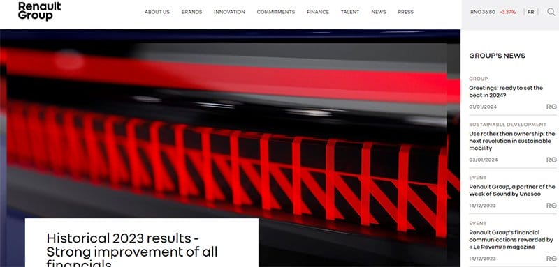
Renault Group is a multinational automobile manufacturer that produces durable and modern cars at pocket-friendly rates.
Welcoming visitors to this fantastic web page is a high-quality image of an electric car with a news-based CTA button at the base of the page.
Visitors and potential clients can use the search function to locate items across the page. I love how the blog section uses a card design to carefully arrange its content visually appealingly with a thumbnail feature.
The search function is a handy tool for exploring various aspects of the page without any restrictions.
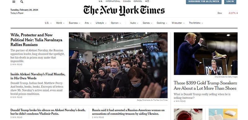
The New York Times is an American mass-media company that publishes the latest and groundbreaking news daily. I love how The New York Times website uses a magazine design layout to display its content featuring the latest news and other engine content.
The image at the center of the page has a thumbnail feature, which grants visitors further access to the news section for further exploration.
You can use the white-colored sticky navigation bar with a dropdown feature to move across different pages without any restrictions.
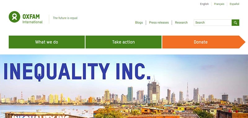
Oxfam International was formed in 1995 by independent non-governmental organizations to reduce global poverty and injustice.
I love how the gray background makes all the site content pop and visually appealing for website users who prefer a simple yet engaging website design.
This unique environmental-based website features stunning and colorful elements like high-quality images and engaging texts, which makes it stand out from other professional websites.
The site’s dominant colors include white, medium spring green, and pumpkin orange, which gives the page a fun and engineered look.
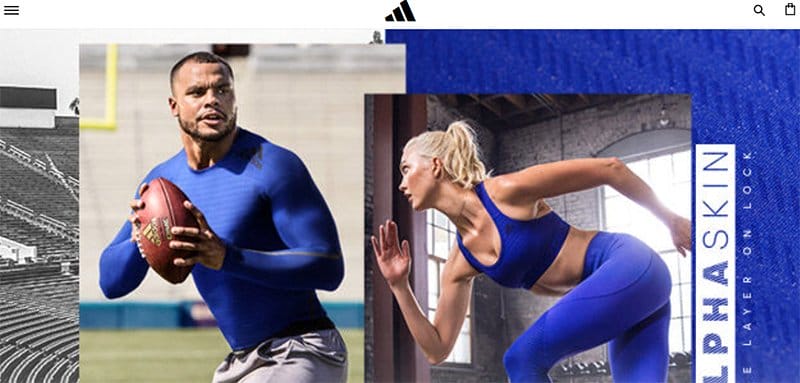
Adidas produces high-quality sportswear and workout clothes at affordable prices, which makes sporting activities seamless for consumers.
The first catchy element on this user-friendly interface with a modern design is an automated slider featuring some of the brand’s latest products.
Potential customers can click the shop icon on the white-colored sticky navigation bar to explore the brand's products and purchase without registration.
Interested visitors can use the newsletter column at the base of the page to drop their details to get constant updates from the brand.
FAQ
Wix is a popular tool among small to medium-sized business owners, freelancers, and individuals who want to build a user-friendly and outstanding platform that ranks high in search engines. The Wix app market helps create and manage websites without technical coding or web design expertise.
Yes, professionals across different fields can use this powerful website builder to create stunning web pages that are in line with their expertise. Wix offers professional-based templates which are useful for creating a fully functioning and visually appealing web page.
Yes, professional website designers use Wix to create their masterpieces. A large, growing community of website designers has fallen in love with Wix.
With Wix as your custom website builder, you do not require coding experience when creating a website. You can use its drag-and-drop feature to arrange your site’s content into areas pleasing to you and your clients. The process takes less time than if you are not using a website builder like Wix.
Some outstanding apps that work best on Wix websites include Wix Chat, Wix Stores, Get Google Ads, Visitor Analytics, Autods automatic dropshipping, Social media stream, Calendar, Poptin, Editorify, Facebook Feed, Omnisend, QuickBooks Connector, Site Search, Social media icons, Wix Blog, Ecwid online store, Elfsight, Facebook reviews, and Logo maker.