45 Best Colors For Websites (In 2025)
Do you want to design your site but having trouble selecting the best color scheme? While having great website content is vital for attracting your target audience, using a poor color scheme ruins the user experience.
Web Design Statistics show that 40% of consumers appreciate the colors on a website more than any other design component. Your website’s color scheme has a strong impact on how visitors perceive your brand.
Smart website designers and owners choose the ideal color palette that matches their brand identity and gives a positive and memorable first impression.
This article covers the 45 best websites with visually appealing color combinations to awaken your creativity.
Let’s get started.
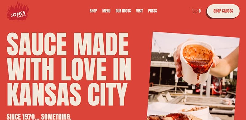
The Jones sisters' barbecue and sauce center is Jones Bar-B-Q, offering mouth-watering delicacies in Kansas City. One of the inspiring color schemes, the Jones Bar-B-Q website is filled with pictures of the fire that complements the natural sauce hue of jasper.
You will find high-quality fonts and images of the restaurant's food options, sauce, and the Jones sisters throughout the website, giving it a polished appearance.
The site’s bold typography is more engaging through its alternating White and Light Tan font colors.

S Kaba Consulting offers comprehensive capabilities and deep industry knowledge necessary to help you navigate the complexity of pharmaceutical product development.
A professional website example to the core, the S Kaba Consulting website is unique, built in its logo’s White and Dark Blue color scheme.
The CTA buttons incorporate the site’s main White and Dark Blue colors, easily recognizable on the homepage. I love how this consulting site alternates between high-quality images and video content, treating visitors to one of the visually appealing website color palettes.
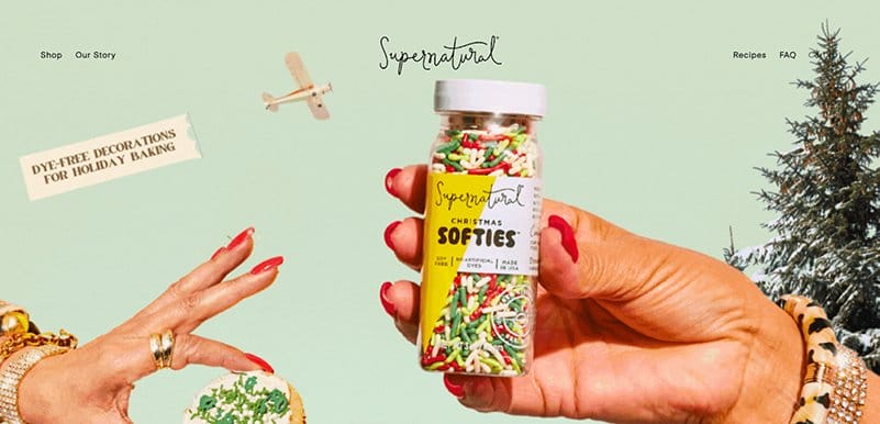
Supernatural takes great satisfaction in inspiring culinary innovation in the kitchen by providing vibrant ingredients that let chefs show off their skills.
One of the best website color schemes, the Supernatural website adheres to the brand's aesthetic, featuring visually striking pictures on bold-colored backgrounds.
Supernatural features vibrant photos from its Instagram page on a Bright Yellow backdrop in the sprinkle grams section. With its contents shown on a Rubber Ducky yellow background, the footer area uses a different shade of yellow.
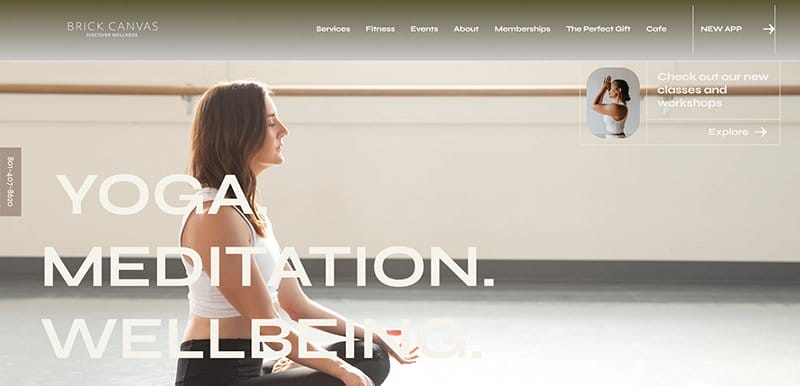
Brick Canvas is committed to bringing balance and joy to your life, offering a broad range of classes for every fitness level. One of the standout website examples, the Brick Canvas website is unique, displaying earthy tones as the site’s primary colors.
I love the use of the Eagle and Platinum colors on the site, creating a calm and soothing scrolling experience. The online chat feature and help call line are easily recognizable in their Eagle-colored background, pinned to the homepage.

Award-winning composer, songwriter, and performer Lin-Manuel Miranda actively supports programs that raise the representation of people of color in the arts and politics.
One of the inspiring website color schemes, Miranda website’s color scheme is unique, blending well with the site’s modern web design.
A primary photograph of Lin-Manuel set against a Royal Blue background occupies part of the key text on his contemporary website.
Miranda's sleek and contemporary website is filled with high-quality photos, videos, and animations that entice users to explore further.
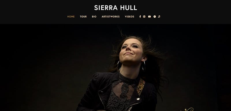
Sierra Hull is a singer, songwriter, and multi-instrumentalist with plenty of accomplishments and milestones hit in her lifetime. A professional at heart, Sierra’s website is professional, sticking to a predominantly black-and-white color scheme for her website design.
I love the use of a touch of Gold in her web design, serving as the background color for unique sections and font colors for header texts.
Her social media icons stand out in White over her sticky header’s all-black background, linked to her social media and streaming platforms.
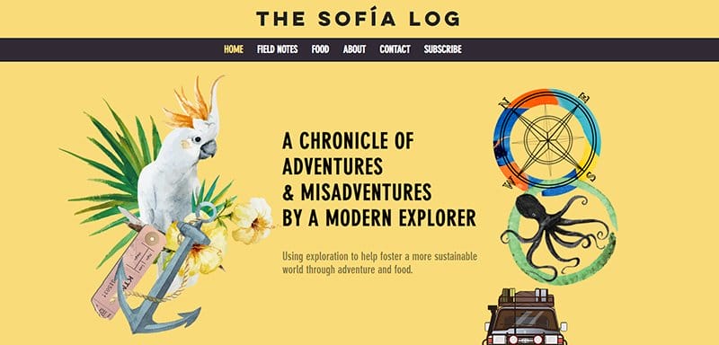
The creator of the Sofia Log brand, Sofia Hollingsworth, is an adventurer and foodie who takes her culinary skills outside.
Her sleek website features animated graphics and paintings that highlight her passion for the great outdoors and adventure against the backdrop of Jasmine.
Beneath the hero section is a slideshow display of several full-width images, each telling a unique story. The footer section displays a subscription box and social media icons in a classical black-and-white color scheme.
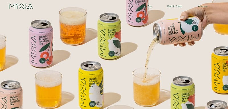
Minna is a brand of refreshing tea known for its use of organic and non-GMO ingredients, as opposed to additional sugars or sweeteners.
One of the best website color schemes, the Minna website is consistent, displaying bold colors as a background for its different homepage sections.
The colors of the brands’ unique cans are visible as distinct background colors for the site’s product sections, displaying consistent vibrant hues.
Catching visitors' attention with their color combination is the hero section’s background image, which displays a hand emptying different cans into glasses.

One of the colorful website examples is Feastable, which stands out from other small firms because of its fantastic startup design.
A top website with an inspiring website color scheme, the Feastables website treats visitors to a vibrant slideshow of pictures of its colorfully packaged products.
The Feastables website has a stunning color design that uses a variety of hues throughout the homepage. Sticking to bold font colors and typography is another design feature that distinguishes its site design, giving it a visually appealing look.

Launchpad leverages a combination of systems, processes, and automation that guarantees a seamless customer experience that easily converts.
A top color combination for a website to gain inspiration from, the Launchpad website is unique in its display of different color hex codes.
Different shades of blue, pink, and purple are visible on the site, catching visitors’ attention as they scroll. Visible is a customized mouse cursor visible as a Bittersweet circle, serving as the site’s primary navigation feature.
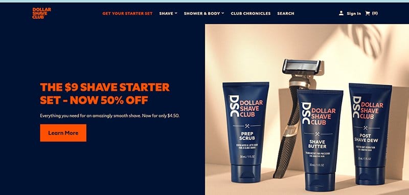
Dollar Shave Club is a luxurious personal grooming company offering customers all they need for an amazingly smooth shave.
One of the top inspiring website color schemes, the Dollar Shave Club website stands out in its bold display of Blue and Coral Red as the site’s color combination.
The CTA buttons on the site alternate between Blue and Coral Red as their background colors, adding a twist to the website design.
A chat feature is visible and pinned to the homepage in a Light Grey and Black color scheme, serving as the site’s online communication channel.
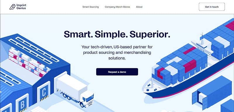
Imprint Genius is your tech-driven, US-based partner that offers smart, simple, and superior product sourcing and merchandising solutions.
One of the outstanding website examples, the entire homepage of the Imprint Genius website displays catchy and colorful animated images.
Different shades of Blue attract visitors in their unique display, serving as the center of attention in the hero section. The Red Violet color is visible although sparingly displayed, helping to give the site a visually appealing color combo.
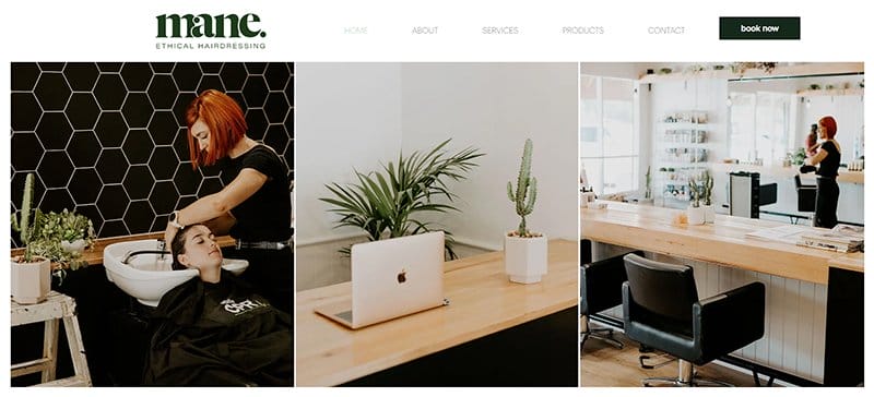
Mane Ethical Hairdressing is committed to creating a salon that exists in harmony with the environment, sticking to its family-friendly core values. One of the top examples of an inspiring website color scheme, the Mane website is minimalistic, sticking to a simple web design.
The logo’s Myrtle color is the site’s predominant color, visible as the font color. The site’s booking CTA button is on the header menu, easily recognizable in its black-and-white color scheme.
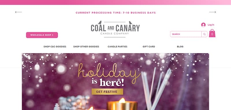
Coal and Canary aims to bring joy and happiness into people’s lives through its high-quality hand-poured products and efficient customer service. A well-designed website example, the Coal and Canary website is unique, sticking to a centralized layout for its web design.
I love the display of different bright tones of pink on the site, making Pink the main hue of the website design. Plenty of white space is visible on the homepage serving as the site’s background.
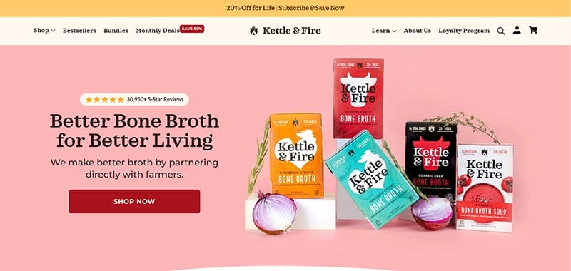
Kettle & Fire makes bone broth convenient, delicious, and nutritious, delivering the amazing benefits of bone broth to the world. A colorful website with a modern color palette, the Kettle & Fire website stands out with its visually appealing color combinations.
The pink color welcomes visitors to the website, serving as the background color for the site’s hero section. Also catching users’ attention is the logo’s Red color, visible as the background color for the site’s multiple CTA buttons.
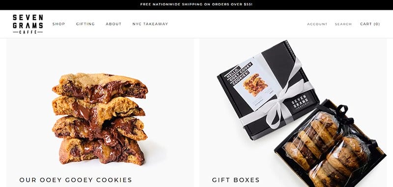
Seven Grams Caffe is a small, independent company offering its customers amazing cookies and coffee. One of the inspiring website color schemes, the Seven Grams Cafe website is unique, sticking to a predominantly black-and-white color scheme for its web design.
Welcoming visitors to the site are two pictures of its cookies and present box, along with clear CTA buttons encouraging users to buy both.
An accessibility icon is visible and pinned to the left-hand side of the homepage in a black-and-white color scheme, letting users alter the site’s layout.

Mitchell Adam is a financial recruitment expert offering honest, transparent advice that helps connect businesses with exceptional people.
One of the most inspiring website color schemes, this recruitment website is unique with its color combinations (Yellow, Black, and White), giving it a visually appealing look.
The bold font type stands out on the site in Black and White, engaging site visitors and screen readers as they scroll.
I love how the website alternates between yellow and black as the color for the customized dot, serving as the site’s mouse cursor.
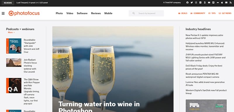
Photofocus partners with some of the greatest vendors in photography to provide its clients with informative tools, gears, and products they need to succeed.
One of the best minimalistic websites with an inspiring website color theme, the Photofocus website is fully packed with information.
The logo’s International Orange is visible on the homepage as a font color for header texts and a background color for multiple CTA buttons.
A subscription feature is visible and pinned to the right-hand side of the homepage, standing out in its International Orange-colored background.

Koysor Abdul is a designer and Webflow developer devoted to crafting beautiful web experiences focused on simplicity and purpose.
One of the simplest and most minimal web designs, Abdul’s website is unique, sticking to Dark Olive as the homepage’s background color.
The entire homepage is divided into unique sections by thin white vertical lines, adding a unique touch to the website design. The footer section stands out in its Burnt Orange background, displaying texts linked to Abdul’s social media platforms.

Andrew Huang is a partially deaf musician, video creator, and author doing audio and video work for some of the world’s biggest brands. A top and inspiring website design example, Andrew’s website is aesthetically pleasing with an astonishing color scheme.
There are different shades of blue displayed predominantly on the site’s homepage, serving as the main color on the website’s color palette. I love the use of bold typography on the homepage in its White font color to engage visitors.
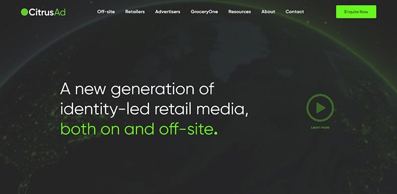
CitrusAd is at the center of the retail revolution, creating a new generation of identity-led retail media, both on and off-site. One of the inspiring website color schemes, the CitrusAd website captures visitors' attention with its color combo of Grey, Lime, and White.
The Lime Green color makes the website more engaging, highlighting key texts and serving as the background color for CTA buttons. Visible in a black-and-white color scheme are logos of the brands’ partners, serving as social proof to potential clients.
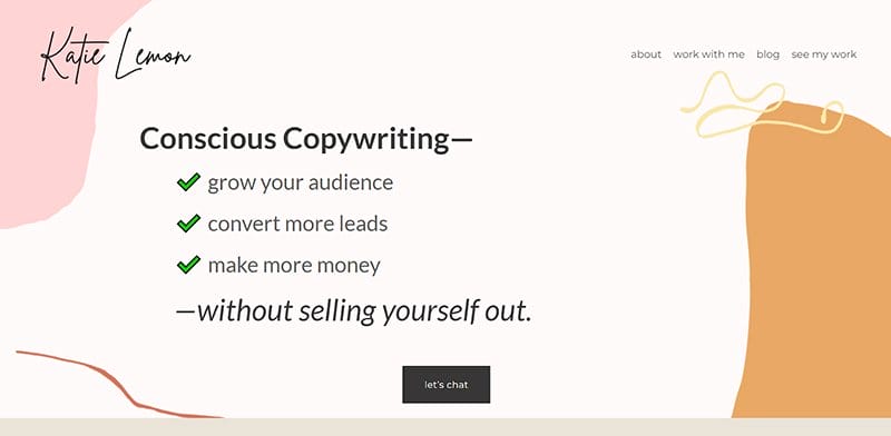
Ad copywriter, Katie Lemon specializes in helping companies develop ad campaigns that increase their productivity. This top website example displays earthy tones, sticking to a soft color scheme for its modern color palette.
The entire homepage uses an engaging combination, with each section distinguishable by its unique background color. I love how she uses her copywriting portfolio as a play area, adding erratic lines and shapes to give it some color.

Bigmouth Copy is a Dallas-based copywriting agency that writes fast, fearless sales copy for creatives and coaches everywhere. One of the standout website examples, the Bigmouth Copy website is unique, displaying bold elements as the core of its web design.
I love the color combinations (Wild Strawberry, Blueberry Blue & Bird Flower) on the site, combined with the bold texts and improving the site’s visual appeal.
The colorful animated images of a mouth add to the site’s visual appeal, leaving its artistic mark on the website design.
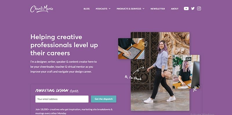
Charlie Marie is a designer, writer, speaker, and content creator helping creative professionals level up their careers. One of the top website color schemes, Charlie’s website alternates between Purple, Lavender, and Teal to give it a visually appealing look.
Welcoming visitors is a centralized display of what Charlie offers her target audience, alongside images on a Purple background. The CTA buttons are easily recognizable in their Green Teal background, prompting visitors to the site.
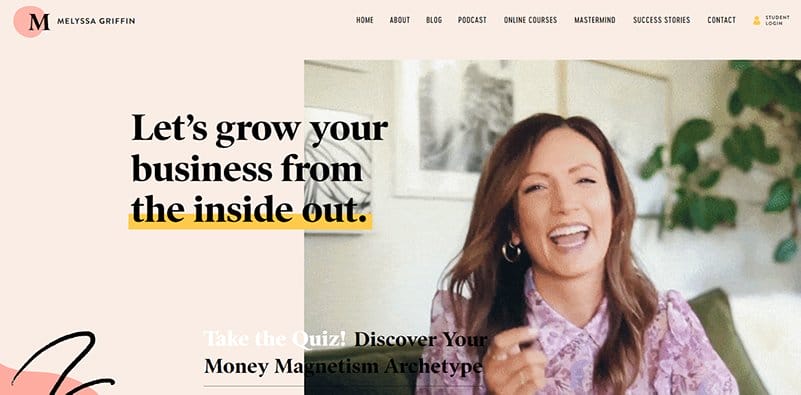
Melyssa Griffin is a former school teacher turned entrepreneur who believes that the best way to grow a thriving business is to heal the leader. A top website example with an inspiring website color scheme, there is no shortage of color displayed on Melyssa’s website.
The different hex codes of colors displayed on Melyssa’s site are beautiful, treating visitors to a unique display of colors. Visible are lines and shapes of different shades of colors, all adding to the site’s design aesthetics.
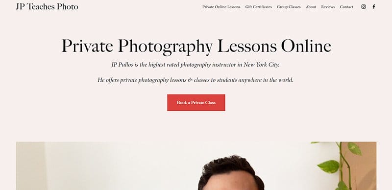
JP Teaches Photo is the portfolio of the highest-rated photography instructors in New York City, offering private lessons and classes to students. One of the inspiring website color schemes, the JP Teaches Photo website is minimalistic, sticking to a two-color combination.
The entire is designed on a consistent Pastel pink colored background, making the high-quality images displayed more attractive. The CTA buttons are consistent in their Red-colored backgrounds, prompting visitors to perform specific tasks.
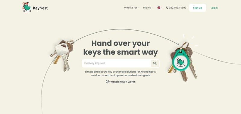
KeyNest provides easy and safe key exchange services for estate agents, serviced apartment operators, and Airbnb hosts. Welcoming visitors to the KeyNest website is a set of keys connected by a long arrow line in the Beige hero section background.
The website's online communication channel is a chat feature, pinned to the homepage in the logo’s Green-Blue color scheme.
I love how the homepage features distinct areas, showcasing the logos of previous clients and featured brands, all presented in a primary black-and-white color scheme.
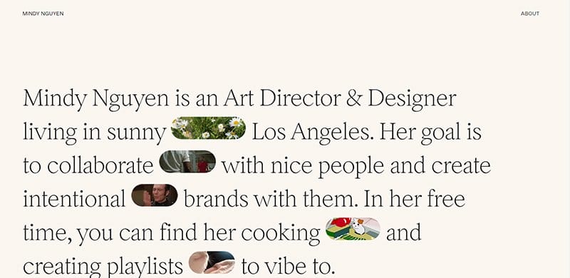
Mindy Nguyen is a Los Angeles-based art director and designer who collaborates with nice people and creates intentional brands with them.
One of the minimalistic website examples with an inspiring website color scheme, Mindy’s website sticks to Beige as her site’s consistent background color.
Animated images are visible in the hero section, adding color to the site’s plain web design. Colorful images are visible beneath the hero section, each displaying different colors and maintaining the site’s centralized layout.
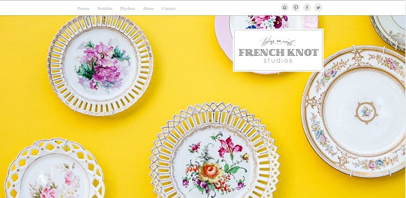
French Knot Studios is a boutique event planning, wedding design, and photo styling studio that helps clients create lovely experiences. One of the less sophisticated website examples, the French Knot Studios website is minimalistic, sticking to a plain web design.
The hero section displays several full-width slideshow images of past events, with the Vivid Yellow color brightening the display. Light Grey and Black are visible on the homepage’s plain white background, creating a gentle color scheme.
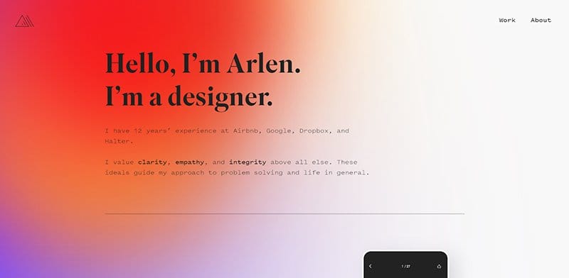
Arlen McCluskey is a designer with over 12 years of experience enjoying the pursuit of craft, solving complex problems, and mentoring others. One of the top websites with an outstanding color scheme, Arlen’s website is unique, displaying an excellent mastery of hex codes.
Color gradients are predominant on the site, adding a unique touch to the site’s outlook. Plenty of white space is visible on the site’s homepage, helping to distinguish between the different bright color schemes.
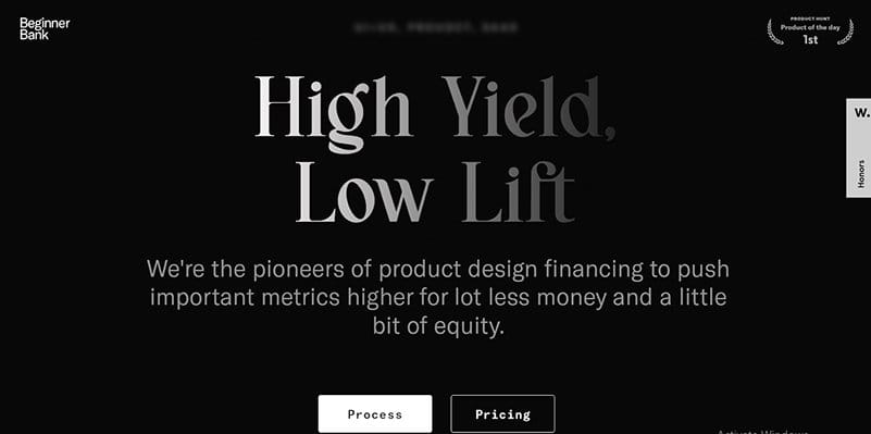
Beginner Bank is the pioneer of product design financing, pushing important metrics higher for a lot less money and a little bit of equity. One of the simple websites with a minimalistic color scheme, the Beginner Bank website is unique in its black-and-white color scheme.
I love how this one-page homepage uses a centralized layout to display the site’s key design elements. The CTA buttons alternate between White and Black for font colors and background colors, adding a unique touch to the website design.
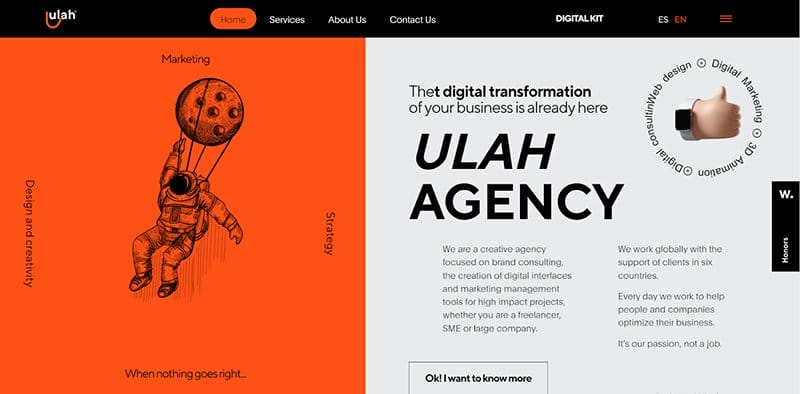
Ulah is a creative agency focused on brand consulting, the creation of digital interfaces, and marketing management tools for high-impact projects.
I love how this design agency displays bold and complimentary colors. The logo’s Orange color serves as the site’s main color hue.
Complimenting the consistent display of the Orange shade are the deep Gray and Black colors, giving the site the right website color scheme.
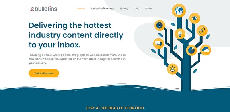
ebulletins delivers the hottest industry content directly to the inboxes of business professionals, providing cutting-edge research. One of the modern website examples, the ebulletins website is aesthetically pleasing in its display of White, Yellow, and Teal Blue.
I love how the hero section of the site is visually appealing with an image of a tree, with different icons linked together by its branches.
The Yellow color is visible throughout the site as the background for different sections and the site’s multiple CTA buttons.
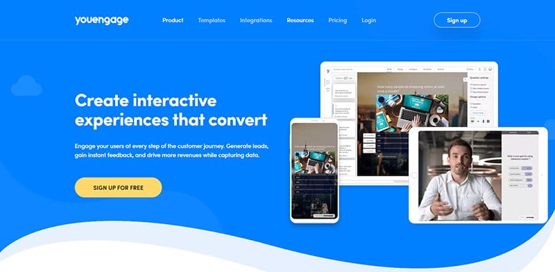
YouEngage helps its clients create interactive experiences that convert and engage users at every step of their journey. One of the best artistic website examples, the YouEngage website is unique, sticking to Light Blue and White as the site’s predominant colors.
I love the use of a light blue background for its hero section that displays different device screens.
Wavy lines and unique shapes are visible throughout the homepage, engaging visitors and adding an artistic touch to the website design.
A chat feature is visible and pinned to the homepage in a blue-and-white color scheme, serving as the site’s online communication channel.
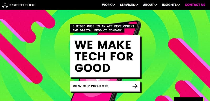
3 Sided Cube is an app development and digital product company helping organizations around the world save the world one app at a time. An example of a visually appealing website, the 3-Sided Cube website stands out in its display of bold design elements.
The color combo on the 3-Sided Cube website is unique, displaying bright colors that engage visitors as they scroll. The font types on the site are unique in their bold display, making it easy for visitors and readers to read and engage.

GolfSpace offers the best indoor golf experience in Sydney, offering a combination of high-tech and high-end design that guarantees a revolutionary new golf experience.
One of the well-designed website examples, the GolfSpace website is unique, displaying the Yellow Green color as its bold feature color.
I love how the CTA buttons use the yellow-green color, adding color to the predominantly dull website color palette. The dark and light gray colors are visible on the site as background colors, complimenting the site’s consistent display of black-and-white images.
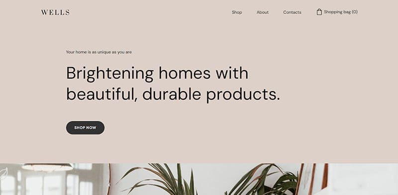
Wells works exclusively with sustainable and environmentally friendly materials, brightening homes with its beautiful and durable products. One of the inspiring website color schemes, the Wells website is minimalistic, sticking to a straightforward website design.
The Beige color serves as the background color of the hero section. The footer section sticks to the logo’s color scheme, displaying Dark Gray as the background color.
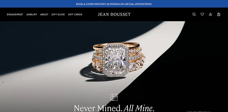
Jean Dousset is a fine diamond jewelry designer who celebrates a legacy of unparalleled craftsmanship while forging a name that stands on its own.
A top business website example, Jean’s website is professionally looking and built on a predominantly black-and-white color scheme.
The Tory Blue adds a unique touch to the website, bringing the entire site to life with its colorful and elegant display. I love the display of logos of top brands featuring Jean Dousset in its Editor-Approved section, sticking to a black-and-white color scheme.

Finlor is a 21st-century logistics company offering safe and reliable 21st-century logistics solutions. One of the outstanding website examples with a unique website color palette, the Finlor website displays different shades of Blue on its homepage.
The CTA buttons on the site are unique, sticking to the site’s primary colors of Navy Blue and Electric Blue as their background colors. I love how the site alternates between Electric Blue and Navy Blue colors as font colors, complimenting the use of White fonts.
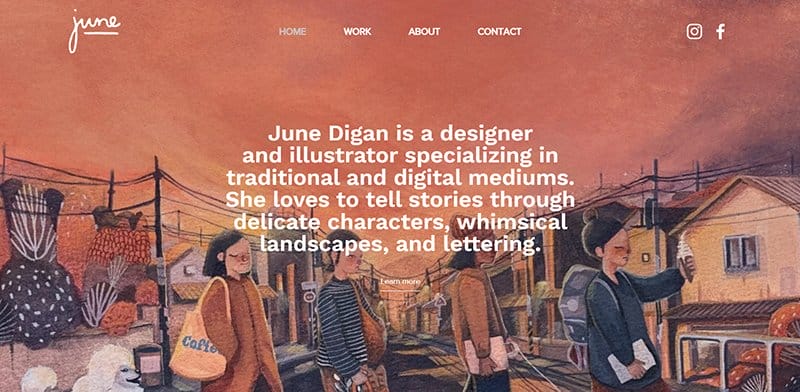
Designer and illustrator June Digan focuses on conventional and digital media. She uses a variety of media, including lettering, wacky landscapes, and delicate characters, to tell original stories.
Welcoming visitors to her website is a hero image that displays a full-width picture of one of her illustrations, with the Light Orange color prominent.
The homepage’s plain white background gives way to alternating two- and three-column displays of her portfolio, using accent colors.
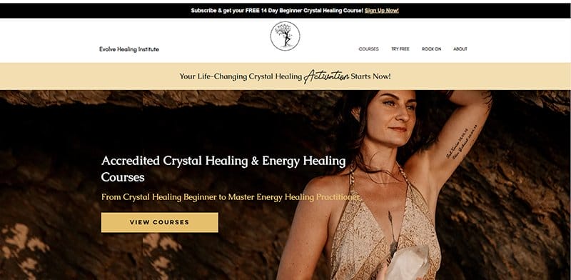
Evolve Healing Institute was created to raise the standards of professional Crystal Healing practitioners globally. In keeping with the brand’s identity, the Evolve Healing Institute website sticks to a gentle color scheme that is calm and soothing.
The site’s multiple CTA buttons are clear, standing out in their Apache-colored background. The Onyx color adds a dark theme to the website design, blending well with other bright colors displayed.
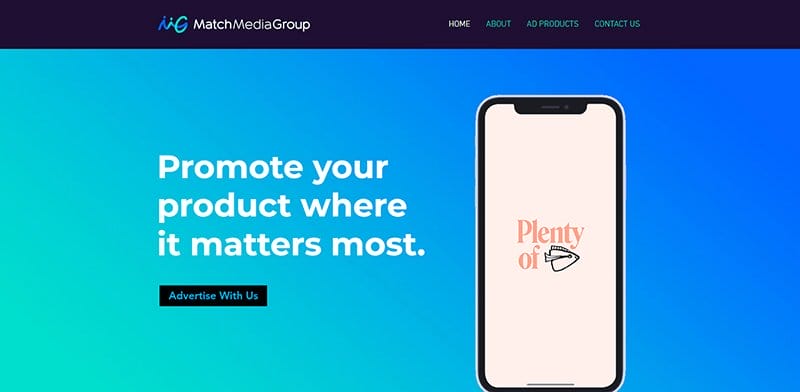
Match Media Group offers innovative advertising solutions that reach highly engaged audiences across industry-leading sites and apps, helping you reach your marketing objectives.
A professional-looking website example, the Match Media Group website is unique, displaying different shades of blue as the site’s predominant colors.
I love the bold display of the logo’s Bright Blue and Aqua Blue colors on the homepage, giving visitors a view of the classic blue color. The font types are unique, displayed in alternating font colors and maintaining the site’s centralized layout.
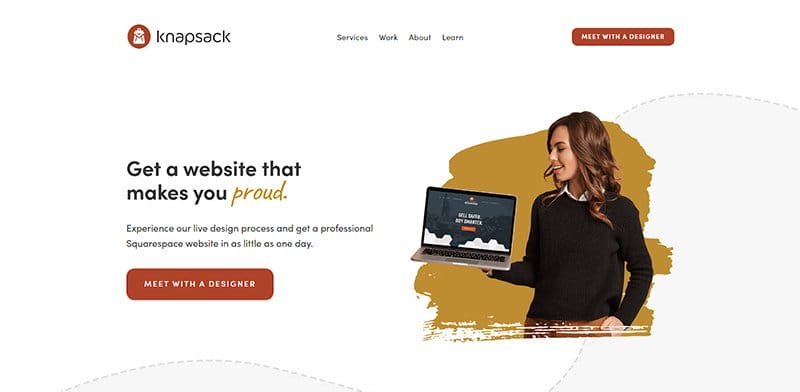
Knapsack Creative is dedicated to producing the greatest web design experience possible, focusing on premium Squarespace websites.
An excellent illustration of a well-organized web design, the Knapsack Creative website is visually appealing, displaying attractive colors on its plain white background.
The Knapsack Creative website uses dotted lines and a muted palette to help convey its message to visitors. Boldly displayed on the site’s homepage is the Pale Carmine color, visible as the background color for the site’s multiple CTA buttons.
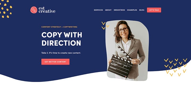
Emily is a freelance copywriter and content strategist who runs EST Creative, where she specializes in content planning and copywriting.
One of the best website color schemes, EST Creative has an eye-catching website design, with an attention-grabbing hero image of Emily taking center stage.
The bean-red hue of the EST Creative logo serves as the background for its CTA buttons, one of its standout website color schemes.
I love the display of prominent firms' logos endorsing EST Creative in White against a Cloud Burst backdrop, arranged so beautifully in a perfect palette.
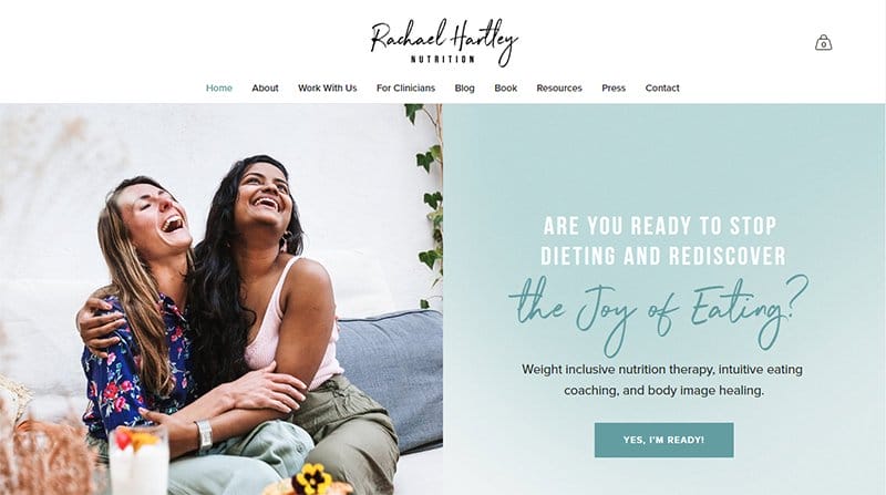
People can live a healthy and well-nourished life and mend their connection with food with the aid of Rachael Hartley Nutrition. This fitness and nutrition website has a basic style with calming colors to instill a sense of serenity in its users.
The high-quality images complement the site’s soft color wheel, with a website design that stands out as one of the inspiring website color schemes.
I love how the Rachael Hartley Nutrition website displays stylish font types, alternating between White, Black, and Hippie Blue as font colors.
Best Website Color Scheme FAQs
The best color combination for your own website color scheme depends on the image you want your website to pass across to visitors. Choosing an appealing and eye-catching color combination ensures users are visually engaged as they scroll through your site.
The 3 color rule is a unique sharing formula that instructs how color combinations are done for the maximum visual effect. This rule advises the choice of three colors, one serving as the main color, the other the secondary color, and the last as the accent color. The combination of these colors in different proportions is behind some of the most inspiring website color schemes.
The harmony rule is based on the general 3-color rules which instructs the use of three colors as color combinations for your website design. The harmony rule is more specific, with 60% of your total for your main color, 30% for your secondary color, and 10% for your accent color.
A color palette plays a significant role in attracting website visitors, pointing them to intended areas on the website. Your chosen color palette has the unique ability to captivate audiences. They can serve as a tool to highlight key information in the website’s design.
Color psychology in website design plays a vital role in influencing your target audience’s behavior. Colors have deeper meanings and can evoke strong emotions. Using the right color scheme helps increase conversions and drive sales.


