23 Best Dance Studio Web Design Ideas of 2025
There are 10,707 dance studios in the United States alone (IBISWorld). With so many dance studio businesses in operation, you must develop a robust online presence to gain visibility, stand out, and attract the desired patronage.
A simple yet reliable solution is creating well-developed websites that positively represent your business or personal brands.
Creating a professional and visually appealing dance studio website is essential to reach a larger audience and make it stand out from other brands.
However, building a top-notch dance studio website can be a challenging task. You can hire professional website designers, but the cost can be expensive.
A better alternative is to use the best website builders, like Squarespace and Wix, to build high-converting dance studio sites.
This article checks the 23 outstanding dance studio websites you can use as inspiration when building your own website.
Let's get started.
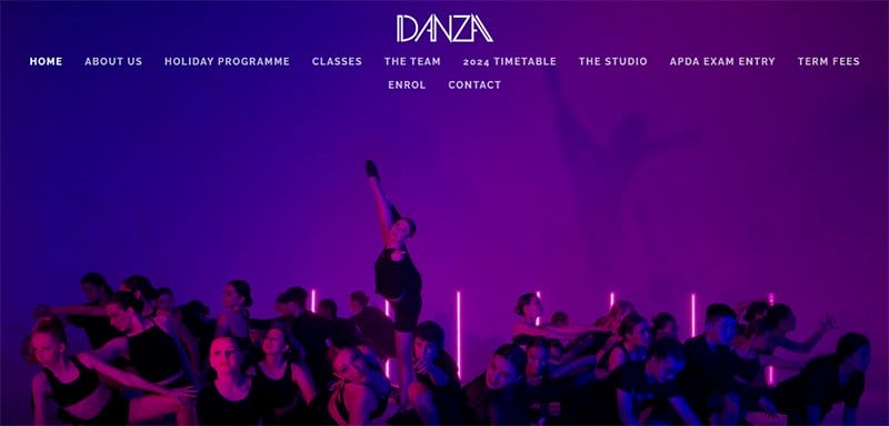
DANZA was established in 2018 and quickly became one of NZ's leading dance studios. This company’s purpose-built studio facilities have wooden sprung floors, heat pumps, and wall-to-wall mirrors suitable for all dance genres.
Welcoming visitors to this lively and energetic dance studio website is a high-quality image of various dancers having a great time expressing themselves.
Upon scrolling, you can check out previous dance videos and high-quality studio images at the base of the page.
The black background does a great job of ensuring that every relevant design element is visually appealing and engaging.
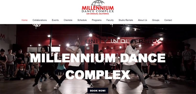
The Millennium Dance Complex is known worldwide as the premiere studio of the commercial dance world and ‘the place where it all happens.'
Welcoming visitors to this new website is an engaging video documentary of students' dance projects in the hero section of the page.
Interested visitors can use the Google Maps feature above the site's footer to find studio locations without sweat seamlessly.
The black-colored site footer houses every important information visitors need about the brand, such as contact details, email, and YouTube URL.
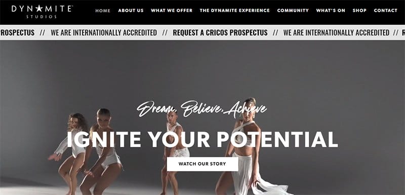
Dynamite Studios has provided a safe, supportive, and empowering environment that enables all to thrive.
The website’s designer understands how black and white backgrounds complement each other and applies this feature to make the page visually appealing.
I love how the motion graphic feature plays a vital role in giving the page a unique outlook and making it engaging.
The product section features multiple grid layouts with high-quality images and titles, displays different pages, and every schedule prospective students can opt-in.
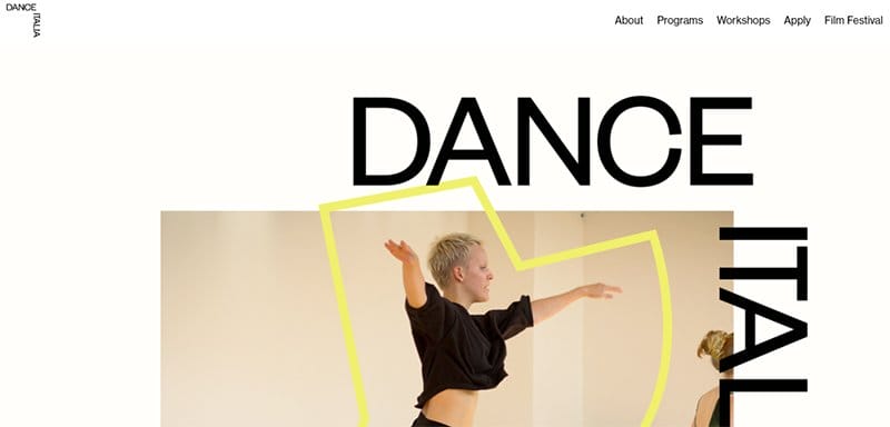
Dance Italia is a vibrant community of international students, performers, educators, and choreographers who regularly gather in Lucca, Italy, each summer.
I love how the parallax scrolling feature makes all the site's content appear cozy, featuring vital content like multiple high-quality images, a schedule page, and a blog section.
The Instagram section features engaging content in a grid format with a thumbnail feature, which gives visitors access to the brand's Instagram page. I love how the white background makes all the site's content visually appealing and fun to explore.
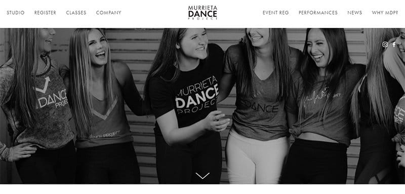
Murrieta Dance Project, one of California's best dance studios, offers services like dance classes, workshops, and special events to users for all classes and age levels.
The navigation bar on the Murrieta Dance Project website is straightforward to use. I like the organization of the menu items using clear labels.
The parallax scrolling feature gives this stunning dance studio website an elegant and sophisticated outlook.
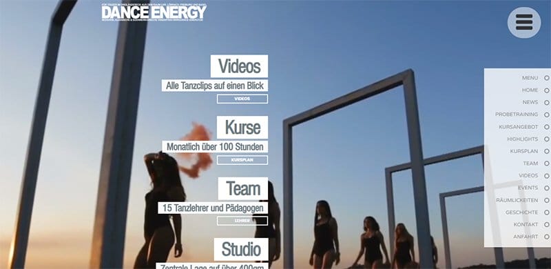
The Dance Energy Studio website uses a consistent color scheme of diverse shades of gray. I love how attractive the CTA button on the Dance Energy Studio website is in encouraging them to get more information or participate in the program.
You can use the hamburger navigation bar to explore various aspects of the page without breaking a sweat. The large and colorful button makes it easy for users to notice quickly.
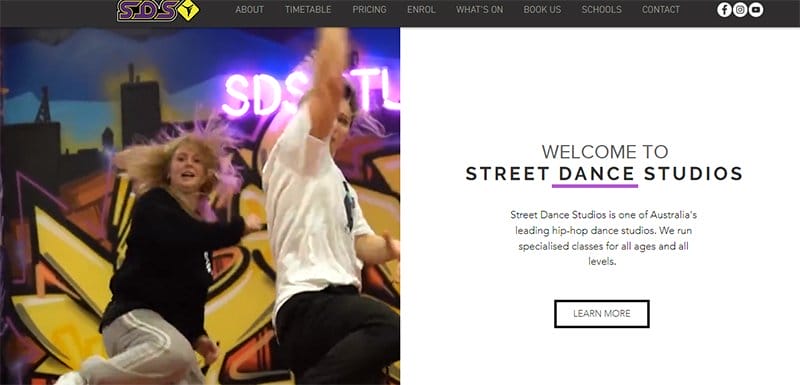
Street Dance Studios is one of Australia's leading hip-hop dance studios that focuses on training people across different ages and classes.
Welcoming visitors to the unique dance studio website is a split-page design layout featuring an engaging video that displays young people dancing and a short bio section.
Interested visitors and prospective students can help the brand increase its revenue by clicking the “Learn More CTA button with a hover feature.
Upon scrolling, you will love how the webpage features multiple high-quality dance-themed images, which gives the page a fun and energetic feel.
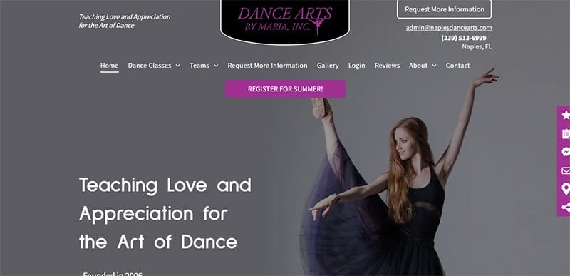
Dance Art by Mara site welcomes users with a clean, straightforward design, white background, and black text. These features make the website easy to read and navigate, creating a feeling of professionalism.
You cannot but love how this website's modern design stands out among other dance studio web designs and uses engaging content to attract more customers.
This dance studio website implores a grid-based page layout, with each section having a different color scheme, making it easy to distinguish between the various website sections.
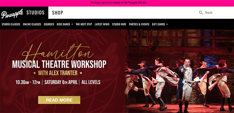
Pineapple Dance Studio's website uses bold and bright colors like pink, white, and black, which are eye-catching and memorable.
When you scroll down the site, you will see a video showing potential customers about the studio. Projecting the video is like a mini advertisement always playing in the background.
Interested visitors can use the various payment options on the black-colored site footer to pay for the dance classes.
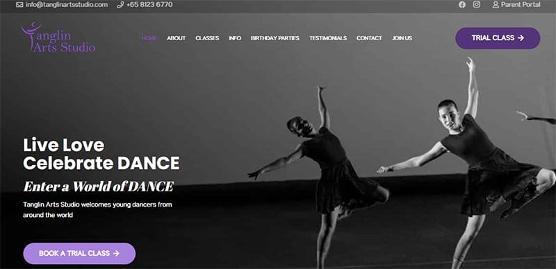
Tanglin Arts Studio offers a welcoming place for expats and students to make wonderful friends and grow their passion for music and dance.
Welcoming visitors and new students to this site is a full-width black and white image of dancers and a caption “Live Love Celebrate Dance.”
This unique dance studio website has a vibrant color scheme featuring different shades of purple in strategic and instrumental sections to grab prospective customers’ attention.
Interested visitors and parents of students can use the live chat feature to contact the student's officials for relevant information, such as class schedules.
I love how the pages feature colored and black-and-white high-quality pictures of professional dancers performing in various events.
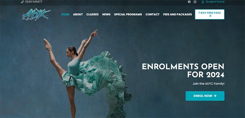
Australian Dance & Talent Centre is one of the leading performing arts institutions in the Hunter region; ADTC has been teaching young students since 1981.
The white-colored sticky navigation with a drop-down feature makes it easy for visitors to visit various aspects of the page and discuss more about the brand's expertise.
I love how the white background makes the colorful elements on the web page, like high-resolution images, appeal to online customers and increase website traffic.
Clicking the white-colored “Free Trial” CTA button with a hover feature grants visitors access to a free dance course.
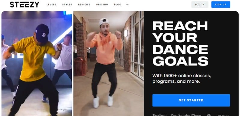
STEEZY Studio is an online dance studio with over 1,500 online classes designed to integrate interested individuals into the dance culture.
The first catchy element you will see on arrival is multiple short videos in a fluid grid format, an effective marketing tool for the brand.
Interested visitors can click the light blue colored “Get Started” CTA button on the right side of the page to access application forms.
Upon scrolling, you will find that the page features various solutions to help prospective dancers develop their skills and reach their goals. Some solutions include an online tutorial section, a dance blog page, and support communications, which allow them to connect with others.
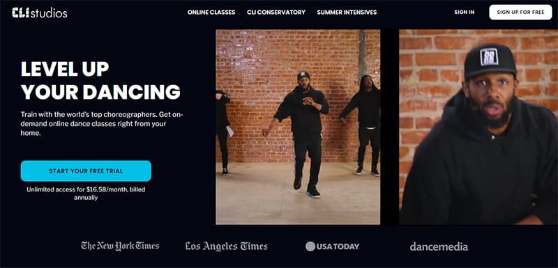
CLI Studios is a famous dance studio that offers various trade instruction and years of experience in the craft.
The testimonial section features heartwarming client reviews in a slider format displaying high-quality images of teachers and students, which is a source of credibility.
CLI Studios’ website exudes a top-notch and classy feel based on the designer's choice of a sleek black aesthetic. The black background integrates smoothly with every site content, giving the page a sleek and engaging outlook.
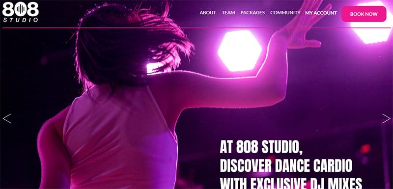
808 Studio stands out from other dance schools because it provides students a fun, liberating, and inclusive way to achieve fitness goals that make them feel good.
Welcoming visitors to this unique dance studio website are high-quality images of different dance sections in a slider format to give the page an engaging outlook.
Interested visitors can use the deep pink-colored “Book Now” CTA button on the white-colored sticky navigation bar to take advantage of the studio's offerings.
This best studio website has a minimalist and modern layout with engaging text, quality images, descriptive icons, and multiple CTA buttons.
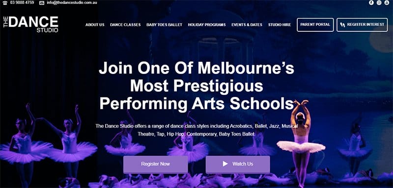
After its establishment by Ms. Susan Sargison in 1991, the Dance Studio has taught thousands of students in the Boroondara area for over 25 years.
I love the strategic display of numerous ballet-based photographs, which significantly enhanced the entertainment value of each page.
Clicking on any social media icons on the webpage grants visitors and potential customers access to the brand's online page for further exploration.
The back-to-the-top button at the site's base allows visitors to seamlessly move across the page without sweat and make necessary decisions instantly.
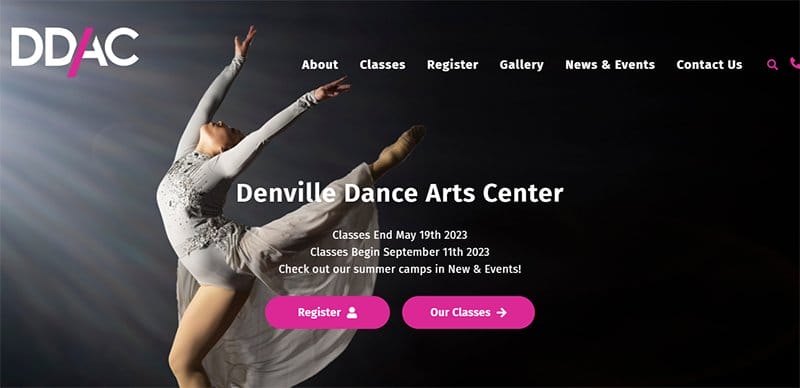
Denville Dance Arts Center offers informative and transformational dance classes designed to make its students some of the best dancers in the world.
The first catchy element that will grab visitors' attention on arrival is a stunning image of a lady displaying a dance pose and class schedules at the center of the hero section.
Visitors and new students can use the search function on the white-colored sticky navigation to seamlessly scan through the webpage and locate various items.
I love how the section uses engaging texts and a slider feature to display various classes, giving the brand a sense of professionalism.
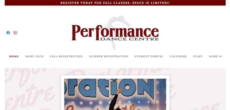
Performance Dance Centre has a vision to provide all students with top-quality acro and dance instruction.
Welcoming visitors and potential students to this fantastic dance studio website is a high-resolution image displaying a lady dancing at the center of the hero section.
I love how the white background makes all the colorful elements on the web page, such as high-resolution images, appeal to online customers and increase website traffic.
The sticky navigation bar with a drop-down feature is vital in allowing visitors to seamlessly explore various aspects of the website.
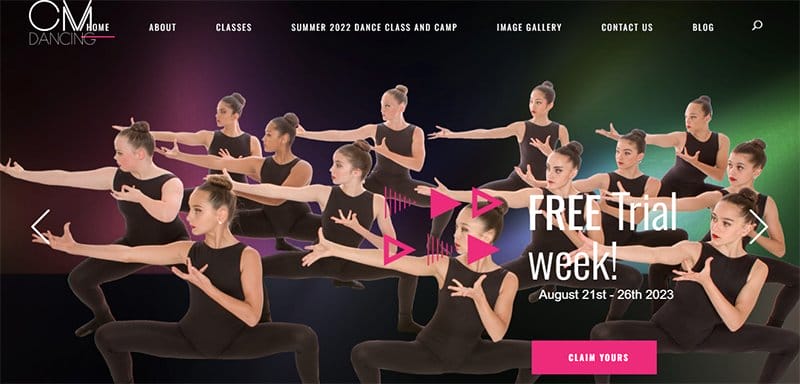
CM Dancing was established in 2005 and offers dance lessons for children ages 2 to 17 years across the city of Hamilton. This unique dance website uses a soft pastel pink as its website color, creating a feeling of joy and compassion.
I love applying a large banner image at the top of the page featuring a group of dancers having fun in a class. The image perfectly represents what the studio is all about and is a great way to draw in new.
This website’s navigation bar has clearly labeled sections, making finding the information you seek easy.
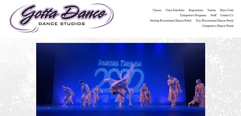
Gotta Dance Studio has a black-and-white color scheme, which creates a classy and professional aesthetic. One of the first things that stands out on Gotta Dance Studio's website is the large, high-quality images of dancers.
The Gotta Dance Studio website features beautiful images of people dancing in slideshows, giving a sense of the studio's energy and passion.
I love the video projection on the side because it is captivating and contains snippets of some dance moves, giving users an idea of what to expect.
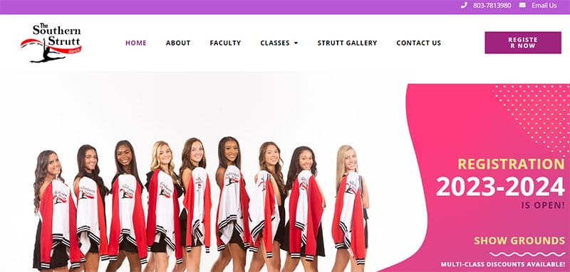
Southern Strutt was established in 1982 by Nancy Giles, a popular dancer, to bring excellence in dance instruction and performance to the Midlands.
This beautiful dance studio has a clean design layout, making it easy to navigate and appreciate its unique and attention-grabbing content.
One of the most impressive features of the Southern Strutt Dance Studio website is the testimonials page. This page is full of positive reviews from past and current students and their parents, giving potential customers a peek at what to expect from the studio.
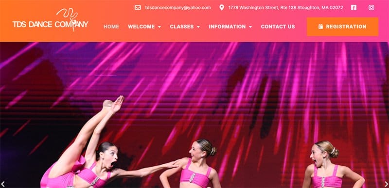
TDS Dance Company welcomes all students and feels that each dancer can find the proper fit within our studio.
This dance studio website features a search function that encourages visitors to type in a search term to identify vital details. Your search results are organized into categories, and you can filter them by category, making it easy to find the information you seek.
The TDS Dance Company website does an excellent job of incorporating videos. The videos on the homepage and other pages are set to autoplay, giving the website constant movement and energy.
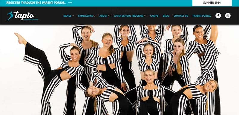
Tapio School of Dance &Gymnastics is a family-owned and operated small business serving East of the Cooper since 1956.
This dance studio is committed to customer service and creating a warm, positive, and pleasant learning experience for children in our community.
I love how Tapio School of Dance and Gymnastics moves away from using most dance studios' average color scheme. The page features blue as the primary color on the website, which is a classic choice for a dance studio.
Tapio School of Dance &Gymnastics uses a well-organized page layout that makes it easy for users to understand. I love how the page is divided into sections with clear headings and subheadings.
The main image at the top of the homepage, featuring a dancer in mid-air, is very captivating and represents the website's content.
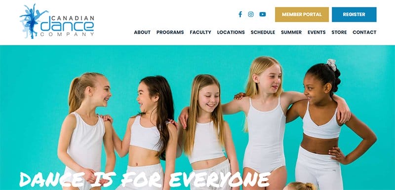
Canadian Dance Company is a top-notch dance website with trained and certified instructors displaying a wealth of experience teaching and performing various styles and disciplines. I like the use of a carousel on the site that appeals to viewers.
I love how the testimonial section displays heartwarming content from satisfied and happy customers at the Canadian Dance Company.
Potential customers can access this Dance Studio newsletter by entering their email addresses into the sign-up form, and they are automatically added to the newsletter list.
Dance Studio Websites FAQ
Choose a website builder like Squarespace and Wix, create an easy-to-remember URL, add contact forms, use an aesthetically pleasing design, add informative blog content, make good use of multimedia, add links to social media, offer easy online registration, post a calendar, list of events, and class schedules, and About Us and contact page.
Yes, dance studios can be very profitable businesses. You can make money with a dance studio if you have a passion for dance and a business knack. With the right strategy and management, dance studios can be profitable businesses providing valuable services to the community.
Various factors influence the size of a dance studio, including the dance style and the number of people using the space. The minimum size for a dance studio is 20 feet by 20 feet (6 meters x 6 meters) to accommodate small group classes or private lessons.
A color scheme involving bright, vibrant colors like red, yellow, and orange can attract attention. Including bright and flashy colors will go a long way in getting visitors' attention, but it can be distracting. You must combine colorful and dark shades to ensure visitors are not distracted by the multiple flashy elements.
Explore Further
- Dance Studio Business Name Ideas Generator
- Dance Website Templates
- Dancer Websites
- Best Website Builders for Musicians and Bands
- Music & Musician Websites
- Music Website Templates
- Music Business Name Ideas Generator
- Music Blog Name Ideas Generator
- Record Label Website Templates
- Record Label Name Ideas Generator