13 Examples of Fixed Position Navigation in Web Design
Do you want to enhance user experience on your site? Are you considering website builders like Wix and Squarespace or contemplating custom design for your next project?
Navigating through the vast landscape of web design, fixed position navigation emerges as an element for seamless user interaction.
Whether you are a novice exploring website builders or an experienced coder, discover inspiring examples showcasing the versatility and impact of fixed-position navigation.
Let’s get started.

Embark on a visually captivating online journey with the fixed position navigation of DKNG. As users start scrolling through this website, a chic black background sets the stage, providing an elegant canvas for each content.
I love how DKNG's page features several examples of fixed-position navigation. You cannot miss how the logos of illustrious clients seamlessly blend with sharp pictures, creating a visually compelling narrative and helping boost credibility.

Jonathan Dacosta's page serves as an inspiring example of fixed-position navigation. The hamburger menu, consistently in the same position, elegantly opens pathways to navigate through projects.
Hovering over images triggers animations that display project titles, showcasing innovative use of design elements.
Dacosta skillfully built his page with simple yet attractive fonts strategically placed on the left side for easy readability. The white space complements the overall aesthetic, making each visit to a new page a visually delightful experience.

In this web design example, the fixed position navigation makes every scroll matter for users. I love how the sticky menu bar remains fixed as you scroll through the page.
The hero section boldly showcases their product, creating an immediate visual impact. You can miss the display of the word “squid,” cleverly serving as the home and refresh button, offering a unique touch.
The hamburger menu button simplifies navigation, and a strategically placed call-to-action link invites users to “visit squid go.”
With a sleek black menu bar and a contrasting white and Rich Electric Blue background, this site creates an engaging user experience.

Glia's web design offers an inspiring layout for visitors, featuring fixed position navigation menu bars that enhance user experience. This visually appealing website uses a blue-violet color scheme to create a cohesive and visually appealing design.
The header includes a strategically placed call-to-action button, inviting users to “see it in action” and explore the platform's capabilities seamlessly.
Intuitive drop-down menus simplify navigation, allowing visitors to explore different pages and sections without feeling overwhelmed by a complicated layout.
Glia's web design serves as a compelling example of how well-crafted fixed-position navigation can guide users through the site.

Elaina's web design creates a seamless browsing experience with fixed position navigation that remains a reliable element on the screen.
With a sticky menu bar, visitors can easily navigate the site while scrolling. The web design incorporates a calming White and Linen background, providing a clean canvas for information.
Elaina's brand has Fire Bush color call-to-action buttons strategically placed for optimal engagement.
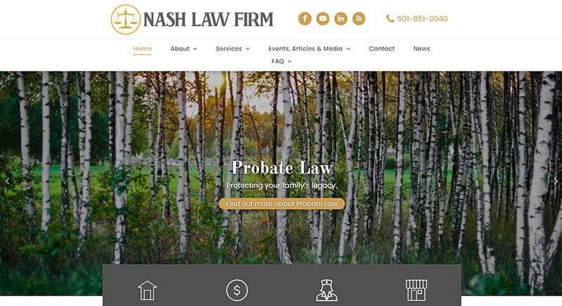
Nash Law Firm's web design offers a distinctive fixed position navigation, combining functionality and aesthetics. A Vampire Grey rectangle with icons elegantly presents the diverse legal services offered.
The fixed position navigation feature on this website is its sticky menu bar. I love how the desktop and mobile-friendly layout features a captivating carousel of nature and sunset images, providing a visually appealing backdrop.
Nash Law Firm's design showcases the law services they provide. This firm prioritizes user engagement through visually striking templates, images, and intuitive functions on both desktop and mobile platforms.

Maveron’s web design exemplifies the essence of consumer brand-building. With a clean White and Bright Blue background, the website delivers a fresh and modern visual experience.
At the top, a catchy video captures attention, offering a dynamic introduction. The fixed position navigation steals the spotlight, cleverly showcasing past brands in a calendar format.
I love the use of a fixed menu bar to ensure seamless exploration, underscoring the significance of a fixed header in contemporary web design.
This example serves as a testament to the effectiveness of fixed navigation menus, providing a user-friendly and visually engaging experience on the web.
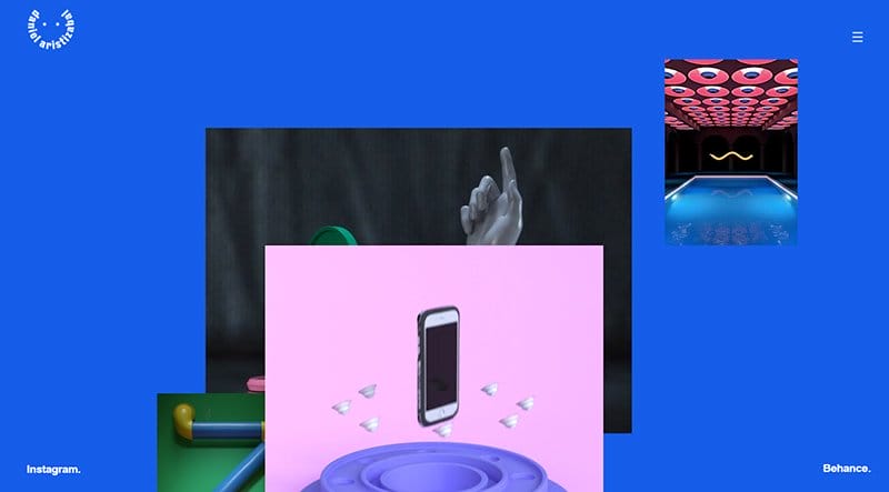
Against an Azul-colored background, the design incorporates Daniel Aristizábal's name as both the home page and a refreshing element, providing a unique touch.
The hamburger menu, home and refresh element, and social media links remain in one position while you scroll through the page.
Engaging animations coded with HTML and CSS dynamically showcase his work in arts, fashion, and entertainment.
As visitors scroll down on project pages, the coded transitions create a slideshow effect. This web design emphasizes the importance of coding to determine and maintain interactive elements across every browser.

Conqr’s website design captures attention with captivating animations at the start, setting a dynamic tone. As a visitor scrolls, a fixed position navigation is visible when the text seamlessly moves. A picture slideshow unfolds, creating an engaging browsing experience.
Against a sleek black background, white text stands out, enhancing readability. The hamburger menu provides easy navigation and access to different sections.
This thoughtful design approach showcases a commitment to user-friendly interfaces, emphasizing how web development can incorporate forms, links, and dynamic scrolling to enhance the overall browsing experience.

BATHHOUSE website's fixed position navigation employs a sleek black background designed for impact. Crystal clear pictures take center stage, creating a visually stunning experience.
A fixed position sticky menu bar ensures seamless navigation, offering users easy access to various sections.
You cannot miss the social media icons that link to the company's online contact, adding a sense of connectivity. A strategic call-to-action link on the menu bar invites users to Book Now, making a difference in user engagement.
The center-focused design elements, with social media icons and a prominent call-to-action, create a sense of purpose and direction, guiding users effectively through the website.
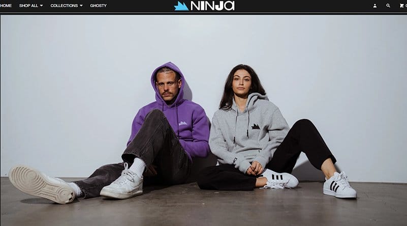
Team Ninja's eCommerce features a sticky menu bar, ensuring smooth browsing across browsers. Icons used for searching the online shop create a seamless sidebar for easy access to essential features.
The clean presentation of clothing merchandise includes an engaging feature where pictures transition to models wearing the items upon mouse hover, employing visually appealing patterns.
This eCommerce website excels in user engagement with strategically placed links and a dynamic video feature showcasing the latest fashion trends.
Whether users browse through products or interact with the mobile app, the design employs tutorials, making the shopping journey intuitive and enjoyable.

Garrett Ramos' web design exemplifies the effectiveness of fixed-position navigation. A compelling call-to-action button invites visitors to “work with me,” creating a direct and engaging path for potential clients.
This portfolio website stands as an excellent example of fixed layouts. A fixed CTA button used on the website enhances user interaction with pictures.
The intentional design, including a sticky call-to-action button and the strategic use of words for navigation, reflects a thoughtful approach to creating user-friendly web layouts.

Lamb Creative Group's web design is an inspiring example of fixed elements in web design ledger, showcasing their prowess as an award-winning Marketing and PR agency.
With a vibrant palette of multiple colors, this design exemplifies how to build pages that are visually engaging and professional.
A prominent fixed yellow lamb logo adds a distinctive touch. This distinctive logo does not move while scrolling. Icons proudly display companies they have collaborated with, reinforcing its credibility.
Including a form featuring fields for name, email, and messages makes this web design a good example of inspiring design elements.
Fixed Website Examples FAQs
Create fixed navigation menus on your site for a seamless user experience by using Wix, Squarespace, or Webflow. Implementing fixed layouts ensures your menu stays visible as users scroll, enhancing accessibility. Check out inspiring examples of fixed navigation menus for creative layouts that prioritize user-friendly navigation.
A fixed header is a website design element that remains visible at the top of the page while users scroll.
Fixed width websites maintain a consistent layout, ideal for precise design control. Fluid width sites adjust dynamically, providing optimal viewing across devices.
Fixed width websites have a set, unchanging layout, offering precise design control. While full-width websites extend edge to edge, adapting to varying screen sizes for a more immersive experience. The key difference lies in layout flexibility – fixed for precision and full width for dynamic responsiveness.
Explore Further
- The Anatomy of a Web Page
- Best Small Business Software & Free Tools
- Best eCommerce Website Design Examples
- How to Create a Website
- How to Design a Website
- How to Host a Website
- How to Start a Profitable Online Store
- What Is An eCommerce Website?
- Best Website Builder Software
- Easiest Website Builders for Beginners