20 Best Glassmorphism Websites of 2025
Are you thinking of how to increase the number of returning visitors and generate more leads through your website? What you need is a website makeover or redesign.
Make your website visually appealing and worthwhile for visitors to explore its contents to ensure they spend more time at it and are willing to return. Using a Glassmorphism design layout is your one-way ticket to getting all your website-related results.
The best website builders like Squarespace and Wix offer beautiful templates you can use to create a state-of-the-art Glassmorphism design layout.
This article explores the 20 best Glassmorphism website examples you can use for inspiration when building yours to give visitors a pleasant user experience.
Let’s get started.
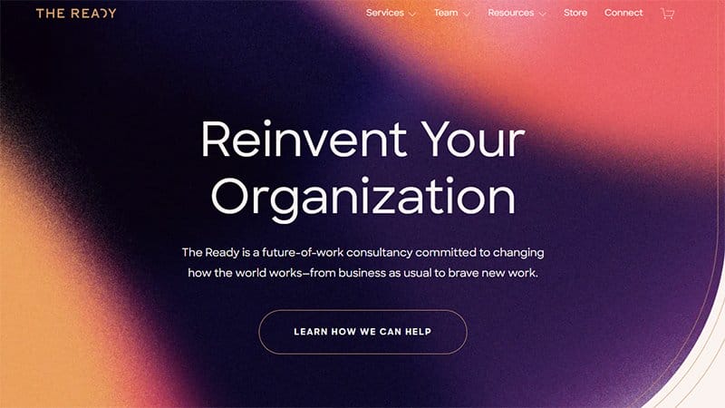
The Ready is an amazing consultancy dedicated to changing the normal way business works. I like how the mix of the colors pink and dark violet in the site’s hero section makes the background blur.
As you scroll, you will see the ‘Our Clients’ segment that displays several logos of the reputable brands they work with for social proof and credibility.
This stylish website uses a single column to display images with a thumbnail and zoom-in effect of happy people in the ‘’Want to learn more?’ segment.
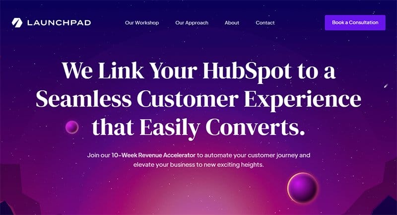
Launchpad Consulting specializes in helping businesses regardless of their sizes manage their tech stack and tackle customer experience obstacles.
I love the transparent navigation bar at the top of the page that contains a purple ‘Book a Demo’ CTA button for interested visitors.
There are lovely floating animated images of the planets and stars giving this website a fun and exciting look. There is a purple ‘See our approach’ CTA button at the center of the page as you scroll further.
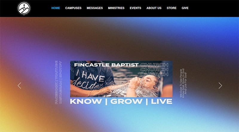
Fincastle Baptist Church was created in Fincastle, Virginia in the year 1831. A high-quality image of a woman getting baptized displayed in a slideshow welcomes visitors to the site, reminding them of the church’s aim.
I love how the ‘Get Connected segment’ displays images with a thumbnail feature of beautiful believers for visitors to choose their preferred group.
The gray-colored footer contains relevant information like their address, the time for their services, their emails, and their emails.
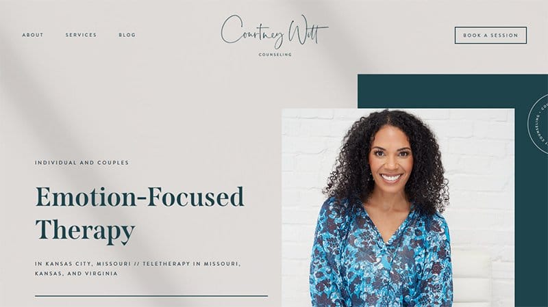
Courtney Witt Counseling is a brand that focuses on helping independent people build emotional resilience and have healthy but deeper relationships.
You’ll notice how this beautiful website welcomes visitors with a high-quality image of the beautiful founder and therapist at the left side of the hero section. Just beside it on the right side is a transparent ‘Get Started’ CTA for interested customers.
The gray-coloured footer contains her phone number, email, address, and a transparent “Client Portal” CTA button at the right side of the footer.
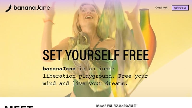
Banana Jane is an educated psychotherapist who specializes in bringing creativity and empowerment to mental health. I like the bold display of the brand's name including the image of a black but shiny banana in the site’s hero section.
At the bottom of the page, you will see an Email-Required subscription field for visitors interested in joining the mailing list. You will find images of their social media handles on the left side for visitors who want to know more about the brand.
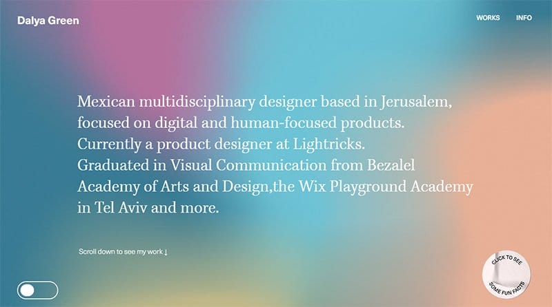
Dayala Green is a multi-talented UIUX designer who specializes in UX and human-centered design that stands out from the world's regular design. One fascinating thing about this website is the multi-colored gradient background in the hero section.
The white clickable ” Click Here To See Fun Fact” circular widget at the lower left side of the page makes the exploration process quite exciting. At the bottom of the page is another pink circular clickable ” back to top” widget that is rotating.
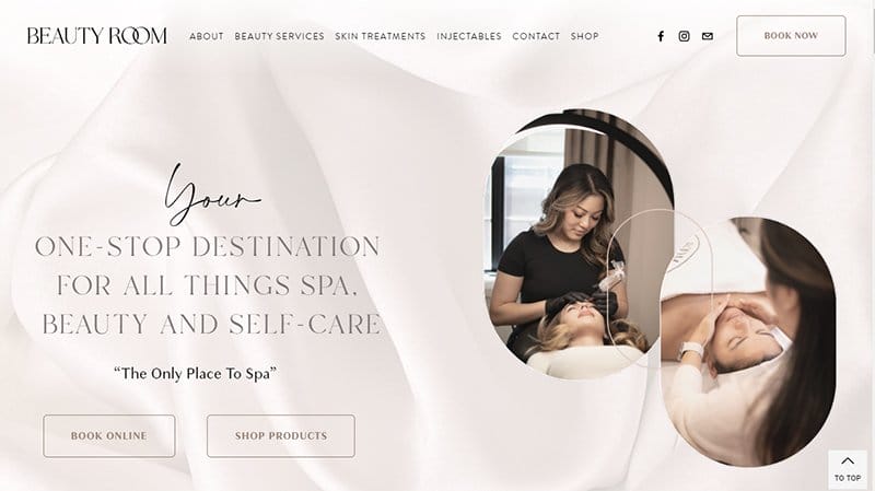
Beauty Room is a beauty spa located in Toronto that specializes in services like relaxing facials and lash lifts. This elegant website uses a soft color palette to give the site a calm and refreshing feel.
I like how this spa website uses a two-column grid layout to display high-quality images with a thumbnail effect in the ‘Our Services ‘ segment.
At the bottom of the page, there is a slideshow of amazing reviews given by previous customers about the top-notch services of the spa.
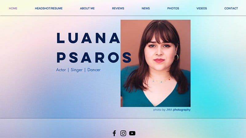
Luana Psaros is a multitalented actor and singer currently based in the UK. I love the overall gradient aqua-blue color of the site.
Unlike other Glassmorphism website examples themes, this lovely website uses a minimalistic colorful design theme to make the website less sophisticated for visitors.
This website welcomes visitors into the site with a high-quality image of the founder, Luana Psarose in the hero section. I like the gradient-colored navigation menu containing links to other pages of the site for seamless exploration.
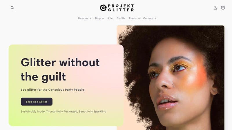
Projekt Glitter was founded by Jeen, a talented lady who has been spreading sparkle for years.
In the hero section, you will notice the eye-catching high-quality image of a lady with glitter on her eyes on the left side. On the other side is the amazing quote of the brand and a dark-colored ‘Shop Eco Glitter’ CTA button.
I love the display of logos of several reputable brands that Projekt Glitter works with just below the hero section for credibility and social proof. There’s a peach-coloured CTA button below it for interested customers.
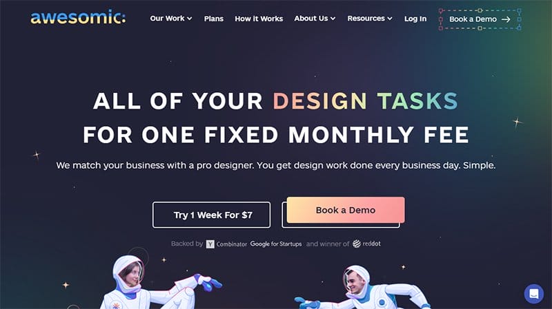
Awesomic is a unique company that created an algorithm to help match businesses with their perfect designers.
Unlike most Glassmorphism website examples, this UI design uses a consistent background gradient color of navy blue, making the web page more attractive to visitors.
I like how this website design uses a transparent navigation bar containing links to every page to ensure visitors can browse through seamlessly. As you scroll, you will notice how this website design uses a two-column layout to showcase high-quality images of its best designers.
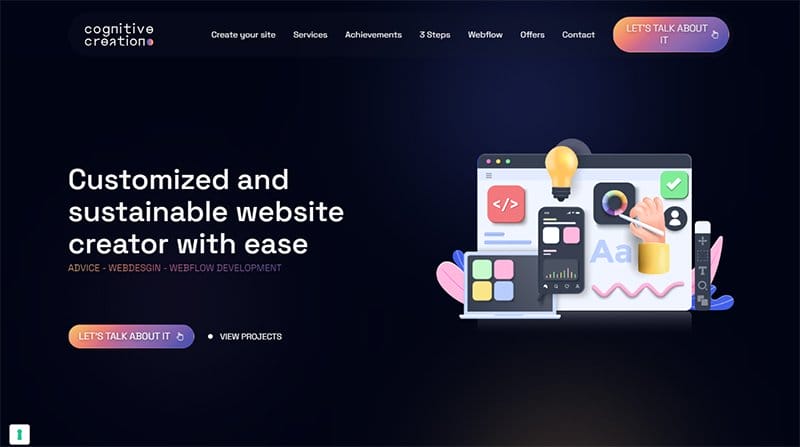
Cognitive Creation is an innovative brand that helps various businesses create or redesign their websites to enhance their image.
This classy website has a black sticky navigation bar with a Royal Blue CTA button for visitors who want to build a website. The navigation bar contains links to other pages so visitors can check and browse the site’s content.
I love the use of a dark-colored background and a Glassmorphism design style to make this site more engaging, attractive, and fun for visitors.
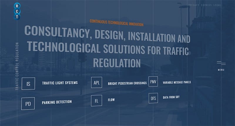
Regolazione Controllo Traffico company was created in 1974 and specializes in creating traffic light systems. I love how this website uses a glass design concept with an image of a city in the background to display links to other pages.
You will notice the multiple white vertical lines that run from the top to the bottom of the site. I love the fun swirly movement of the writings and the hover effect color (brown) of the several CTA buttons.
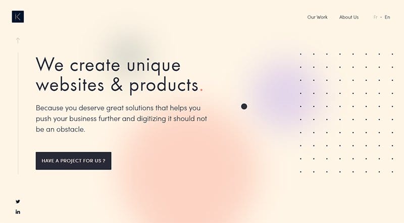
HEKA Design is a unique brand that creates solutions and helps push businesses further by digitizing it
I like the use of a small dark-colored circle instead of a regular arrow cursor to navigate the site. On the right side and bottom of the web page, you will find links to the site’s social media account to view their posts.
Unlike most Glassmorphism websites that use templates, this unique website uses a single column to showcase pictures with a thumbnail effect.
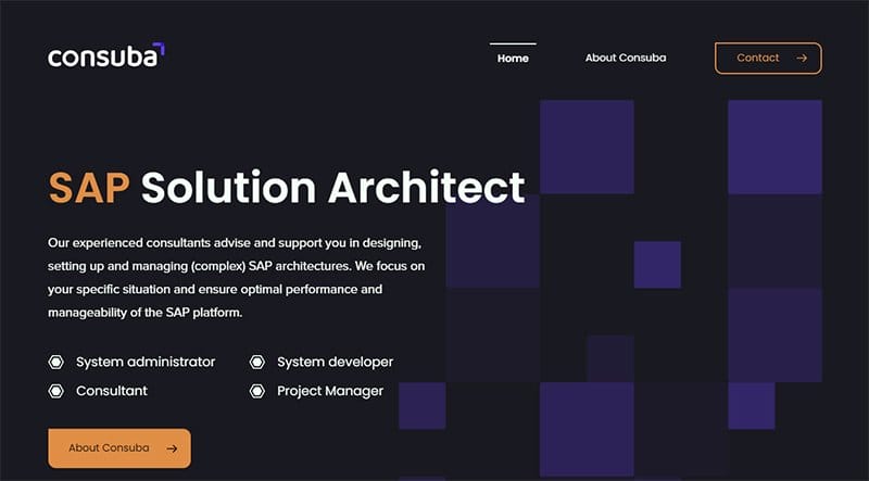
Consuba is a consultancy with expert consultants who advise customers in designing and managing sophisticated SAP architectures.
This dark-themed site uses a dark-colored background and a transparent navigation menu containing a transparent ‘Contact’ CTA button with a brown border. You’ll find a brown-colored ‘About Consuba’ CTA button in the lower left corner of this site's hero section.
I love how this website uses a frosted glass design style to describe their working methods and the steps involved in the process.
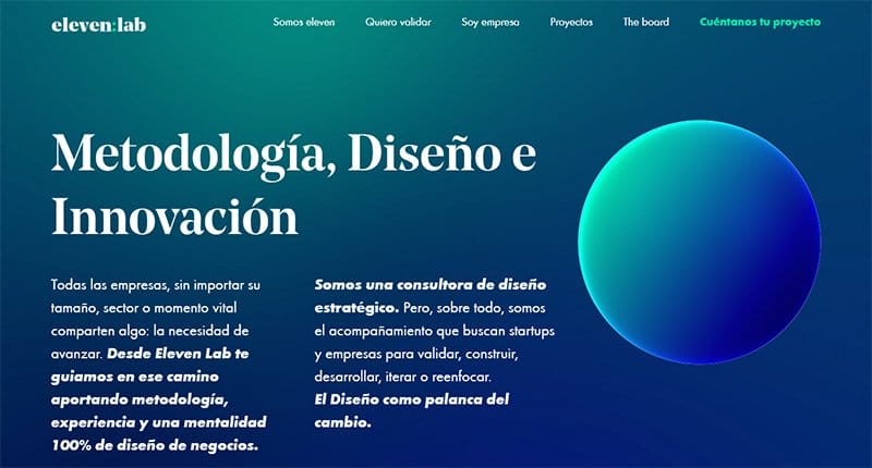
Eleven Lab is a strategic design agency that can offer businesses experience and a successful business design mentality.
I love how the blue gradient color of this site’s background and how it uses bold stylish fonts to describe what makes them stand out. Just beside this write-up is the image of a blue gradient-colored globe.
As you scroll, you will notice how this site displays images of objects like colored cones and cubes, making it easy for visitors to engage.

Daisy Camp is a trustworthy establishment with resources and a primary goal of helping women live a successful fulfilling life while going through a divorce. This simple website has a white sticky navigation bar with links to other pages of the site for easy exploration.
I love how this website displays lovely testimonials on a purple background with a transparent ‘Read more’ button at the bottom. Just beside the testimonials segment is a “Donate Now” segment with options for visitors to choose how much they're willing to donate.
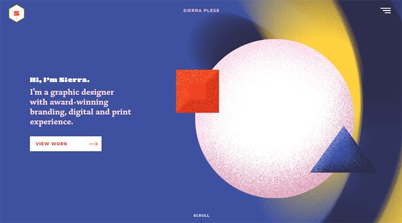
Sierra Please is a skilled designer who solely focuses on graphic design. She is very knowledgeable in branding and print design.
At the left side of the hero section, there is a colorful moving image of shapes which includes a circle, a square, and a triangle. There’s a white ‘View Work’ CTA button at the lower right side for interested victors that’ll like to explore.
This minimalistic website design has a purple-colored footer with its email and social media handles in the left corner.
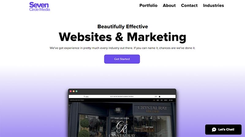
Seven Circle Media is a marketing agency that believes in building strong relationships with its clients while helping make their products trend.
You will notice the lovely alternating images displayed on the interface of a computer in the hero section. As you scroll, you will find several ‘Learn More’ segments with various high-quality images displayed on the side and a catchy write-up on either side.
I honestly love how the black-coloured ‘Let’s chat’ widget sticks to the lower left corner of the homepage making it easily accessible.
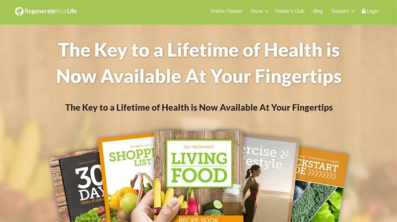
Regenerate Your Life is owned by Dan, a certified detoxification specialist with about fifteen years of experience. Just below the hero section is a lovely five-minute and twenty-second video of a white man describing the product to interested customers.
The following segment displays a high-quality image of the founder on the left and persuasive content about the product and its uniqueness.
As you scroll, you notice how this website strategically displays the product’s guide and a high-quality image of the goods beside it.

Cabana Atelier is a successful brand that offers unique services like renovation, design, and furniture restyling. This minimalist website features an eye-grabbing image of white chairs floating on a white background.
I love that the webpage uses a unique design template to display stunning high-quality images in each segment as you scroll. What’s handy about this clean website example is the use of soft and bright colors like White and Gray to give the site a refreshing look.
Best Glassmorphism Website Examples FAQs
Some common characteristics of Glassmorphism that make it stand out from other designs are translucency (like frosted glass using a background blur), vivid colors, a multi-layered approach, a subtle, light border around the Glassmorphic object, stylish and gradient designs, and objects floating in space.
The best Glassmorphism website builders include Wix and Squarespace. The website builders are loaded with state-of-the-art Glassmorphism design templates that make the website building process seamless. With these website builders, you are sure to end up with a website that will appear stunning on desktops and mobile apps.
The application of Glassmorphism in web design has tons of benefits leading to its high demand. Using Glassmorphism helps to create a sense of transparency by imitating a virtual glass and the resulting background blur effect. Glassmorphism helps to enhance visual hierarchy which in turn makes the exploration process seamless and visually appealing.


