30 Best Microsite Examples of 2025
Does the term “microsite” sound unfamiliar? You are not alone. While virtually everyone knows what a website is, a microsite doesn’t enjoy the same popularity. A microsite is an independent website separate from your main website that focuses on a single campaign.
Savvy marketers use microsites to avoid overcrowding their primary sites with many pages, better search engine optimization (SEO), and a higher ranking on search engines.
Launching a microsite is easy, designing an eye-catching microsite that actually converts is where the work lies. Luckily, use the best website builders like Squarespace and Wix that come with visually appalling templates and powerful tools to build your perfect microsite,
This article covers the 30 best microsite examples you can use as design inspiration to build your own microsite.
Let’s get started.
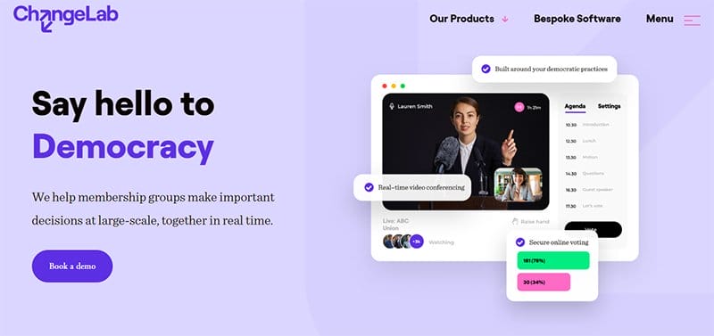
Democracy is a secure video and voting platform that helps membership groups make important decisions at a large scale, together in real time.
I love the display of the logos of industry leaders who trust the brand in a moving slideshow on a Pale Lavender background, serving as social proof. The Pale Lavender color is visible on the site’s homepage, adding color to the plain web design.
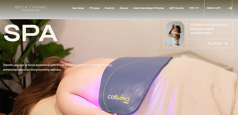
Brick Canvas helps users discover wellness by elevating their spa or facial experience with the invigorating benefits of infrared therapy. One of the engaging microsite examples, the Brick Canvas Spa microsite is a copy of the primary website.
Welcoming visitors to the Spa site is a similar soft color scheme that provides visitors with a cool and soothing atmosphere. Visible and pinned to the right-hand side of the homepage is a revolving text chat feature, that serves as the site’s online communication channel.
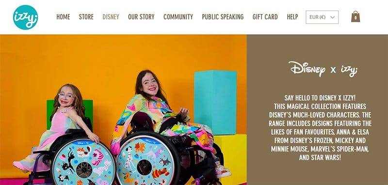
Disney x Izzy is a magical collaboration between two creative brands, featuring a magical collection of Disney’s much-loved characters. One of the top microsite examples, the Disney x Izzy microsite is accessible from the Izzy main website header menu.
I love the display of colorful images of the brand’s products on the site’s homepage in a centralized three-column layout. Visible are plenty of white spaces from the homepage’s plain white background, a huge part of the site’s lead generation strategy.
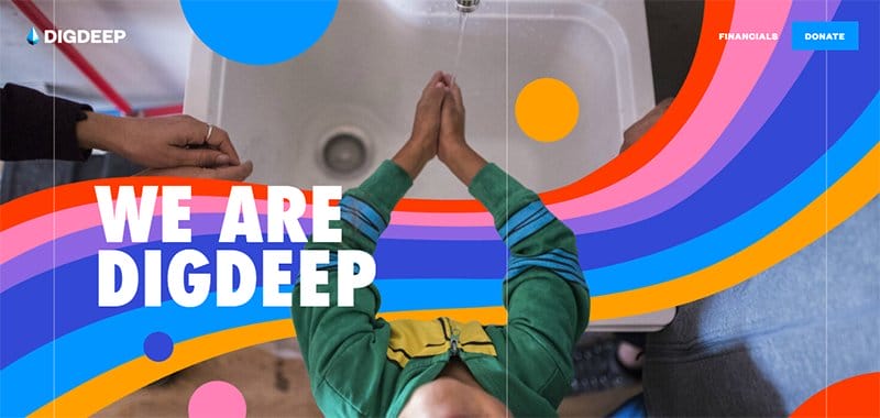
DIGDEEP works to close the water gap for every American, providing them with their fundamental human right to clean and running water. This creative microsite example tracks the progress made by the organization in delivering on its mandate.
The entire Annual Report 2020 DIGDEEP microsite is visually appealing, treating visitors to a consistent display of bold colors in an interactive manner.
Consistent on the site’s homepage are its reports and news, sticking to a three-column display, in between boldly colored backgrounds.
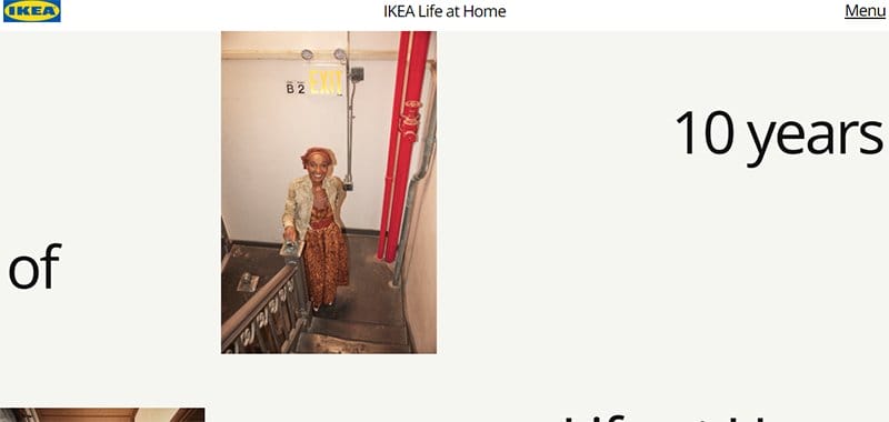
IKEA’s Life at Home is a microsite designed to celebrate a decade of research, insights, and discovery. One of the best microsite examples, the Life at Home microsite is minimalistic with a creative blend of unique design elements.
I love the display of bold typography on the microsite, engaging visitors and screen readers as they scroll through. Adding a unique touch to the web design are thin lines, distinguishing between different sections on the site.

To the Third Dimension offers free abstract, 4k, and web-optimized 3D elements for designers and founders. One of the visually appealing microsite examples, the To the Third Dimension microsite is unique, sticking to a centralized layout for its web design.
The homepage’s plain white background serves as a canvas, displaying eye-catching free 3D elements interactively. An extensive FAQ section is accessible from the site’s footer section, one of the three centralized information sections.
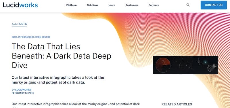
The Data That Lies Beneath is a dark data deep dive by Lucidworks, taking a look at the murky origins and potential of dark data. This top microsite example is the official open-source blog site of Lucidworks on dark data.
The parent logo color is a key element of the microsite’s design, standing out as the background color for the site’s multiple call-to-action buttons. I love the display of excerpts from the blog page on the site’s homepage, each linked directly to the full website publication.
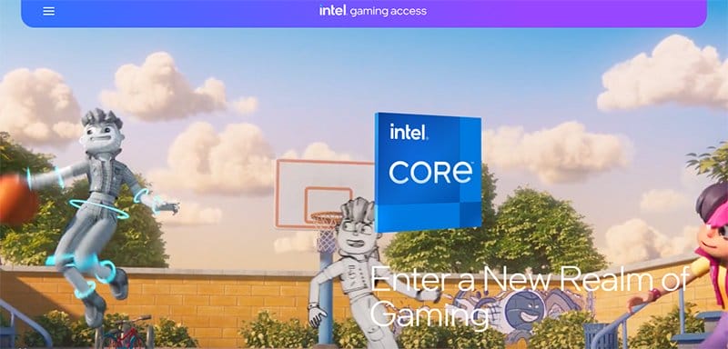
Intel Gaming Access is the gaming platform of Intel Core, one of the top technology platforms in the world. One of the best examples of a visually appealing microsite, the Intel Gaming Access microsite is unique with its interactive web design.
Welcoming visitors is a full-width video in the hero section, displaying a compilation of different games the brand has created as part of its marketing campaign.
The background images displayed on the site are engaging, focusing visitors' attention on the interactive elements.
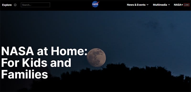
NASA at Home is a site created for kids and families to enlighten them on what they need to know about space travel. One of the best-branded microsites, the NASA at Home microsite is an extensive information site, sticking to a centralized layout to educate visitors.
A search bar is visible on the site’s dark-themed header menu, helping visitors easily locate specific information. CTA texts are embedded in the homepage’s information text, easily recognizable by dotted lines.
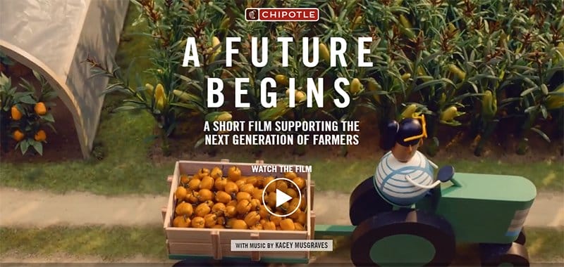
Chipotle’s A Future Begins is a short film supporting the next generation of farmers, leading the charge to support young farmers. A prime example of a well-designed microsite, Chipotle’s A Future Begins microsite helps put perspective on the life of young farmers.
Visitors get access to the film directly from the hero section via a play icon, one of the top marketing strategies employed. There are several videos displayed consistently on the site, with a pause feature giving visitors control of the video playing in the background.
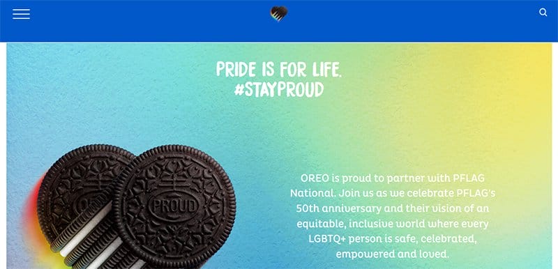
OREO and PFLAG are proud partners dedicated to supporting, educating, and advocating for LGTBQ+ people and those who love them. This colorful microsite is a collaborative effort designed to accommodate and target specific buyer personas.
I love the adoption of the LGBTQ+ rainbow colors into the microsite design, blending in with the site’s display of bold colors. A cookies icon is visible and pinned to the left-hand side of the homepage, giving visitors control of the site’s cookies.

SNICKERS is a popular chocolate brand and the official chocolate sponsor of the NFL. A top microsite example, the SNICKERS Ice Cream campaign microsite generates leads on its product.
The logo’s chocolate color is visible as a major part of the microsite design, with each section adorned in bold colors. Visible is a chat feature pinned to the bottom right-hand corner of the homepage, serving as the site’s online communication channel.

Power.Global is on a mission to improve global accessibility to safe, reliable, and modern clean technology through innovative electrification products and services.
Two CTA buttons stand out side-by-side on the site’s homepage in their Black and Supernova color schemes. Social media icons are visible centrally in the site’s footer section, each linked directly to the business's social media platforms.

Blinker is one of the top interactive mobile apps that makes it easy for everyone to save money in the car financing process. One of the best examples of a modern microsite, the I Love Financing Cars microsite provides information about what Blinker aims to offer.
A parallax scrolling feature is visible as visitors scroll through the homepage, the site’s top interactive feature. I love the fine display of screenshot images of the app on the site’s homepage, taking users on a step-by-step guide on how to use the platform.
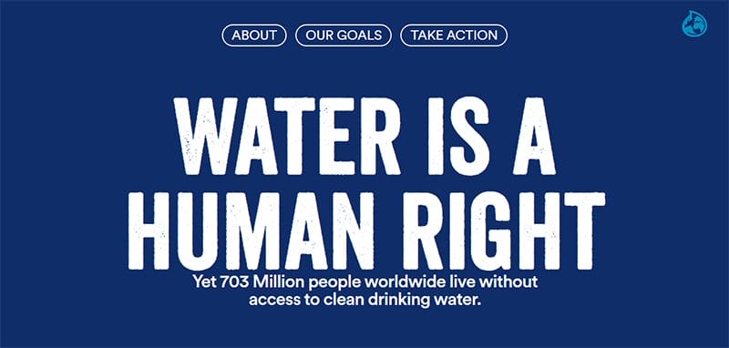
Water is a human right is a global initiative that seeks to raise awareness of the human right to clean water on World Water Day. This beautiful microsite is visually appealing in its modern and clean web design.
Retaining the water's original blue hue, the one-page Webflow website uses the Deep Sapphire color as its sole background color. I love how the microsite draws visitors in and leads them on a customized path that ensures a first-rate user experience.
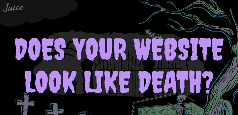
Does your Website look like Death microsite is a great example of a well-designed interactive microsite, with plenty of interactive elements. Like its main site, this microsite welcomes visitors to a dark-theme animated image in the hero section.
The hero section is visually appealing, with each animated icon adding an artistic touch to the web design. Plenty of negative spaces are visible on the microsite, ensuring the microsite highlights interactive elements.
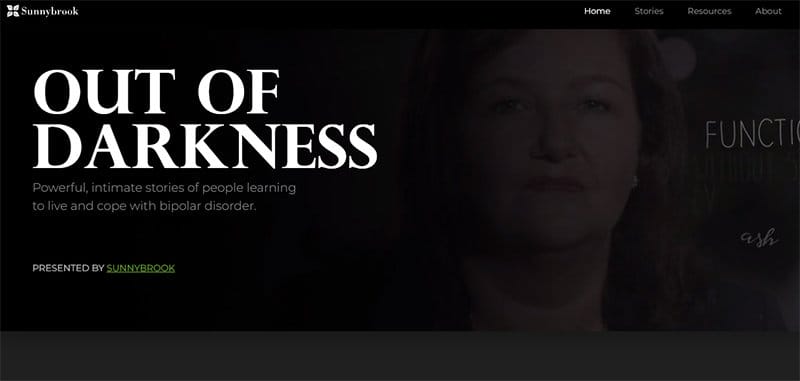
Out of Darkness is a project developed based on narrative medicine and recovery principles for five diverse men and women with bipolar disorder. One of the top microsite examples, the Out of Darkness site is the microsite of Sunnybrook Health Sciences.
I love how this microsite sticks to a dark-themed background for its web design. Links to its primary website are embedded in underlined texts, easily recognizable in a lime lemon font color.

Happy Holidays from Kmotion Design is a microsite from the Kmotion Design team intended to introduce the team to its target market.
One of the outstanding microsite examples, the Happy Holidays from Kmotion Design microsite is aesthetically pleasing in its blend of creative and animated icons.
An interactive map feature is visible on the site, helping visitors with a visual perspective of where the design firm is located. Treated as a timeless blog, the entire page displays information about each team member using stylish texts and animated images.
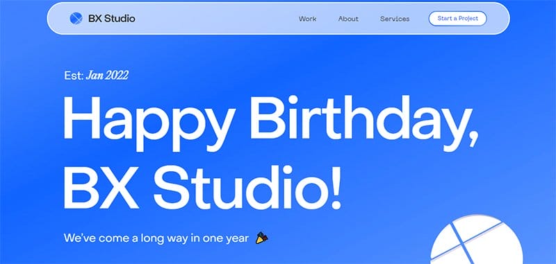
BX Studio 1 Year Anniversary microsite created in January 2022, was designed to celebrate the accomplishment of X Studio over a year. A great example of a microsite built using a modern design, the BX Studio 1 Year Anniversary microsite sticks to a clean layout for its web design.
The company logo colors, Dodger Blue and White serve as the microsite’s predominant colors. Awards received and logos of its trusted partners appear in separate sections of the site, serving as social proof to potential clients.
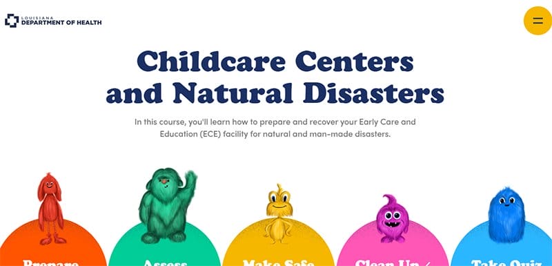
Louisiana Department of Health offers a course on how to prepare and recover your Early Care and Education facility for natural and man-made disasters.
One of the fantastic microsite examples, the Louisiana Department of Health takes a cue from its main site, sticking to a single-page layout.
Several animated icons in different colors steal the attention of the site, each tied to a specific creative personality. CTA buttons become visible as the mouse cursor moves over each of the five-colored sections, prompting visitors to click.
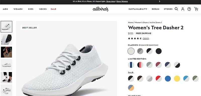
Women’s Tree Dasher 2 page is a specific women's footwear product from multiple pages available on the Allbirds company website. An effective microsite example, the Women’s Tree Dasher 2 microsite provides all the required information about the footwear.
I love the display of extensive reviews from loyal customers on the product’s page, building a creative personality around the product launch.
Users can access information on shipping and availability of colors and sizes from the site, one of its top content marketing initiatives.
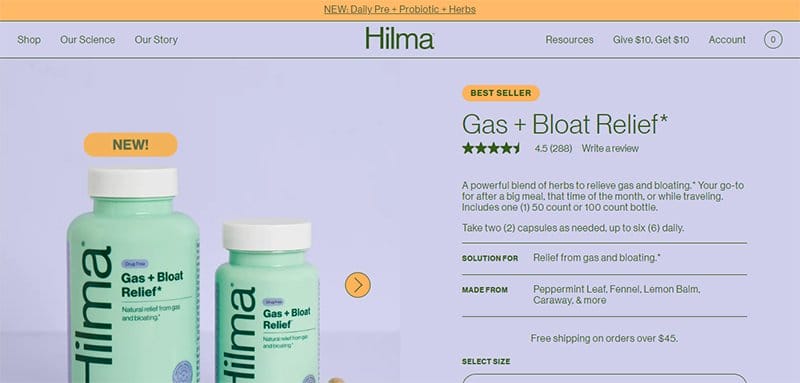
Hilma Gas + Bloat Relief is a powerful blend of herbs created by the Hilma brand to relieve its users of gas and bloating. A great microsite example, the Hlma Gas + Bloat Relief microsite boosts customer engagement through effective marketing campaigns.
The entire homepage displays focused content about the products, sticking to a Link Water, Texas Rose, and Army Green color scheme. A help feature stands out on the homepage in a Texas Rose and Army Green color scheme, providing answers to visitors' queries.
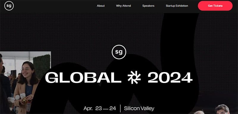
Startup Grind Global Conference works with organizations helping startups just as they are making some of the most important decisions to help grow their business. This conference website reels visitors in with its modern design.
I love the display of reviews from past clients on an extensive Strawberry background, sticking to a centralized three-column layout. Visible in Strawberry colors are the site’s multiple CTA buttons, prompting visitors throughout the site.
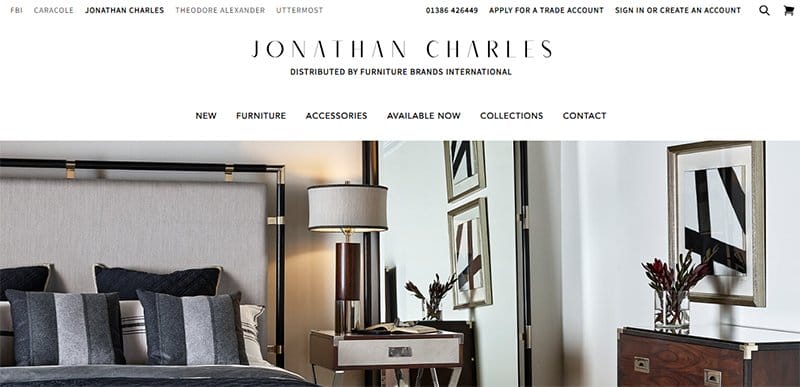
Jonathan Charles Furniture exhibits some of the finest traditional replicas and transitional furniture pieces in the world. This beautiful microsite is one of many sites under Furniture Brands International’s main website.
The site's call-to-action buttons are unique and easily recognizable in their black-and-white color scheme, prompting visitors.
Creating an interactive experience for site visitors are the high-quality images of its products, helping to generate interest in the brand.
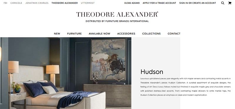
Theodore Alexander Furniture is an iconic furniture and accessories brand synonymous with quality craftsmanship, exquisite design, and timeless appeal.
One of the best microsite examples, the Theodore Alexander Furniture microsite is coined out of Furniture Brands International’s main website.
Accessible from the site’s header menu, the Theodore Alexander Furniture microsite is exquisite, sticking to a gentle color scheme for its web design. I love the consistent display of high-quality images of its products on the homepage, a key part of its marketing strategy.
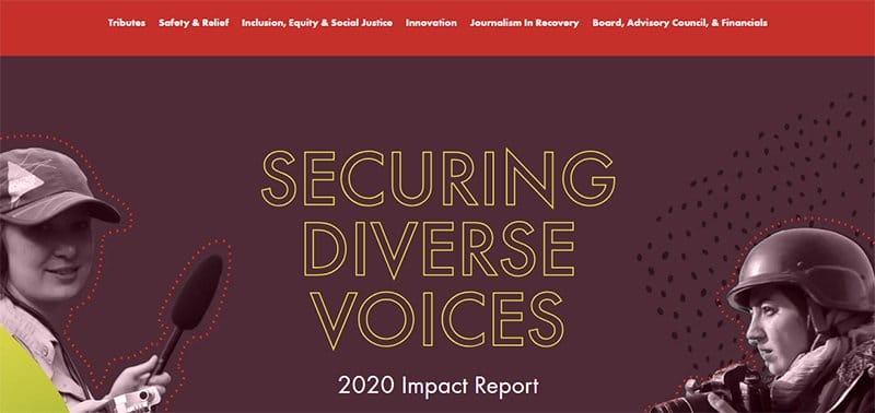
International’s Women Media Foundation helps secure diverse voices through inclusion, equity, and social justice. A successful microsite example, the 2020 Impact Report IWMF microsite helps raise brand awareness of the activities of the global organization.
This aesthetically pleasing microsite example treats visitors to a display of different colors and shapes. As users scroll through the homepage, they view a careful blend of different design elements, helping to generate interest in the organization’s cause.
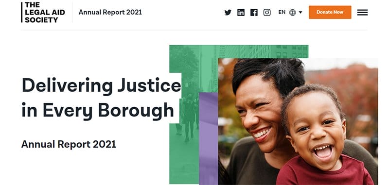
The Legal Aid Society is built on the simple, but powerful belief that no New Yorker should be denied the right to equal justice. This top microsite example is coined from the company’s website, helping keep track of its progress.
Lined up in the site’s sticky header menu in a black-and-white color scheme are social media icons and a language-switching feature, alongside a hamburger menu.
The bold font type stands out as one of the site’s top design elements, making it easy for users to skim through branded content.
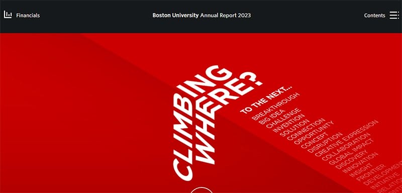
Boston University Annual Report 2023 showcases the breakthroughs made by Boston University, a major global research institution.
A unique microsite dedicated to the gains experienced by the institution, the Boston University Annual Report 2023 microsite is modern, sticking to a clean layout.
I love the display of the Rosso Corsa color on the site, welcoming visitors as the background of its hero section. The site’s multiple call-to-action buttons are easily recognizable, bordered by the logo’s Rosso Corsa color.
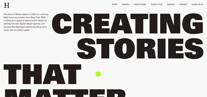
HiLabs Vision is a global team of creative storytellers and experts in design, illustration, animation, editorial, 3D printing, and social activation.
A creative microsite example, the HiLabs Vision microsite is unique, sticking to a predominantly black-and-white color scheme to display its engaging content.
Bold typography is the site’s top interactive element, engaging screen readers and site visitors with its eye-catching black fonts.
A bright yellow-green customized dot is visible on the homepage of the site’s mouse cursor, adding color to the web design.
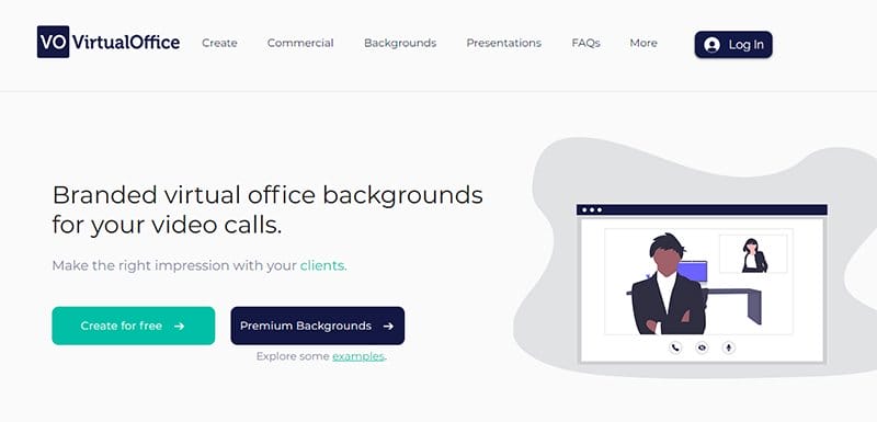
Virtual Office helps users make the right impressions with their clients, offering branded virtual office backgrounds for video calls. One of the stand-out microsite examples, the Virtual Office site is unique, sticking to a centralized layout for its web design.
A centralized gallery display is visible on the site’s homepage, displaying images in a slideshow using an interactive carousel feature. I love the display of logos of top brands the platform is compatible with on the homepage.
Best Microsite Examples FAQ
A microsite is its own website, not a landing page, designed to help a company promote its products, services, campaigns, events, or entire brand. Primarily designed to function as an individual entity, a microsite serves as a company’s temporary asset and is limited in its life span. A microsite lives on its own domain and usually links to the main site.
Creating an interactive microsite requires creativity, and using creative design elements makes it easy, as they help to shine the spotlight on your site’s interactive content. Using creative animations and a mobile-friendly web design, making scrolling engaging and navigation interactive are some of the best ways of creating an interactive microsite.
Although both are a form of branded content focused on a project or business, a microsite is entirely different from a website. A website is a platform designed as the anchor of a project or business online presence, while a microsite is smaller and consists of a few or only one page.
Microsites differ from landing pages despite having some notable similarities in their life, size, and purpose. A microsite is published on its own or part of its parent website and is either designed as a single page or more. Landing pages, on the other hand, are always a single web page published on their branded parent website.
A good microsite is characterized by how interactive, informative, and highly engaging your targeted content is to a specific target audience. Every good microsite focuses on the design elements, including images, videos, fonts, and navigation.
Explore Further
- Best Black and White Website Design
- Best Dynamic Website Examples
- Best Colorful Website Design Examples
- Best Sleek Website Design Examples
- User Interface Design Examples
- Best Clean Website Design Examples
- Best Multi-Page Website Examples
- Best Creative Web Design Ideas
- Latest Website Statistics
- The Ultimate List of Web Design Statistics