Nutrition Websites: 18 Best Dietitian Website Examples
Designing a nutrition or dietitian website that converts is essential if you want to attract your ideal target audience and remain relevant in the nutrition world.
Irrespective of the nutrition services you offer, whether nutritional therapy, counseling, or education, building a nutrition website is a great source for finding new clients.
Designing an eye-catching nutrition website design doesn’t have to be time-consuming or cost a fortune. You can use the best website builders, like Squarespace and Wix, which comes with beautiful templates and state-of-the-art building tools to design your nutrition site.
This article explores the 18 best button website examples that serve as a guide when designing your own site.
Let’s get started.
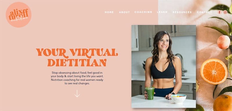
Alix Turnoff helps people escape the world of poor diets as a virtual nutrition consultant, personal trainer, and nutritionist. Her website, Alix Turnoff Nutrition, has a straightforward, vibrant design with colored bands and wavy lines that complement the color scheme.
The orange hues on Alix's website are complemented by images of oranges, with a navigation bar encircling the entire edge. Alix includes a piece about her podcast and a call to action for visitors to tune in.
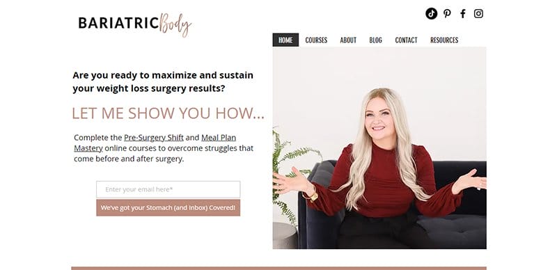
Bariatric Body is the nutrition business of Carrie Brander, a nutrition therapist helping weight loss surgery patients overcome the struggles of bariatric surgery.
One of the top nutrition website examples, the Bariatric Body website, is unique, sticking to a simple design for its web design.
The entire site sticks to a consistent, centralized layout for its website design, with white spaces visible around the homepage.
A chat feature is visible and pinned to the right-hand side of the homepage, serving as the site's online communication channel.
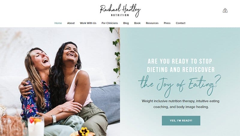
People can live a healthy and well-nourished life and mend their connection with food with the aid of Rachael Hartley Nutrition. The Rachael Hartley Nutrition website has a basic style with calming colors to instill a sense of serenity in its users.
Visitors navigating through the main page with blog articles are greeted with cheerful pictures of people and food.
The logos of a few well-known companies, such as Insider and The Washington Post, are visible in the site’s “As Seen” area, serving as social proof.
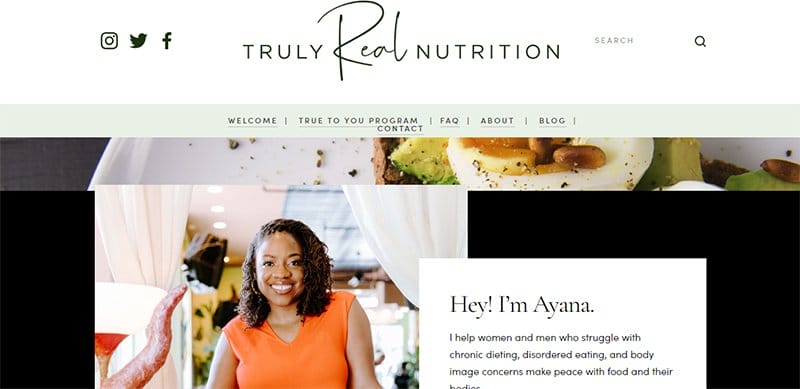
Truly Real Nutrition is the nutrition site of Ayana, a nutrition therapist, certified intuitive eating counselor, macro social worker, and cultural diversity advocate.
One of the top nutrition website design examples, the Truly Real Nutrition website is aesthetically pleasing, displaying artistic and eye-catching design elements.
An extensive FAQ section on the homepage provides ready answers to potential clients' questions. I love how the site alternates between stylish and bold font types for the typography, engaging users in their artistic display.
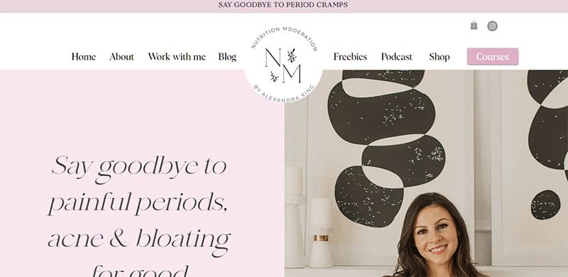
Nutrition Moderation, Alexandra King is a certified women's health nutritionist helping women recover from endometriosis, PCOS, and hormone imbalance post-birth control.
One of the best dietician websites, the Nutrition Moderation website is soothing with its consistent display of soft colors.
I love the display of excerpts from her blog page on the homepage in a centralized three-column layout over an extensive Pearl background.
You will find image excerpts from the brands' Instagram page displayed above the footer section in a five-column layout.

Method Nutrition helps moms find peace in their relationships with food and learn to love their bodies. This great design example displays an excellent use of space on the homepage.
Welcoming visitors to the site are bold texts, taking center stage in the hero section alongside an image of its founder, Gabi.
The logo's Cerulean color adds a unique touch to the website design, highlighting texts and serving as the background color for CTA buttons.
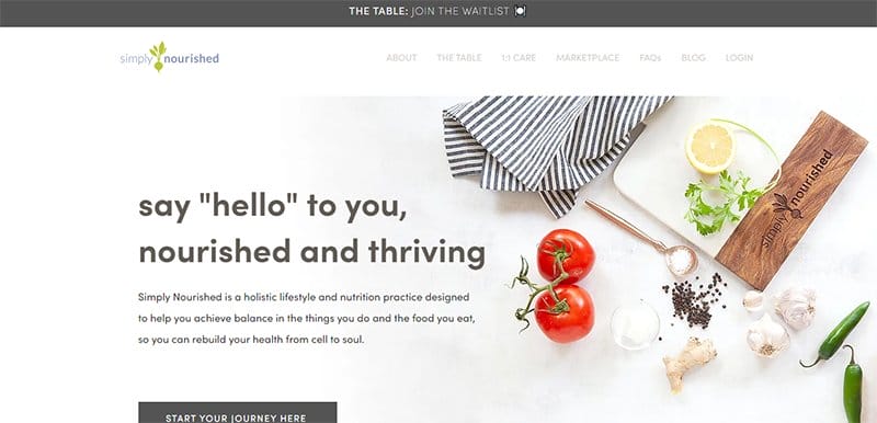
Simply Nourished is a holistic lifestyle and nutrition practice designed to help people achieve balance in what they do and eat. One of the top nutrition website design examples, the Simply Nourished website is aesthetically pleasing, consistently displaying soothing colors.
I love the display of testimonials from past clients on the homepage in a centralized slideshow, serving as social proof. Appetizing images are visible across the site's homepage, adding an artistic touch to the website design.

Culina Health offers virtual nutrition care with registered dietitians who understand and care about their client's health. One of the top dietitian website examples is the professional Culina Health website, with each homepage section arranged in an engaging display.
The site's multiple CTA buttons are consistent and stand out on a Mineral Green-colored background, consistent with the brand's logo.
Testimonials from past clients provide evidence to potential clients, displayed in a centralized slideshow alongside arrow icons for navigation.

Robyn is a functional medicine dietitian and health strategist taking a root-cause approach to health and healing. This modern dietitian website uses a clean layout that makes its content appealing to users.
The entire site is built on a soothing color scheme, making scrolling through the homepage visually appealing. I love the site's typography, alternating between different font types, giving the site a unique feel.

Finding Ground Nutrition is a functional and mindfulness practice that counsels individuals seeking healing by fostering healthy relationships with food, the body, and the self.
This fantastic nutrition website is aesthetically pleasing, displaying Greeny Grey and Double Spanish White as the site's predominant colors.
The CTA buttons on the site are clear in their Greeny Grey-colored background, prompting users to perform specific functions.
I love the display of logos of associations and accreditations associated with the brand on the homepage, serving as social evidence.
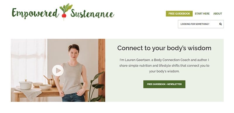
Empowered Sustenance is the nutrition site of Lauren Geertsen, a body connection coach sharing simple nutrition and lifestyle tips that connect body wisdom.
One of the standout nutrition websites, the Empowered Sustenance website is user-friendly, sticking to a centralized layout for its web design.
Plenty of white spaces are visible around the site's homepage, allowing users to focus on the site's main content.
I love the display of grain-free recipes on the homepage in a three-column layout, serving as an inspiration to users with a desire to live healthily.

Dr. Nina dedicates her life to helping women conquer food and body image issues once and for all. This nutrition website displays bold and eye-catching elements, visible as texts and colors.
You will find logos of top business brands featuring Dr. Nina beneath the site's hero section in an interactive display, serving as social evidence.
I love the display of excerpts from her blog above the site's hero section in an inconsistent two-column layout, each linked to her blog page.

Vani Hari, or Food Babe, is the brand name she goes by, and she shares information about her investigation of what is in our food. One of the professional dietician website examples, the Food Babe website, is unique, displaying eye-catching design elements.
Bold colors and typography are the site's consistent design elements, engaging screen readers and users on desktop and mobile devices.
I love the display of reviews from past clients on the homepage in a centralized, interactive slideshow, serving as social proof.

Food Heaven offers virtual nutrition counseling dedicated to diabetes and prediabetes through its virtual nutrition coach and registered dieticians. One of the best dietician website examples, the Food Heaven website is modern, sticking to a clean layout for its web design.
Links to its nutritional service are visible as texts over several high-quality images designed to draw attention. Visitors and users can access and listen to the brands' latest podcasts from the homepage by clicking the “Listen Now” CTA button.

Lose the Body Fat is an extensive nutrition and healthy lifestyle blog that provides viewers access to relevant information. One of the top nutrition websites, the Lose the Body Fat website, is unique and professionally displays its site's content.
A huge search bar is uniquely positioned on the site's homepage, helping users access a particular article or blog post quickly.
I love how the site sticks to Azure as the font color for header texts, easily distinguishing them from ordinary texts.

Sarah Waldman is a health-focused home cook and food freedom expert who develops and offers recipes for simple, whole-food meals appropriate for the whole family. This great example of a simple site, is minimalistic, sticking to a straightforward web design.
The homepage sticks to a centralized two-column layout, displaying high-quality images linked to other pages.
Links to her other pages and social media icons stand out at the top right-hand corner of the homepage, serving as navigation links.

So Simple Health offers research-backed, no-nonsense nutrition and lifestyle strategies aimed at thyroid, adrenal, and gut healing for women.
One of the top nutrition websites, the So Simple Health website is visually appealing, displaying bold design elements such as colors and shapes.
I love the display of excerpts from her blog post on the homepage beneath the hero section, sticking to a three-column layout. The multiple CTA buttons on the site are clear in their Macaw Blue Green-colored background, prompting users and visitors.

Christa Orecchio is a clinical and registered dietitian nutritionist dedicated to helping individuals use food, soil, and self-awareness as medicine for root causes. This top dietician website example is minimalistic, sticking to a straightforward web design.
I love the display of logos of top brands featuring Christa Orecchio on the homepage, serving as social proof to potential clients. The site's CTA buttons stand out in their Light Taupe-colored background, prompting users to perform specific tasks.
Nutrition Website Examples FAQ
Distinguishing yourself and content from other dieticians is the first step in creating a nutrition website and determining your ideal client. Social media integration and free newsletter sign-ups are critical for starting a nutrition website.
Squarespace and Wix are the best website builders for nutritionists to use to display their nutrition content. These website builders offer a variety of health and wellness templates, affordable pricing, and easy-to-use features to create a great website.
The Academy of Nutrition and Dietetics, The Mayo Clinic, and the National Institutes of Health are some of the top websites for nutrition information. Registered dietitians, licensed nutritionists, and extension agents are good sources of information for food and nutrition matters.
Building a functional nutrition website design requires learning step-by-step website-building strategies, expert design tips, and essential marketing techniques. A functional nutrition website is an effective platform to communicate a unique message to the target audience.
A great dietitian website is characterized by engaging, straightforward content that captures visitors' attention. Besides the web design, a great dietitian website should use clear messaging and copy to complement its layout and distinguish it from other dietitian websites.