Squarespace Websites: 66 Inspiring Examples (2025)
Creating a website doesn’t have to be a difficult task or cost a fortune. Do you want to create your own website, redesign an existing one, or launch your business online? Use website builders like Squarespace to build a professional, visually appealing, and affordable website.
Squarespace is a media-focused website design platform that offers beautiful templates and easy-to-use tools. BuiltWith estimates that 5 million+ live websites are using Squarespace, with more than half coming from the United States. on the market.
This article covers the 66 best Squarespace websites from different niches you can use as inspiration to create your own site.
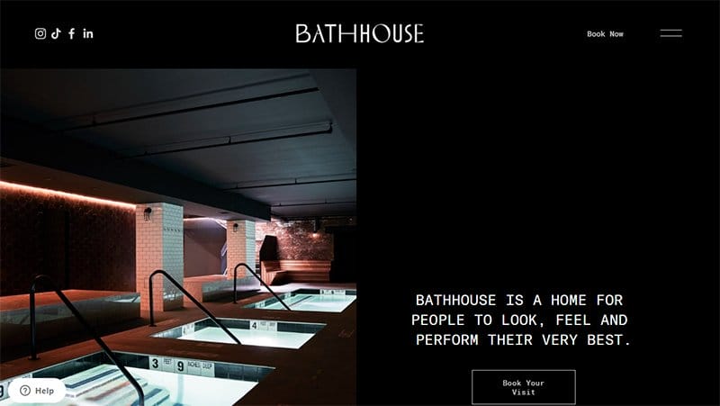
Bath House uses a dark-themed concept, displaying its texts and CTA buttons on black backgrounds. This Squarespace website beauty is in its arrangement, alternating between images and texts from left to right throughout its front page.
The header menu contains links to its social media pages, a book now CTA button, and a hamburger menu that assists visitors with navigating the site.
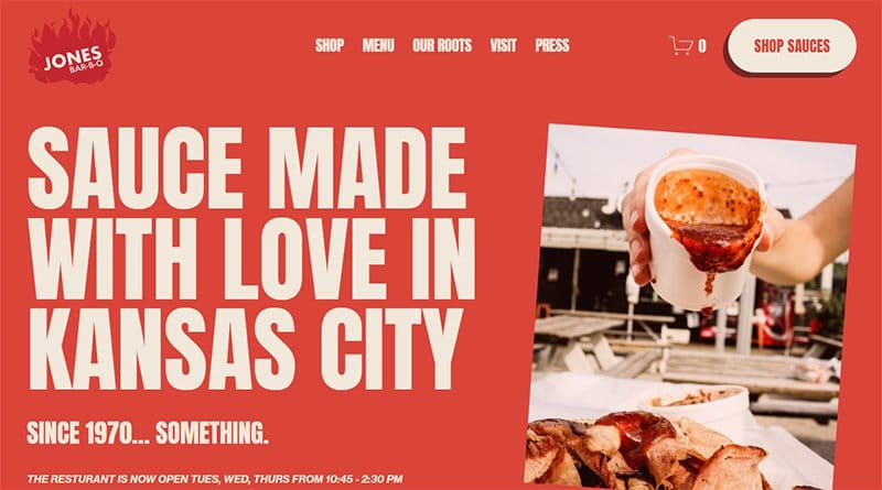
Jones Bar-B-Q is the barbeque and sauce hub of the Jones sisters. Full of images of fire and displaying the natural sauce Jasper color, the Jones Bar-B-Q website is unique in its arrangement.
Images of its food offerings, sauce, and the Jones sisters are displayed all over the site, alongside quality typography, giving the website a professional look.
I love the arrangement of its footer section, listing its opening hours and days, contact info, and referral links to the Jones-Bar-B-Q social media pages.
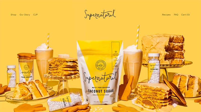
Supernatural prides itself on leading a parade for kitchen creativity via its colorful ingredients that help chefs shine. This food website keeps up with its brand’s message, displaying eye-catching images of its ingredients alongside pastries on a Bright Sun background.
The sprinkle grams section showcases colorful images from its Instagram page on a Bright Yellow background. I love how the footer section displays its information on a Rubber Ducky yellow background.
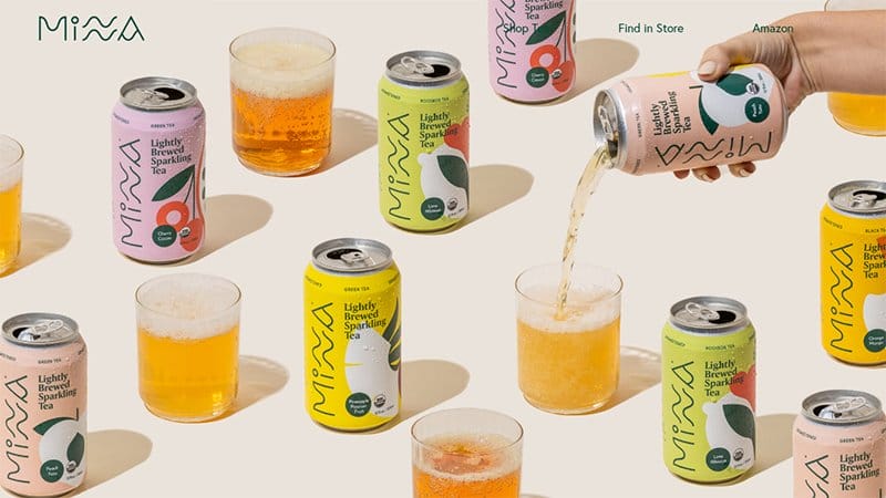
Minna is a refreshing tea brewing brand using only organic and non-gmo ingredients, with no sugars or added sweeteners for its tea flavors.
Taking center stage on its website homepage are images of Minna’s branded tea can, with glasses full of its content arranged side-by-side. The hero image captures a hand pouring into one of the glasses.
There is no shortage of exciting colors on Minna’s Squarespace website. The can colors form separate backgrounds for its product sections.

Soliboy operates with one specific mission: to inspire a sense of curiosity for the greener things in life. The hero image is a colorful plant with Dark Tan leaves, Saffron Mango flowers on a Soft Amber background.
Soliboy’s website displays high-quality images of various plants, ceramic planters, and ready-to-mix soils with CTA buttons leading to its online shop.
There are centralized images linked to the Instagram page arranged in a four-column layout, with a CTA button directing visitors to its Instagram page.

Oshii is a berries-based company offering customers the unique taste of its Omakase and Koyo berries. This food website is visually appealing, with images of berries displayed as background images for its home page sections.
Visitors get a sneak view of Oshii’s Instagram page, with linked images and videos just above its footer section. Client testimonials are a vital aspect of web design, and Oshii uses text and video elements to share its client testimonials on its website.
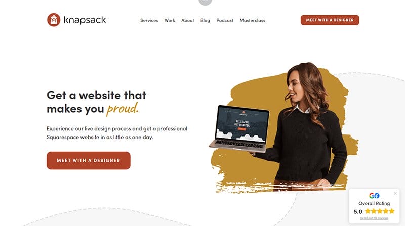
Knapsack Creative creates one of the world’s best web design experiences. Focusing solely on high-quality Squarespace websites, the Knapsack Creative website is a great example of a well-structured web design.
This web design agency website uses simple colors and dotted lines to pass its message. I love how Knapsack Creative uses the Pale Carmine color on its logo for its CTA button background.

TinySeed is on a mission to multiply the world’s population of independent, self-sustaining startups. Taking center stage on its homepage over an extensive Ebony Clay background and shaped dotted lines is a text and video introduction of TinySeed.
The client testimonials section takes the same design structure as its homepage. However, this section adds images and a Light Olive Green line divider.

EST Creative is all about Emily, a freelance copywriter and content strategist, offering content strategy and copywriting. A roughly bordered hero image of Emily with artistic golden downward-pointing arrows catches visitors' attention on the EST Creative website.
Like most of the best Squarespace websites, EST Creative integrates the Bean Red color of its logo as the background for its CTA buttons. I love the display of logos from top brands that trust EST Creative with their copy, displaying them on a Cloud Burst background.

The Hyphenated Canadians focus on displaying its expertly taken portraits on its single-layout website. Displayed on the black background are slideshow images that show samples of The Hyphenated Canadians’ photography.
I love how the Start CTA button draws attention with its legible white font, providing users access to the website portraits, contact, and about pages.
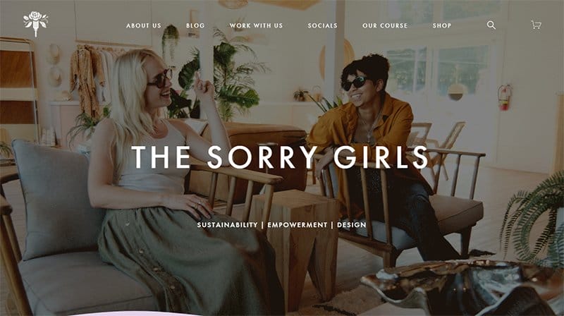
Becky Wright and Kelsey MacDermaid are the names behind The Sorry Girls brand, offering sustainable and empowering designs. Visitors will love the slideshow video showing the ladies, their team, and their workplace.
The Sorry Girls website uses wavy lines to distinguish between different sections on its home page, adding an artistic effect to the web design.
I love the footer section on a Pale Lavender background, displaying a search feature, icons that link to the Sorry Girls socials, and a navigation menu.
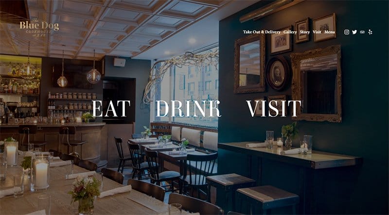
Blue Dog is a cookhouse and bar offering its customers nourishment via locally sourced ingredients. This beautiful Squarespace website displays an astonishing image of the indoor view of its bar and cookhouse that draw attention.
I love how Blue Dog displays three clear CTA buttons displayed over its hero image. Other than containing links to its other pages, the Drink, Eat, and Visit CTA buttons display different images when the mouse hovers over them.
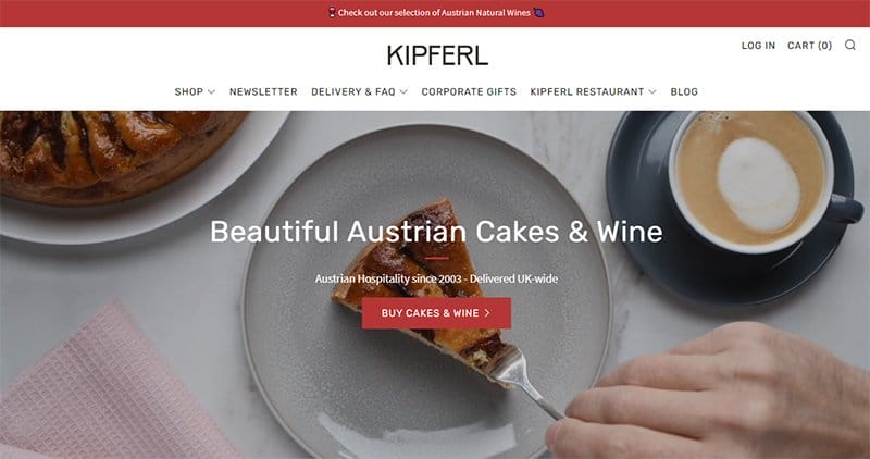
Kipferl is in the business of providing Austrian hospitality to its customers in and around the UK, focusing on its beautiful Austrian cakes and wine. I love how the hero video displays high-quality video content of its cakes and wine, leaving people wanting every bite and drink,
Full of great photos and quality content, the CTA buttons on the Kipferl Squarespace website stand out in its Pale Carmine background.
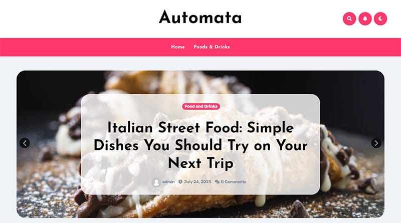
Automata falls under the best Squarespace website examples, with a clean design backing up the arrangement of its web content. Using the color Radical Red as the background color for its header menu and top features, the Automata site’s content pops into the eye of visitors.
I love how Automata displays its content in a simple three-column layout, with the Radical Red color highlighting Food and Drinks as the header.
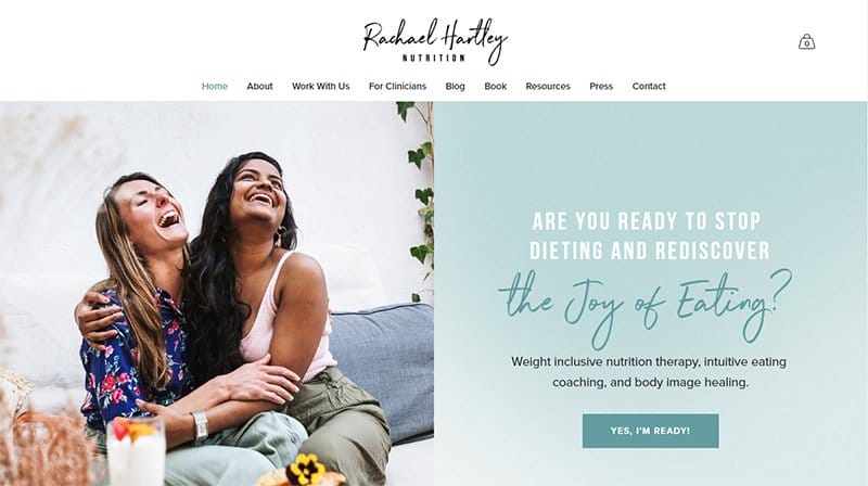
Rachael Hartley Nutrition helps people heal their relationship with food and live a healthy and well-nourished life. The health and nutrition website opts for a minimalistic design for its web design, using soft, soothing colors, that prescribe calm to visitors.
Visitors are met with happy images of people and food as they scroll through the home page, including articles from its blog.
The As Seen section of the Rachael Hartley Nutrition website showcases the logos of notable brands, including, Insider, and The Washington Post as social proof.

Randy Rogers's Band is a unique brotherhood fueled by their shared passion for making and writing music. Fused into its homepage background and serving as its hero image is a black-and-white picture of the band.
Displayed over the hero image background on the Randy Rogers’s Band website is a CTA button directing users to listen to their latest album. Icons leading to their social media and streaming platform are visible in white on the hero image background.
Just above the footer section are black-and-white slideshow images of the band performing, taking visitors on a usual journey.
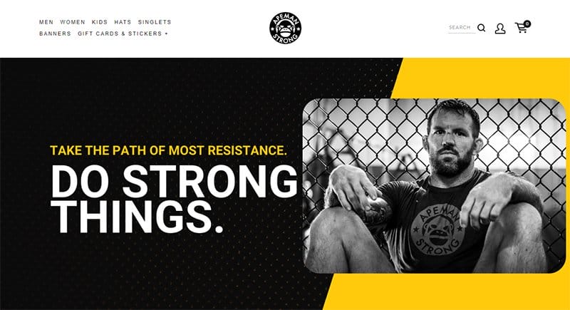
The color scheme of Black and Supernova gives the Apeman Strong Squarespace website an entertaining website design. Displayed just below its hero image are images of its latest releases displayed in a four-column layout with prices attached.
I love how Apeman Strong displays black-and-white images with the Supernova text and background that adds color to its look.

Sean Casey Animal Rescue is a non-profit, no-kill shelter specializing in the rescue, rehabilitation, and placement of dogs, cats, reptiles, and other small mammals.
Taking center stage on its website is a full-width hero image of a dog. You can’t miss out on the mission of Sean Casey Animal Rescue displayed over the image in white and bold text. There are CTA buttons displayed, prompting visitors to donate or adopt.
Sean Casey Animal Rescue’s website displays articles from its blog in between images, with plenty of visible white spaces.

Upside Foods creates cultivated meat that is good for both people and the planet. Visitors notice the colorful illustrations displayed on the Upside Foods website where the brand’s logo transforms into its homepage hero’s image.
The Reddish Orange color from its logo is visible throughout the site, serving as the background for its homepage. Plates of different dishes are fixed and visible on the Reddish Orange background.
I love the image slider feature used in Upside Foods' web design, giving an unusual effect to site visitors.
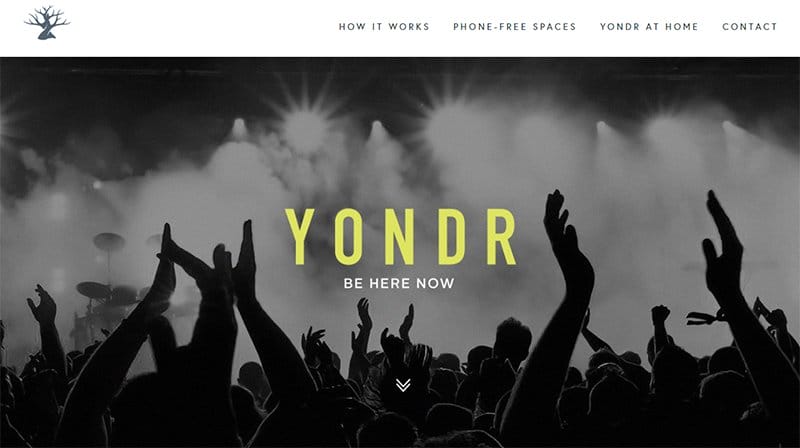
Yondr creates phone spaces for artists, educators, organizations, and individuals, carving out places where real connection, focus, and creativity can flourish. This Squarespace website is creative in leaving behind plenty of white spaces for visitors to dwell on its important content.
A black-and-white hero image showing the hands of people in an enclosed space helps build visitors' connection to the website. The clients' testimonial section is extensive, displaying reviews from its different category offerings, including people and organizations.
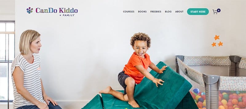
CanDo Kiddo uses Squarespace website builder for its website design, centering its focus on growth, intuition, intensity, and diversity,
Visible on the CanDo Kiddo website is a full-width hero image of Rachel Coley, the owner, watching over a toddler.
CanDo Kiddo’s website layout is simple, built on a white background, with images, and text positions alternated alongside CTA buttons leading to other pages.
The footer section is home to links to its Instagram page, embedded in its section header and images displayed on a Cloud Burst background.
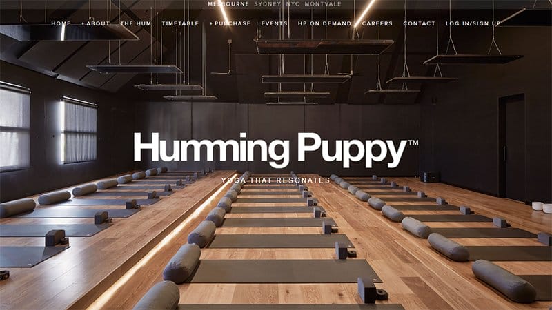
The first thing visitors see on the Humming Puppy website is a pop-up announcement feature, announcing its available studio location to visitors. Clicking on any location options, users are taken directly to the general Humming Puppy’s website homepage.
A hero image of the interior of its studio greets visitors alongside bold text in white announcing the brand and the Yoga experience it offers. Humming Puppy’s header menu is neatly lined up, and serves as the site’s navigation feature.
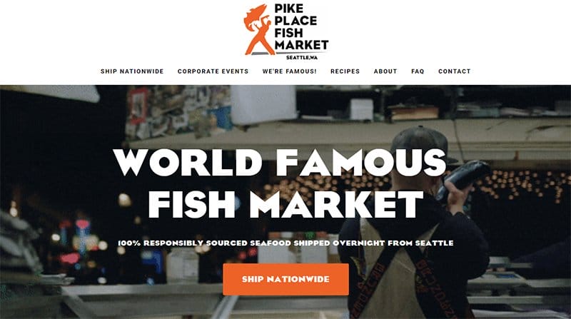
Pike Place Fish Market takes visitors on an entailing ride, using video as its hero image, showing off its fish processing processes and fish market.
Halloween Orange is the recurring color theme for the Pike Place Fish Market website, visible in its logo and as the color of the apron worn by its team. I love the accessibility feature that allows users to make considerable changes to the site’s layout and outlook.
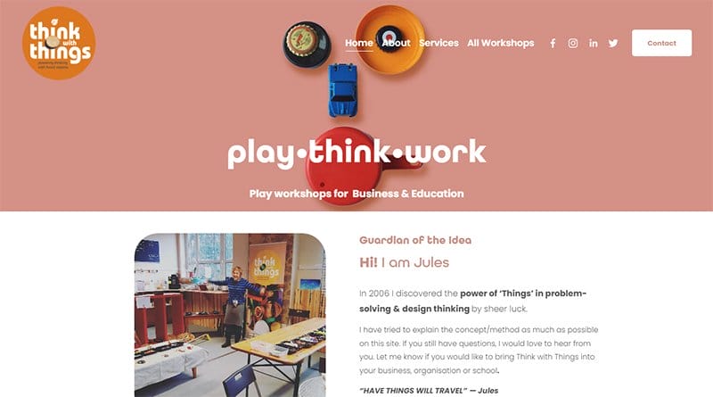
Think with Things came to the limelight as one of seven winners of the Open Education challenge to make a difference in education on a global scale.
The header menu on an extensive Dusty Pink background first catches users' attention, displaying a brief bio with its social media icons on top. There is a contact CTA button in white, leading to the site’s contact page.
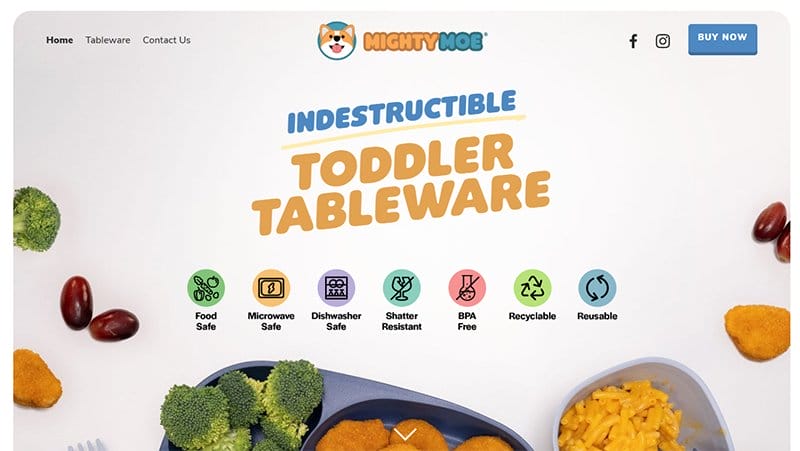
Mighty Moe’s Kid’s Dinnerware is a sub-brand of MightyGod, offering indestructible toddler tableware. In the business of making kiddies' tableware, Might Moe’s website is particularly appealing to kids.
Full of animated images, colorful texts, and illustrations, Mighty Moe displays eco-friendly designs that strictly guide its business operation. An arrow navigation feature in white helps users find their way across the Mightwebsite.
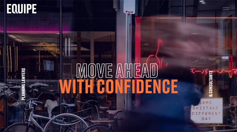
Equipe Planning Lawyers and Consultants boldly displays the text “Move Ahead with Confidence” over its hero image. Adding to the glamor of the text, the hero image itself moves, creating a thrilling experience for site visitors.
This website structures every section to draw visitors’ attention, with a color scheme of predominantly Burning Orange and Black Rock.
Unlike other Squarespace websites, the Equipe Planning Lawyers and Consultants website CTA buttons stand out as underlined texts.
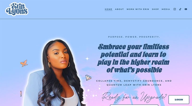
Erin is not shy to showcase her favorite colors on her website, with the Bay Blue background of her hero image matching the color of her suit.
Erin’s website also uses a Sunshine heart-shaped icon as its cursor feature, her way of spreading love throughout her site.
Her footer section alongside its navigation headers displays images and videos from her Instagram and Tiktok pages, with her official handle displayed in a moving-text slideshow.

Lost Lore Tequila website is an educational website displaying quality images and videos about its Tequila production processes. Numbered from one to four, Lost Lore Tequila takes visitors on an educative journey of how their favorite Tequila bottles are made.
The hero image turn video is one of the stand-out features of the Lost Lore website, displaying a moving video of its farm. I love its product showcase section which displays a slideshow of its Tequila products alongside brief details of their composition.
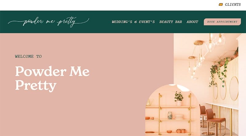
Powder Me Pretty offers wedding and events services with its beauty bar to help its clients look all glammed up for their events. I love how the front page alternates between Rose, Dust Storm, and Aqua Deep colors for its texts, CTA buttons, and backgrounds.
The footer section stands out with a Rose background and a large CTA button termed Clients for online booking.
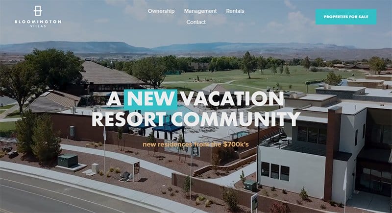
Bloomington Villas is a five-star destination resort offering luxury and comfortable vacation locations with the perfect management.
A high-quality video of Bloomington Villas’ new residences greets visitors, displaying luxury, comfort, and convenience all at once. There are slideshow images of its interior and exterior, painting a perfect picture experience in the minds of visitors.

PivotPoint’s website design is consistent with the colors from its logo, Reddish Orange, Topaz, and Carrot Orange colors on a white and Blue Chalk background. The CTA buttons displayed on a Reddish Orange background stand out in its oval-shaped layout.
I love how PivotPoint uses lines, shapes, and bold colors to pass its message, relying greatly on its bold fonts to deliver. The back-to-the-top oval-shaped navigation feature at the bottom helps users find their way easily on the site.

The Monarch Athletic Club website is aesthetically pleasing, alternating between dark and light-themed backgrounds to grab visitors’ attention. Full of high-quality images and video clips, scrolling through this website gives an entertaining experience.
I love the slideshow arrangement of its service offerings on a white background, accompanied by names and images intending to provide a mental view. There are white logos of top brands that have featured the brand on a black background to serve as social proof.

Square Launcher Golf is in the business of simplifying golf, intending to make it an enjoyable experience for everyone. Alternating between the natural grass colors of Dartmouth Green and Irish Green, the web design of Square Launcher Golf’s website is striking.
The inclusion of the logos of top golfing agencies on its website is a nice addition, helping the brand build online credibility.
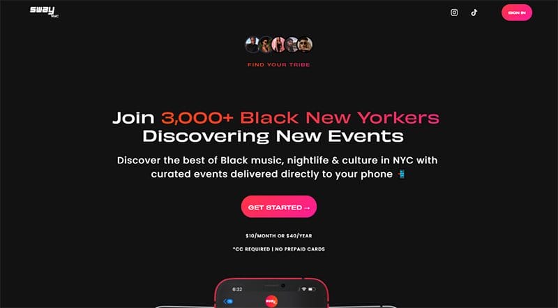
SwayNYC is an online community helping black New Yorkers discover the best of black music, nightlife, and culture. Built for both mobile devices, the SwayNYC brings curated events directly to the phone of their users.
Black, Orangey Red, and Cerise Pink are visible throughout the SwayNYC website, with a dotted Cerise Pink cursor feature visible as the cursor moves. The pop-up announcement feature is a nice addition, announcing when new users sign up or when users log in.

De Baere is an award-winning bakery with a world-champion heritage in patisserie, offering passionate, patiently baked products. Not shying away from its products, De Baere's website showcases its carefully crafted products, amidst an unusual parallax scrolling effect.
Showcased in a separate section in a three-column layout are photos of what their customers love, with a text prompting them to view more. I love the inclusion of logos of brands De Baere supplies to, building trust in its confectionaries.
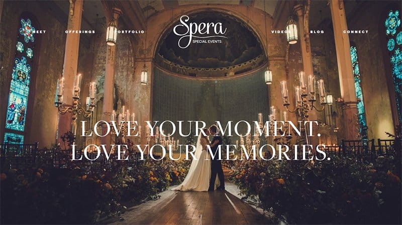
Spera Special Events is a destination wedding planning and design company with over 20 years of experience in making lovely and remarkable memories for its clients. This event website rings wedding bells with plenty of photos and videos of different weddings.
Using Regent Grey and White in a creative way to design its website, the Spera Special Events website is among the best examples of Squarespace-hosted websites.
I love the Feeling the Love section displaying testimonials of happy clients in a slideshow format, using photos and quoted text.

The Meletius header menu is extensive, with a white background that spreads into its hero image. Displayed as its hero image are images of its wholesale and shop portfolios with CTA buttons directing users to the specific pages.
Offering coffee like no other, Meletius uses a cup of coffee as its cursor feature, customizing its brand in all aspects of its website design. Meletius uses a shopping cart feature with a number above that helps people keep count of their orders for its online store.
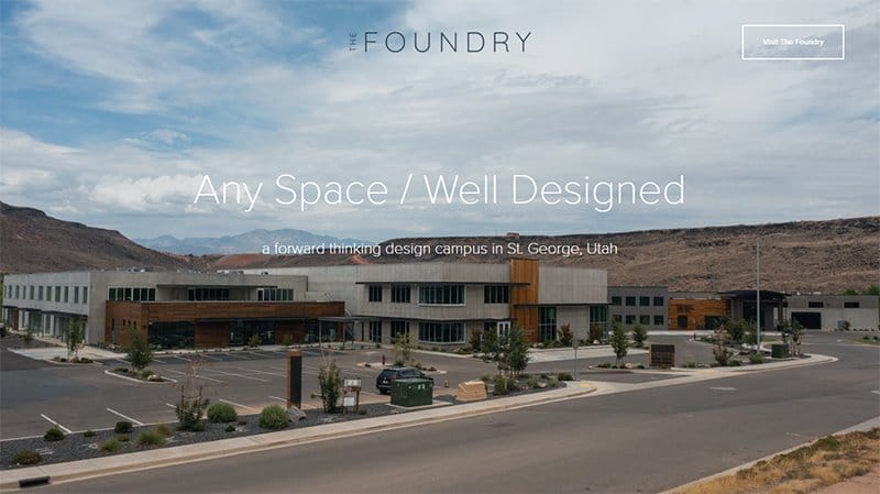
The Foundry is a campus created to elevate and inspire creativity in the design and building environment in Southern Utah.
Displayed extensively on Foundry’s website are logos, with a brief introduction of some of its partners in a four-column layout. There is a map feature that provides users with the layout of its campus space.
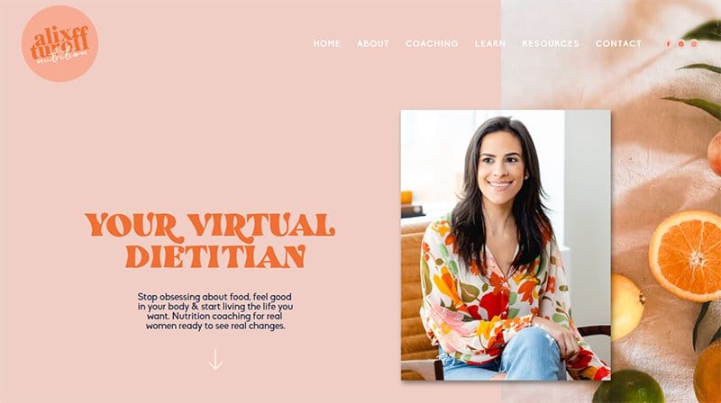
Alix Turnoff is a virtual dietitian, personal trainer, and virtual nutrition coach helping people break free from unhealthy diet culture. Her website, named Alix Turnoff Nutrition is simple and colorful, displaying wavy and band lines in different colors, contributing to its overall look.
Images of real-life oranges complement the shades of Orange colors on Alix’s website, with a navigation feature bordering both sides. Alix devotes a section to her podcast with a CTA button directing users to listen.
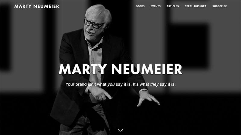
Marty Neumeier started as a graphic designer and copywriter and is now the founder of the liquid agency, a design firm scoring high in creativity and strategy. His website displays a black-and-white hero image of himself gesticulating at one of its workshop sessions.
All the other background images on Marty’s website are in black-and-white, except for his book covers and social media icons.
Marty’s website footer section doubles as his connect section, containing links to his personal and agency’s social media pages.
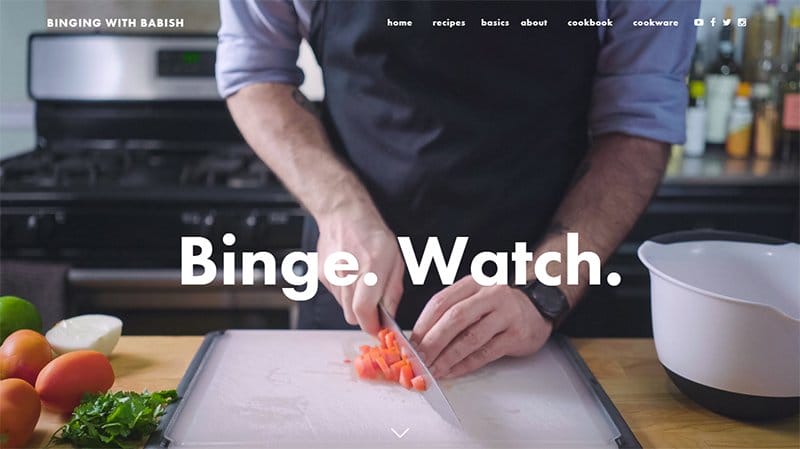
Binging with Babish is a cooking show dedicated to discovering what delectable foods from fiction taste like. Home of chef Babish, the Binging with Babish website welcomes visitors with a hero image of Babish dicing vegetables.
Babish’s website displays its latest dishes in a centralized three-column layout, with a CTA button at the bottom opting for users to view its recipes. The footer section on a black background displays icons linking to its social media and streaming platforms.

Fighting Eel which started as a small dream for Designer Lan Chung has grown into a full lifestyle brand encompassing her Fighting Eel and Ava Sky clothing lines. This clothing website is consistent, displaying its products in a four-column layout.
Full of content information, the header menu of Fighting Eel’s website uses a drop-down menu feature to display its hidden content on its homepage. The inclusion of a search feature makes it easy for users to search for specific items on the site.
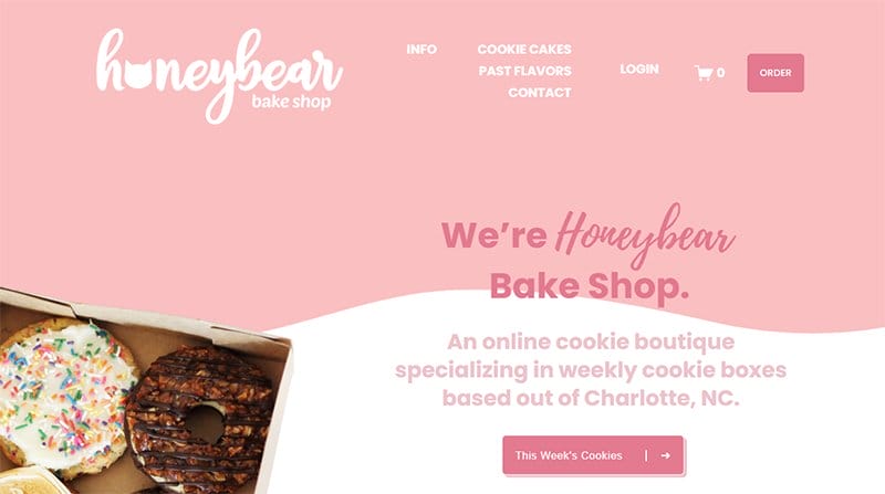
Hannah is the owner and pastry chef of Honeybear Bake Shop, an online cookie boutique specializing in weekly cookie boxes based out of Charlotte.
Different shades of Pink give the Honeybear Bake Shop website its colorful look, with images of cookies sure to entice anyone at first glance. The CTA buttons have their effects, with some revolving with the cursor while others display colorful sprinkles.
Honeybear Bake Shop displays its client testimonials as sweet words on a sweet Pale Rose background.
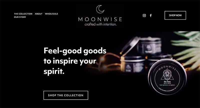
MoonWise is devoted to crafting feel-good products, focusing majorly on 100% natural soy wax candles. I love how this website brands itself with the moon as its logo which takes center stage in its header menu.
Scrolling through the MoonWise website, users discover a dark and light-themed layout that makes the images and texts more prominent. I love how MoonWise displays texts in bold fonts, almost like they are jumping right into the attention span of users.
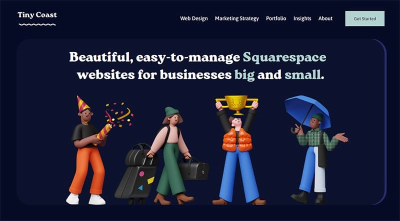
Brittany Taylor is a web designer, digital marketer, and founder of Tiny Coast Digital, a brand offering beautiful Squarespace websites for small and big businesses. Tiny Coast Digital uses Black Pearl as its background color.
Blending animations with real-life images, Tiny Coast Digital lists its web design packages in detail on its homepage, making them easily accessible at a glance.
I love how Tiny Coast’s website includes a three-column display of some of its already-built websites, making it accessible for all to see on its homepage.
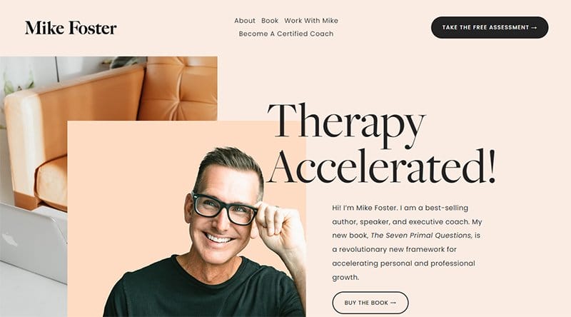
Mike Foster is a best-selling author, speaker, and executive coach, specializing in accelerated therapy. Being one of the best Squarespace website examples, Mike displays calm colors on his website, prescribing what he preaches to users.
His new book, The Seven Primal Questions is the theme for his modern website design. Multiple CTA buttons are visible, asking people to try out the free assessment or buy the book.
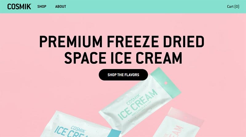
Cosmik is a unique ice cream brand birthed by the desire to provide ice cream that does not melt easily and is a worthy travel companion. The result was a high-quality freeze-dried ice cream.
I love how Cosmik sticks to its brand image, displaying popular flavor colors of ice cream, including Medium Turquoise, Baby Pink, and Pale Robin Egg Blue. These colors are visible on its logo and variety pack and add color to Cosmik’s website design.

ChangeLab is in the business of building and offering revolutionary tech to several industry leaders and businesses alike. Some logos of the notable industry leaders it has provided with its services are visible in a constantly moving section on ChangeLab’s homepage.
The hook of ChangeLab’s website is the special effect caused by two large arrow icons that merge, displaying a slideshow video in the space between. I love how the website colors blend well, sticking to Purple Blue as its predominant color.

Wild Haven Studio is a one-woman-led brand, with Kayla leading the charge for an experience made for life and tailored with love. The hero image is a lovely picture of two couples walking down the shoreline, a nice way to welcome guests.
There is a search feature that helps users find what they are looking for. Wild Haven Studio’s website header menu is its most prominent feature, using a drop-down menu option to display texts and images for a unique experience.
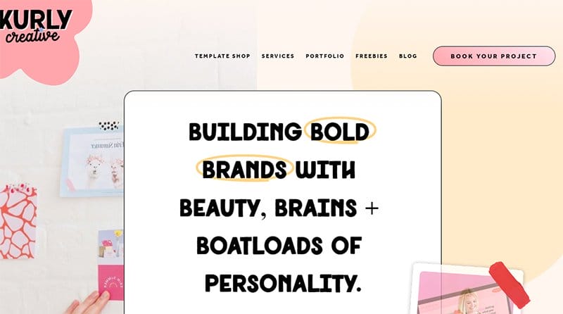
Kurly Creative is a company focusing on building bold brands by incorporating beauty, brains, and boatloads of personality. This Squarespace website uses bold and beautiful designs, taking a cue from the bold body of text taking center stage on its homepage.
I love how the Kurly Creative website reuses colors, typography, line designs, and shapes, making them the highlight of its consistent website design.

Freemans Restaurant website is among the top Squarespace website examples due to the quality images displayed. From the well-lit hero image of the front view of the restaurant, visitors are motivated to join them on the website’s virtual tour.
All of Freemans Restaurant's main content is displayed on its homepage, with the header menu lighting up when you scroll. The high-quality slideshow images displayed in the restaurant section are well-structured to make you want to order immediately.
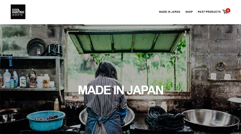
Cool Hunting Omakase offers an annual collection of limited edition gifts commissioned by the company, and specially curated for its customers.
The header menu of Cool Hunting Omakese’s website serves as its navigation menu, displaying shop and past products CTA buttons, with a cart icon beside it.
Other than the site’s hero image, other content including the slideshow of images are all displayed in a centralized layout, leaving plenty of white spaces.
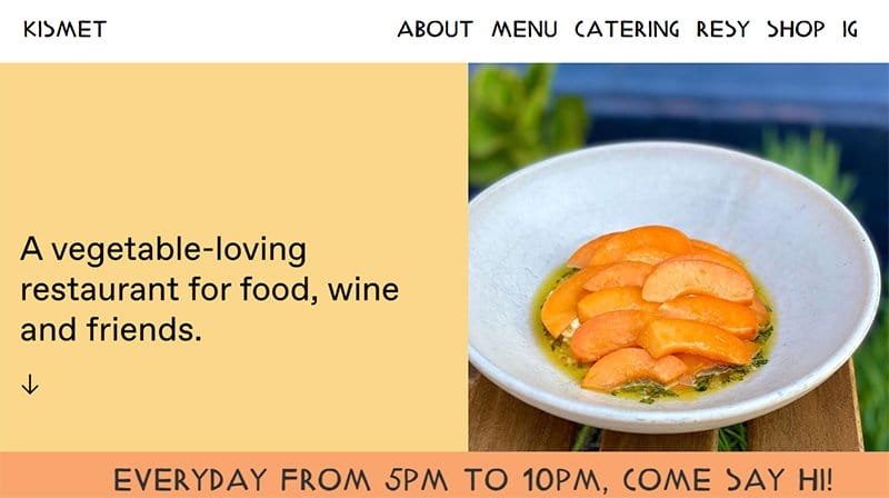
Kismet’s Squarespace website is bold in its design, using bold typography and colors to give its online store a bold stance. High-quality images of some of the meals made by Kismet chefs, Chef Sarah and Sara are displayed all over alternatively from right to left.
The half-width image serving as the hero image has a special effect, carving in at the edges when the cursor moves over it.

Girlboss is a brand that champions women and their brands. A community of ambitious women, Girlboss is poised with assisting women find success on their terms.
The first thing you will notice when scrolling through the Girlboss homepage is the colorful background on which images and texts are displayed. You literally can find any shade of color you are looking for.
I love the structure of Girlboss’s website, arranging its content based on all the unique areas it assists women.
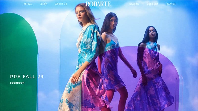
Rodarte’s website portrays the romantic and conceptual way of its founders Kate and Laura Mulleavy through colorful inspiration and storytelling. A look at Rodarte’s website design and there is no doubt that it oozes creativity.
The use of bright colors makes Rodarte stand out among other Squarespace website examples. I love how all the images of its collections are labeled with a CTA button prompting users to buy now.
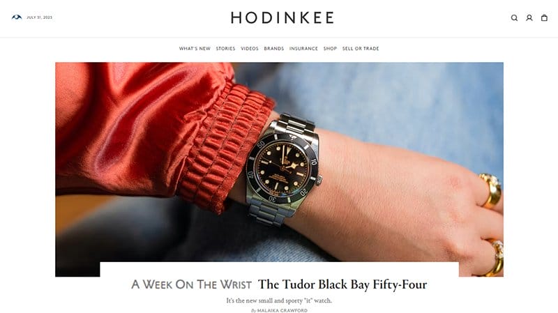
Hodinke is a watch-based website, displaying watches for different top watch-making brands, including Rolex. Acting as the middleman, Hodinkee is a company that deals solely with watches, with its blog content displayed on its website.
The header menu of the Hodinkee website is neatly centralized on the home page, with its content taking center stage when hovered by the cursor.

Lift Environmental Design is a California-based landscape architecture and planning firm, focusing on design excellence, client service, and practical approach. This website takes a practical approach to its design, displaying slideshow images of its various spaces.
Icons leading to the Lift Environmental Design page are displayed just beneath its brief bio and replicated close to the footer section.

Exploring Eden Media comprises a team of award-winning tour guides and authors focused on in-depth and highly curated information for travelers.
I love how the website’s hero image takes users on a unique pictorial experience, displaying quality travel locations, as part of its discoveries. You will find book cover images of popular titles displayed in a four-column layout on an extensive white background.

Sadie Williams's website is an artistic masterpiece, blending animation, colorful illustrations, and special effects to give it a glamorous look. The white and black texts displayed over the colorful images stand out amidst the glamor and shine displayed in the background.
One feature that stands out is the parallax scrolling effect that users notice when they scroll through the site. There is an anchor menu feature that assists with navigation.

Adrienne Raquel is a Professional photographer and creative art director basing her work on soulfulness, femininity, and color. Her website uses a Black and Cadillac Pink color scheme, with black serving as the background color and Cadillac Pink as the font color.
This professional photographer’s website is designed more like an exhibition displaying her works extensively throughout in a two-column layout.
I love how she displays navigation features and links to her socials as text rather than icons, with the Cadillac Pink-colored text ensuring they remain visible.

Edible Boston is a food and drink-based website, celebrating the abundance of local products, season by season. This food website uses a drop-down menu feature to display its portfolio lists.
The Stay in the Know section displayed on Eddie Boston’s website is colorful, displaying Pinterest images in a five-column layout. You can’t help but love the footer section that displays icons leading to its social media pages on a Mercury background.

Lumio is a technology-based brand offering products that blend technology with unique craftsmanship. The Lumio website engages all five senses like its products, displaying surprise, delight, and a little magic.
Taking center stage on Lumio’s website are colorful slideshow images of three of its product offerings illuminated by light. CTA buttons are attached to each slideshow image prompting users to explore its products.

For over 160 years, the Banner United Church building has served as the heart of the small community in which it was built, earning the name Banner. The Banner United Church’s Squarespace website uses a front-view image of the church as its hero image.
Unlike other Squarespace website examples, Banner United Church’s website displays its navigation menu at the center of its homepage. There is no need for scrolling as its design is a single-page homepage.

Self-taught photographer Gunnar Freyr Gunnarsson captures his love for his home country Iceland in his pictures. The Icelandic Explorer is his professional website displaying slideshow images of both animals and natural landscapes, with each image given a title at the bottom.
An official Canon Nordic photographer and Squarespace ambassador, it's no surprise Gunnar uses Squarespace as his website builder. Displaying a great deal of his work on the Icelandic Explorer, Gunnar’s website is an artistic masterpiece.

The Deck is a contemporary tailoring brand offering elegant and timeless suits made by women for women. You can’t help but admire how this unique Squarespace website design uses a header menu that displays texts and images via a drop-down menu feature.
I love The Deck’s silhouettes section that displays only images with arrow icons on both sides helping with navigation. The Featured In section features logos of top brands including Vogue magazine.

Beautiful Destinations are tourist and hospitality experts with a deep understanding of the unique needs of today’s travelers. Using bold fonts and high-quality images, Beautiful Destinations uses a modern website for its online portfolio.
Hooking users to its site is a video displaying the most exciting experience. You just want more after watching the video content. Bordering between homepage sections are white and yellow bold lines, helping users distinguish between its content.
Best Squarespace Website Examples Examples FAQs
Many big brands use Squarespace as their website builder due to its ease of use, mobile responsiveness, and stunning template options. A few examples of notable brands that use Squarespace are HBO documentary films, National Geographic Kids, The Guardian, and Buzz Feed.
Squarespace’s user-friendly design options and mobile responsiveness are what makes it good for small and large businesses. You can use Squarespace to add up to 10,000 products on your store page. Except you want to go beyond that, Squarespace is a good option for creating and managing your large business website.
Making an amazing website on Squarespace is easy as there are beginner tutorials and guides you can use to get started. If you intend not to take the DIY approach, then consider hiring the services of a professional web designer.


