20 Great Examples of Vineyard and Winery Websites
The wine industry is rapidly gaining huge popularity in the global marketplace due to the high demand for wine consumption globally. Statista shows that the global wine industry will hit a market volume of US$215.7 billion by 2028.
With more business owners entering into the vineyard and winery market, you need effective marketing strategies to stay ahead of the competition. A great strategy that gives an edge over the competition is to design a user-friendly vineyard and winery website.
Creating a beautiful wine website design helps you build a strong online presence, attract quality leads, and make huge profits. Professional website builders like Wix and Squarespace offer the best templates for building the best site that appeals to your ideal website visitor.
This article covers the best 20 winery and vineyard websites that will provide you with the ideas and inspiration you need to build your winery website.
Let's dive in.
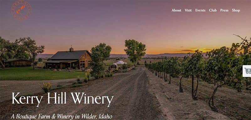
Kerry Hill Winery is a boutique farm and winery in Wilder, Idaho. This wine website has a great choice of visual elements. I love the use of beautiful images to tell the brand’s story and white fonts to convey location and winery hours.
This winery site features a white background showing off photo frames accompanied by Terra Cotta-colored CTAs. Those CTAs are jump links to the wine club and other pages of the site.
I like how the customer’s testimonials lavish simple and filtered background photos tailored to the brand colors, and carousels displaying them in turns. Customers can use the static cart icon to save items for purchase.
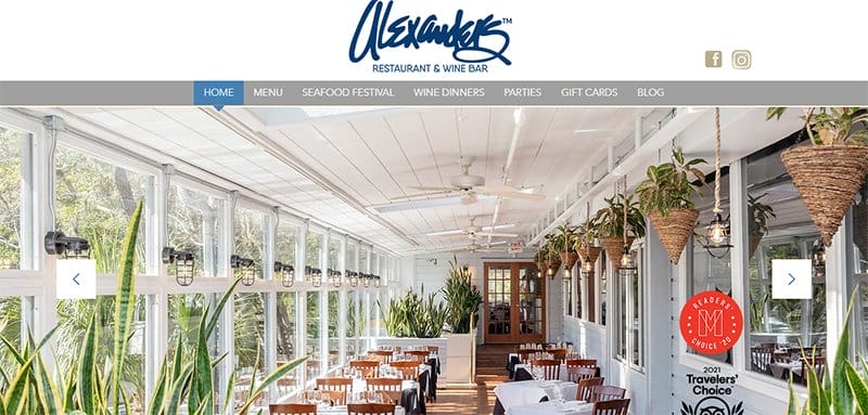
Alexander’s Restaurant & Wine Bar is proof of exceptional branding. This wine bar website presents gorgeous photos showcasing the brand’s identity and attribute image sliders on both sides to allow viewers to gain control of the auto-view.
The white space beneath the hero section is your notice board to access information on how to book reservations and find location details and work hours.
As you scroll past the notice, you will find the introductory section accompanied by garnished food photography and video. The video will get you fascinated as it captures the standard dinner date settings while unleashing another level of branding.
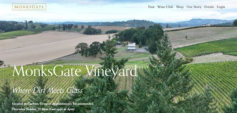
MonksGate Vineyard's website is a balanced mix of visual elements. This beautiful website prominently displays clean sections of spectacular green scenery of its vineyard in video format with white typography layered at the bottom of the video.
As you explore the website, you will find the white space inviting potential customers to find out more about their new products and wine clubs.
The testimonial section serves as social proof to potential customers. I like how MonksGate uses backgrounds to showcase testimonials in slide formats, allowing for smooth visual access.
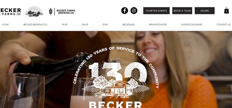
Becker Farm's website is a whole vibe capturing the legendary existence, celebration, and innovations of the brand in one video. If you need ideas to build a simple wine website with a touch of timeline design, Becker Farms is your go-to place.
The header of the site uses a black and white color scheme with menus like “Play” which takes you through a visual tour and a “Shop” menu for wine shopping. Other menus on the header take you through a timeline and memorable experience.
Rather than using color palettes, Becker Farms makes good use of background images and a hint of modern designs to set the homepage. The triple patterned footer provides customers with basic work information like address and operating hours.

Artelium uses a well-designed winery website with images to bring the center stage to you. This wine website features a wine shop advertising sophisticated thrills in bottles.
Other features of the site include the featured section, news section, awards, and recognition. I like how it uses borderlines to organize each section, resulting in great visual coordination.

Adante Vineyard has a great web design layout with unique elements of design. Specifically, it uses white space, monochromatic color schemes, and lines to give an outstanding visual outlook.
Instead of using a Google map to give its location address, Adante Vineyard employs artistic photography using free-hand style to create magic.

Alpha Wines is an eCommerce site for wine shopping. One thing that will fascinate you about this custom wine website is the unique branding, consistent from the beginning to the end of the website.
Instead of using long and boring content like some websites, Alpha Wines proves that a website can do more with visuals and still retain its branding. The sight of wine bottles in each collection stands out elegantly on cool and classy color schemes.
Other design elements are the customized logo, interactive CTAs, and the blocky style footer menu. Website visitors can visit the footer menu to explore the social media icons and find valuable resources.

Sweet Heart takes accomplishment in crafting a memorable experience with its goodness-inspired class of wines. This custom wine website is aesthetically pleasing, evenly distributing gorgeous photos across the site.
The hero section features a non-sticky header, a cart icon, CTA and white font letterings layered to a well-photographed winery.
If you scroll down the website, you will notice the parallax scrolling feature, revealing the white space showcasing the wine products and special events.
Potential customers can use the CTAs to view their products and book them for special events ahead of time.
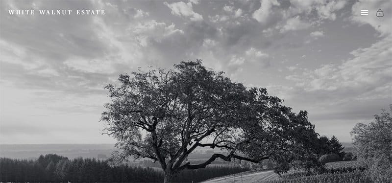
White Walnut Estate’s website uses a simple winery web design, keeping its content to a minimum. Unlike other winery websites, this winery website ensures that design details are minimalistic, yet achieves its goals from one page of the site.
The homepage is a black-and-white filtered vineyard photograph with no scroll. Basically, it has a one-page-inspired design with a hamburger navigation bar and an interactive hero header.
Each menu at the hero header is an overview of the hamburger menu, popping several still images and a visual tour with a hover effect. Exploring the hamburger menu are landing pages detailing the brand’s wine products and lifestyle.
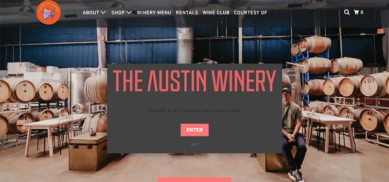
The Austin Winery’s website opens with a striking image of a winery welcoming visitors on arrival. Upon scrolling, it pops an age verification form to ensure regulatory compliance, such that only eligible customers can access its age-restricted products.
Navigating Austin’s winery website, you will notice the scrolling effect revealing the one-stop wine shop. While the wine shop employs micromotion design to enhance the visual experience of new wines, it uses fine fonts to convey the details effectively.
This great website features professional imagery, elegant fonts, and modern web designs, creating a sophisticated visual outlook.
Interested customers can explore the menus to get details of the wine brand and use the call-to-action buttons to make purchases.

Westcave Cellars doubles as a winery and brewery and prides itself as the ultimate muse for a good wine experience. I like how it takes the same experience to its website, filling its homepage with beautifully laid out designs.
This winery website is detail-packed. Starting from the engulfing hero image to the 3D wine menu, down to the footer section, gives an account of the brand’s vision.
One notable feature of this winery website is the responsive map that allows potential customers to locate its physical wine store.
Another awe-inspiring design of Westcave’s website is the alternating visuals displaying memorable experiences of the brand on an almond-textured background. I like how it uses a back-to-top arrow and a touch of Mulberry color to enhance the appearance of the site.

Haus's wine website is an online store, popular for its winery products. Welcoming visitors to this winery website is a split-page design featuring its hot-selling wines and a promotional advertisement on a davy-green background.
Beneath the hero section is the wine shop displaying five-star rated wines along with shopping carts that allow customers to save items for future purchases.
I admire Haus’s strong sense of customer service, capable of keeping old and potential customers returning. Primarily, this winery site employs a black background to keep customers informed of new products.

Soter Vineyards, a great example of a safe winery website, uses automated age verification to ensure only qualified users have access to its website. The homepage of this beautiful website greets you with “Welcome Home”, setting the tone for a user-friendly experience.
Unlike other wine websites with regular header designs, Soter Vineyards employs a double menu header to organize menus sequentially. This wine website is packed with navigations and custom design elements.
Prominent design elements of the web include interactive points serving as jump links to other sections of the homepage and a web accessibility adjustment feature.
While the adjustment feature allows visitors to switch languages, the chat icon and social media icon unleashes another form of customer experience. A click on the downward arrow introduces you to details accompanied by modern web designs.

Jordan Vineyard and Winery is a legendary winery that specializes in Cabernet Sauvignon and Chardonnay wine production.
An example of a good wine website, the Jordan Vineyard and Winery website unfolds with a high-quality introductory video. The video serves as the brand’s synopsis and captures memorable experiences in an engaging and time-effective manner.
You can't help but notice how this wine website uses images and sleek font letterings to showcase the height of professionalism, expertise, and boundless hospitality. Visitors can scroll to the blog section in disguise, visit the page, and explore recent news about the brand.

Covides has everything it takes to create matchless and timeless wines for wine lovers at all times. This winery brand proves its mission by displaying animated visual tours of its laid-out vineyards and modern wineries in the hero section.
The hero section flaunts a wordmark logo in delicate style fonts and language options, along with a hamburger menu on a vertical Persian-plum background. As you scroll down the website, you will notice split-page designs further introducing the brand.
Covides features a notice board on a floral-white background and employs animation effects to display the brand’s latest development. This section uses big yellow metal fonts to effortlessly draw the user's attention.
I like how every section maintains interactive and uniform call-to-action buttons, enhancing the user’s experience on the site.
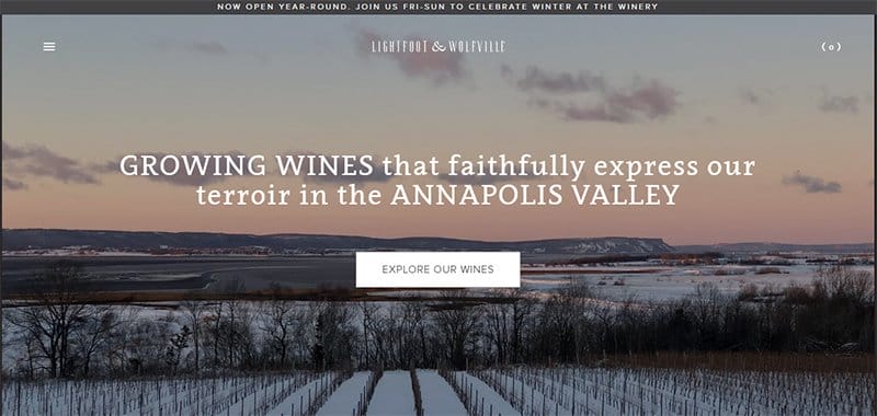
Lightfoot & Wolfville Vineyards is family-owned and dedicated to growing wines that faithfully express the Annapolis Valley terroir. This vineyard website is neatly customized, laying visual elements on top of an extensive Zeus color scheme.
The homepage prominently displays a stock vineyard image that features a hamburger menu at the top left side and a cart function at the right side. I love how the homepage showcases a big brand logo with a slight scrolling effect, creating an immersive experience.
Wine lovers can visit Lightfoot’s menu list, book a tasting, shop their signature wines, and subscribe to their mailing list.
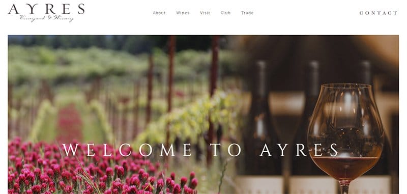
Ayres Vineyard is a family-owned vineyard and winery with a vision for producing versatile and expressive wines. This vineyard website unfolds with “Welcome to Ayres“, creating a friendly and homely impression.
A noteworthy design of this vineyard website is the minimalist design and two color schemes of the site. While the white background details the brand story, the Carbon-gray color invites visitors to subscribe to newsletters.

Decanted Wine Truck is a traveling mobile wine bar servicing all of Massachusetts and Connecticut. One of the best wine websites, the Decanted Wine Truck website has one of the stand-out minimalist designs.
The homepage looks beautiful, well-organized, and smooth to scroll, with plenty of images across the pages of the site. This page employs a magazine-style header with drop-down menus flaunting its service offering and visible border lines coordinating the welcome stage.
What I love about this website is the use of stylish fonts, an attractive color palette, motion images, and viewing effects. The viewing effect magnifies the appearance of web content on a scroll and makes the web design a beauty.

Montaluce Winery & Restaurants’ web design is minimal, making it easy for content to load quickly. All the website menus are stationed on the non-sticky header of the homepage, leaving the footer to bear the address of the company and the business hours.
I like how it uses parallax scrolling to reveal its vineyard and restaurant, following detailed lettering that helps potential customers understand everything about its business.

Whitehall Vineyard has a straightforward and effective website. Every section follows a unique sequence different from traditional orders.
This pattern displays the most important things first, followed by the next relevant content, down to the least sought content. My favorite aspect of this page is the delivery terms and FAQ section, answering all the possible questions customers are likely to ask.
Best Vineyard and Wine Website Examples FAQ
Creating an amazing and visually appealing website doesn’t have to be a tough task. You can use a top website builder like Wix or Squarespace, select or customize a template, and include important information. Using captivating copies and attractive visuals tailored to your brand image sets the tone for a visually appealing winery website.
The best website builders are Wix and Squarespace. They offer free no-code templates that make your building process seamless.
The best winery websites communicate their brand identities to the world. Any well-designed winery website should have high-quality images, easy navigation, relevant and engaging content, and responsive designs.
The best website design trends include parallax scrolling, smooth scroll, custom illustrations, interactive designs, animations, loops, custom cursors, glitch effects, micro-interaction, chatbots, and pastel palettes.


