21 Best Wix Photography Examples of 2025
Are you a photographer looking for an online platform to display your portfolio? Do you get low traffic on your photography portfolio website and want to boost your traffic numbers? The simple solution is redesigning your webpage to make it more engaging and user-friendly.
With a freshly-packed photography website, you can reach your ideal target audience, boost your online presence, and attract your desired clients.
Hiring web designers to create a top-notch portfolio website for you can be expensive. A better alternative is to use Wix, a user-friendly website builder, to build an awe-inspiring photography portfolio.
This article will explore 21 Wix photography website examples you can use as inspiration to create your own photography website.
Let's get started.

Sharon Radisch is a photographer, creative director, and artist based in NYC and Paris. Welcoming visitors to this stunning webpage is an aqua haze-coated theme image displaying a combination of fruits and clothes with the brand name in the center.
You can click the brand's name to access the About page and discover vital and intriguing details about the brand.
Upon exploring, you will discover that each image has a thumbnail feature, which grants visitors access to some of her top projects.

Marion IDA is a fashion and beauty photographer based in Vienna and offers her services internationally to paying clients.
This Wix photography portfolio welcomes visitors with her best works, a product of different series. Her stylish logo is at the extreme right, with the remaining heading beside it.
The arrangement makes navigation seamless and encourages visitors to explore various page aspects. Potential clients can use the transparent sticky navigation bar to access different page elements.

Calvin Pausania is a professional photographer who takes beautiful images and enhances the visual storytelling of his work for paying clients like Adidas and Converse.
Welcoming visitors to this modern photography website is a looping video content displaying a hypercar to leave a lasting impression.
Accessing the rest of the portfolio page, which showcases his best work and answers to common questions, is possible by clicking the blue-colored “Enter” CTA button.
Upon entering the landing page via the access link, you will love how a background video gives life to the rest of the page. You cannot miss the details in large prints about the brand's services in a vertical format, creating a client-friendly experience.
My favorite aspect of this photography business web design is its simplistic outlook, encouraging potential clients to explore its gallery and other pages seamlessly.

Byronic is a professional Chinese-based black-and-white photographer who brings a fresh take to the world of photography.
This unique portrait photography website has a minimalistic design layout with ample use of its white space and features a few bright colors on the homepage.
Interested visitors can use the mega-scrolling bar to access multiple sections of the page and check out each of his stunning works.
This photography portfolio features a vertical scrolling feature, making it easy for visitors to explore the beauty of each image and the inspiration behind his photography work.

Pichitphan Photography website has amazing photos of various events, people, and places. The first line of contact for visitors is the home page, where he arranges his pictures vertically and uses the white spaces strategically.
I love how the webpage displays ample use of its white spaces, giving it a clean and engaging design layout.
Interested visitors can click any social media icon to check out the brand's online profile and get further project information.

Alicia Wiley Photography Studio was established by Alicia Wiley in Baltimore, Maryland, USA. This photography brand offers various services, from fashion and editorial shoots to lifestyle photography.
I appreciate the use of classic and sleek designs on this photography studio website as it conveys a sense of professionalism.
This photography website implores a grid-based layout, with each section slightly changing color. Separating the different sections using different color schemes makes distinguishing between the website's various sections easy.

Vanessa McKeown Photography Studio was established by Vanessa McKeown, who works in London. One of the specialties of this photography brand is creating imaginative, entertaining, and beautiful images using a combination of food and objects.
This photography website uses bright and vibrant colors that express a sense of joy and creativity.
Navigation on this photography studio site is accessible via colorful sticky navigation, allowing visitors to explore various things. I like the visible display of the CTA buttons due to their bright and flashy outlook.

Lorenzo Fanfani Photography Studio's website design engages and piques clients' interest. His photography web page features two unique, eye-catching, and attention-grabbing prints. Beautiful photographs of models appear when you click on any of the prints.
This Wix photography web page is easy to navigate due to its strategic display of white space, which gives the website a clean and modern feel.
This negative space declutters the website and helps draw the user's attention to the most important element of a web page.

Fei Luo Photography Studio's webpage implores a simple and uncluttered design, creating a modern look that emphasizes the studio's beauty.
I love how photographs on the carousel scroll automatically on the home page, creating an engaging and interactive user experience.
Interested visitors can check the biography section for more information about the photographer and his successful projects.
When you click on any of the four prints on the homepage, you can browse through many images manually and scroll to make a selection.

Skyler Knutzen Photography Studio implores the use of simple and clean web design. The Call-to-Action (CTA) buttons on the top part of the home page are clear and concise, helping users or clients access the information they require.
You can’t help but notice the engaging video projection on the homepage, giving visitors and potential clients insight into the brand’s offerings. I love how the site content properly communicates what the photography brand is all about.

Aling Wen's photography website design uses a simple, uncluttered web design and white space. The use of white space makes navigation easy for customers.
You cannot but love how this website's modern design stands out among other photography studio web designs and uses engaging content to attract more users.
This page contains positive reviews from past and current clients with testimonials that give potential clients an idea of what to expect from the studio.
The review section informs potential customers on how professional the photography studio is in rendering services.

The Wild Bride Photography Studio has a classic, sleek design with a fantastic color scheme that guides customers. This photography website excels with its clear and visible CTA (Call-to-Action) buttons that attract your attention when you visit its homepage.
With social media platforms like Facebook and Instagram on the Wild Bride website, customers get information about the recent development of the photography brand.
Projecting beautiful and romantic photographs on the slideshow is attractive and engaging.

Hilary O'Leary is a British photographer specializing in photographing animals in their habitat. This photography website gives clear details on what the webpage is about.
One of the things that stands out about this photography brand is that it offers mentorship programs and online courses to clients willing to learn about wildlife photography.
Seeing animals in their natural habitat evokes a sense of appreciation for the natural world in clients and enlightenment on the importance of wildlife conversation.
This stunning photography website doubles as an online store where visitors can purchase some of the brand’s projects without stress.

Emily Guftason's photography website uses a simple and uncluttered design, which makes it easy for users to navigate. This photography studio engages in visual storytelling, communicating messages and emotions to its customers using photographs.
I love the arrangements of the webpage content and attractive CTA buttons to guide visitors softly but effectively toward hiring photography services.
One of the fantastic things about this photography studio is the creation of beautiful outdoor pictures that offer the opportunity to work with natural light.

Jesaja Class is a professional photographer, cinematographer, drone pilot, and visual storyteller based in British Columbia, Canada. With a focus on outdoor, lifestyle, and commercial Photography, Jesaja's talent has attracted collaborations with leading global brands.
I love how the parallax scrolling feature makes the full-width images on the webpage visually appealing and engaging to visitors and potential clients.
Interested visitors can use the hamburger navigation with a sticky feature to explore various aspects of the page.
This portfolio webpage features many nature-themed projects displayed in a fluid grid layout, giving visitors access to other content.
I like how the page features the brand's top clients' logos in a vertical format, which helps visitors trust its stunning work.

Max Montgomery is a great example of an outstanding photographer portfolio website with a unique design. You can't help but notice the brand's name displayed in big and bold text to ensure site visitors remain conscious of the brand identity.
I like how the site's homepage features a full-page showcase design and simple grid galleries with a thumbnail effect to make product photos attractive.
Visitors can click on any of the pictures on display for a full view of the photo catalog, such as his behind-the-scenes and travel photography series.

Lisa Michele is a travel photographer with a catalog of mind-blowing pictures across different regions of the world.
The grid layout of the pictures on her site's home page makes the page unique and colorful. These photos include images of animals, snow, people, monuments, cities, trees, and more.
I love how the webpage features ample use of its white space to make the site's content visually appealing and engaging.
You can use the white-colored sticky navigation bar with a drop-down feature to explore various aspects of this Wix photography website example.

Reiko Wakai is a fashion and advertising photographer with a track record of creating state-of-the-art photography projects with unique styles and ideas.
I love how the webpage uses a multiple fluid grid design layout to display each stunning work on a personal and interactive level. Each image on the screen comes with a thumbnail feature, which grants visitors access to the portfolio section for further exploration.
I love how each image features a motion graphic effect, making the page fun and engaging. Potential clients can use the transparent sticky navigation bar to access various aspects of the page.

WeShootFood is a collaboration between food photographer Kaveh Kashani and food stylist Madina. Based in the United Arab Emirates, they produce food-related visual content.
This unique food photography website has a clean and well-organized design layout, featuring a smooth display of engaging text and high-quality images.
You cannot but love the use of a zig-zag layout to display some of the brand's top projects and gives visitors a peek into its professionalism.
The testimonial section features multiple heartwarming contents in a slider feature, which helps to boost credibility and increase social proof.
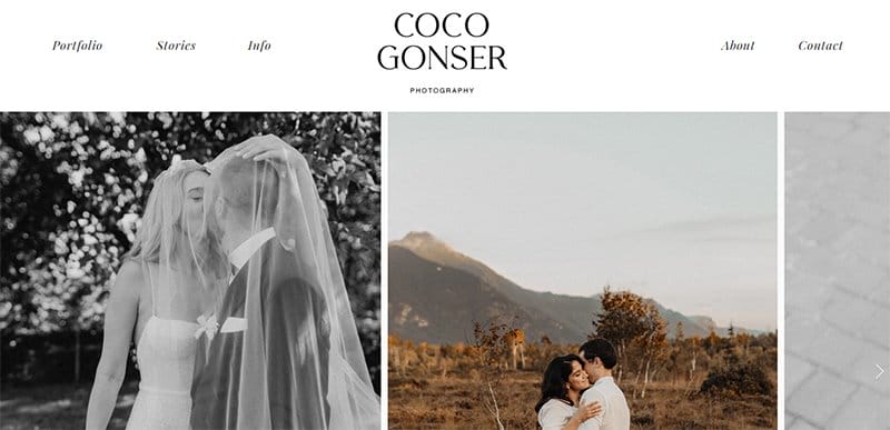
Coco Gonser has one of the best wedding photography websites, with awesome photos of couples and singles on display. There is no doubt that Coco is a master of her craft; having her own website allows her to showcase her works, especially at weddings.
The first catchy element on this photographer's website is a slideshow featuring multiple high-quality images from various projects.
Interested visitors can click on any reels in the Instagram reel section to explore further Instagram-based content.

Aditya Patkar is a Mumbai-based advertising and fashion photographer specializing in transforming brand messages into compelling imagery that resonates with audiences.
The first catchy element of this minimalistic photographer's arrival is a slider featuring multiple high-quality images from various projects.
Interested visitors can use the mega navigation bar with a drop feature to explore the page content and contact Aditya Patkar.
The site's base features two unique social media icons that link to the brand's online page, where visitors can seamlessly get further information about the brand.
Wix Photography Website Examples FAQ
Yes, Wix is a good website for photographers; Wix is a popular website builder that many designers use to create their own websites. Wix is easy to use and user-friendly for photographers with no web design experience.
Wix offers many beautiful photography website templates created by designers, which include features like sample content, color themes, and galleries. Photo Gallery, portfolio, and Minimalist photography are some of its templates.
The best photography portfolio examples are Alicia Wiley, Vanessa McKeown, Hillary O'Leary, Emily Gustafson Photography, Fei Luo Photography, and The Wild Bride.
Yes, you can create a free portfolio website on Wix. This amazing website builder allows for a free plan but has limitations. To eliminate the limitations, you can upgrade to a premium plan.
Your portfolio should contain 12-20 of your favorite pieces of photographs. There is no limit to the number of pictures you can display on your portfolio.