27 Great Examples of Conference Website Designs
Do you want to host an onsite or a web conference but don’t know how best to track signups and promote your conference?
Designing an interactive and visually appealing conference website helps you display details about your event, track signups, and page visits, and encourage visitors to register.
The best conferences have beautiful and high-converting conference website designs that help attract a truckload of signups and attendees. You can use the best website builders like Wix and Squarespace to design eye-catching conference websites that work.
This article explores the 27 best conference website designs that you can use as inspiration to create your own site.
Let’s get started.

London Film Music Orchestra was established to bring to life the music of film and television. This great conference website displays a consistent dark-themed background image with dotted stars adding light to its web design.
Displayed in a centralized layout are two animated images on top of each other, taking center stage on the website. Sticking to displaying only a few words serving as header texts, the London Film Music Orchestra website is simple and minimalistic.
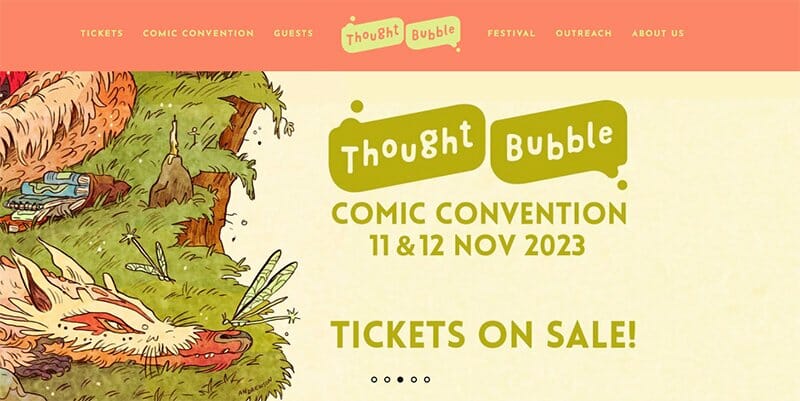
Thought Bubble is the Yorkshire Comic Art Festival offering a week-long of comics, illustrations, and more spread across Yorkshire. This leading design festival sticks to its logo’s Coral Pink and Barley White colors as its predominant colors.
Welcoming visitors is a colorful slideshow of animated images announcing the dates and locations for its upcoming comic convention. Logos of its sponsors and supporters appear in a centralized layout on the homepage in a black-and-white color scheme.
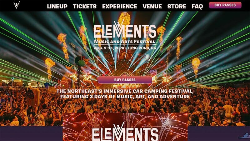
Elements Music & Arts Festival is the northeast’s immersive car camping festival featuring 3 days of music, art, and adventure. This beautiful conference website displays bold and catchy design features as its top design elements.
Visitors enjoy visually engaging images as they scroll through the Elements Music & Arts Festival, focusing their attention on different design features.
I love how the artistic elements and bold-colored images blend with the site’s all-black background, treating visitors to a colorful display of information.
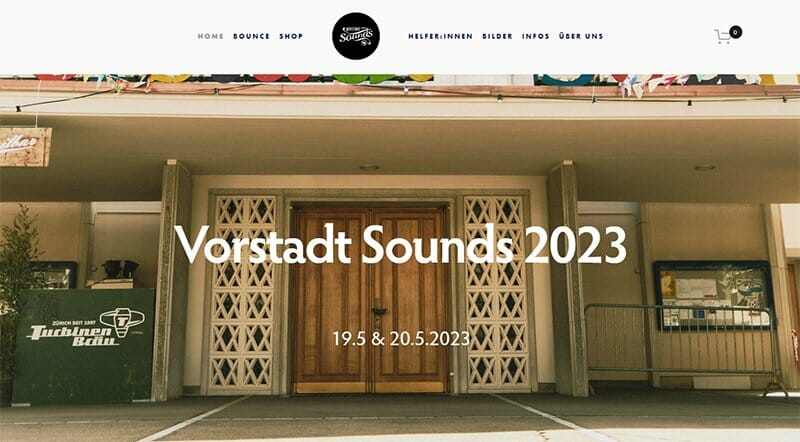
The Vorstadt Sounds Festival website welcomes visitors to a video from one of its past events, taking center stage in the hero section.
Colorful and bold logos of its sponsors are in a separate section on the homepage, categorized in a centralized three-column layout.
I love how the Vorstadt Sounds Festival website alternates between bold and normal texts on the homepage’s plain white background, guaranteeing an engaging read.
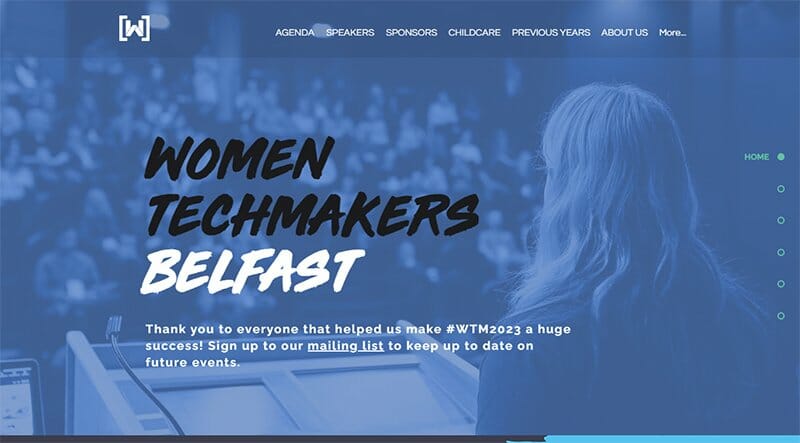
Women Techmakers Belfast organizes and hosts meetups, events, and an annual International conference focused on showcasing the work, talent, and achievements of women in technology.
One of the top conference websites, the Women Techmakers Belfast is modern with a colorful color blend consistent in its website design.
An anchor menu feature is visible and pinned to the right-hand side of the homepage, serving as the site’s primary navigation feature. Visible are black-and-white images from its past conference, displayed in a three-column layout.
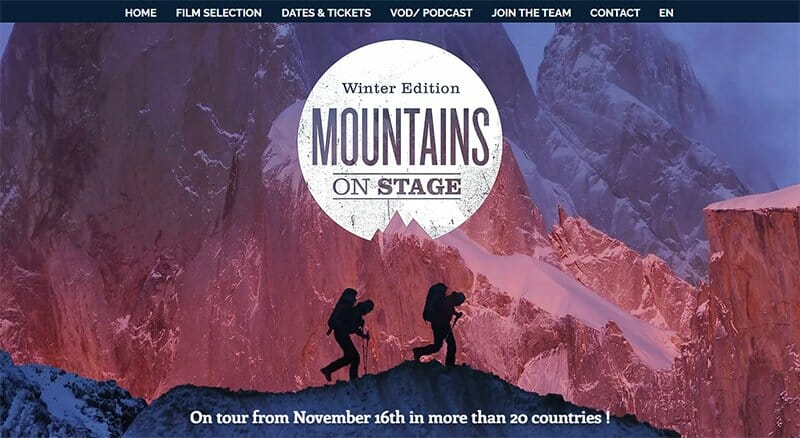
Mountains on Stage has a straightforward conference website design for you to draw inspiration from for your own conference website. Displaying just a few words, the Mountains on Stage website takes a minimalist approach to the site’s web design.
Above the colorful logos of its partners are black-and-white social media icons, each linked to the conference's social media platforms.
I love how the All Together Now website sticks to a centralized layout for its website design, consistent with the site’s plain white background.
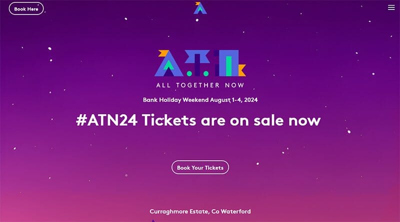
All Together Now has a beautiful conference website design that draws the attention of a website visitor, offering a dynamic and unique experience.
One of the top conference websites, the full-width animated image takes center stage on its website, keeping web visitors visually engaged.
At the top of the homepage is a hamburger menu and a booking CTA button in White, standing out at both corners of the homepage.
I love the colorful display of logos of its partners in a centralized six-column layout, adding color to the section’s Wild Blue Yonder-colored background.

Lovebrain is the world’s most advanced cognitive performance training scientifically designed to boost memory and focus and unlock the brain’s potential.
A compelling conference website, Lovebrain draws visitors’ attention with a black-and-white image of Albert Einstein in the hero section.
Beneath the hero section are logos of brands associated with Lovebrain in black-and-white, consistent with the site’s black-and-white color scheme.
Adding color to the site are clear CTA buttons standing out in their Rossa Corsa-colored backgrounds and prompting visitors to book a free masterclass.
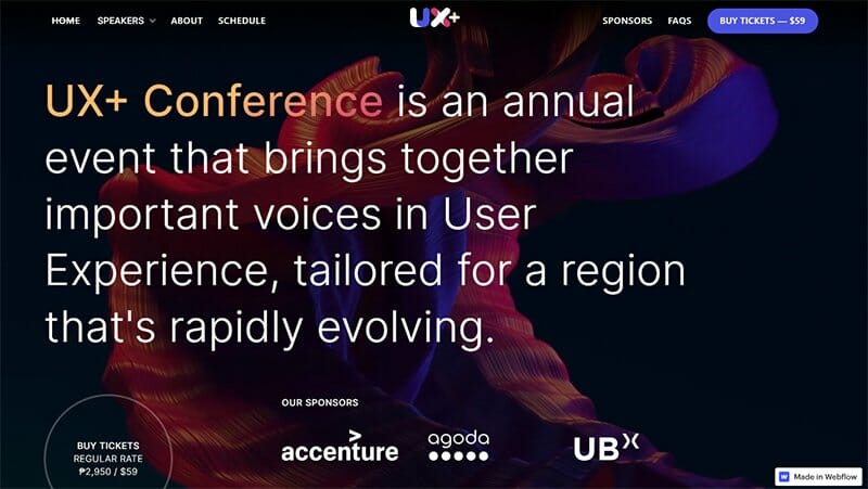
UX + Conference is an annual event that brings together important voices in user experience, tailored for a region rapidly evolving. Sticking to a consistent white font color, the colorful background throughout the UX + Conference website encourages visitors to keep scrolling.
Pinned to the bottom right-hand corner of the homepage is an announcement box feature, announcing the web designer, Webflow. Visible extensively on the homepage is a list of officially released upcoming speakers and their portfolios for its own branded event.
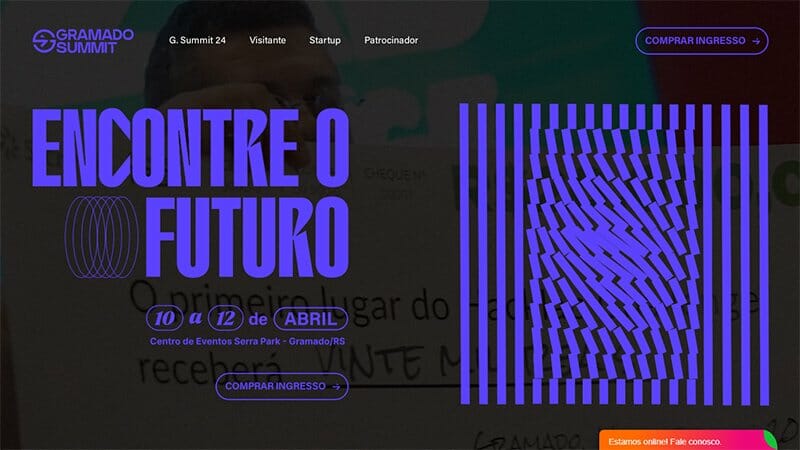
Gramado Summit is one of the great conference websites with several bold and interactive elements designed to convert web visitors to active participants. This outstanding conference web design sticks to a consistent all-black background, making its content engaging.
A hero video plays in the hero section’s background, overshadowed by bold lines, shapes, and texts in Bluish-purple, taking all the attention.
Pinned to the homepage is a colorful chat icon, offering links to a messenger-powered online chat feature, serving as the site’s online communication channel.
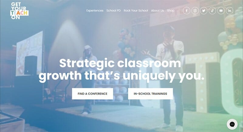
Get Your Teach On through its conference and in-school training aimed at providing strategic growth that is unique to individuals. One of the top conference websites, the Get Your Teach On website offers web and mobile site visitors access to its great conference website design.
Social media icons stand out in a black-and-white scheme on the site’s sticky header menu, leading visitors to various social media and streaming platforms.
Pinned to the homepage is a chat feature in a Black and Pink Sherbet color scheme, serving as the site’s online communication channel.
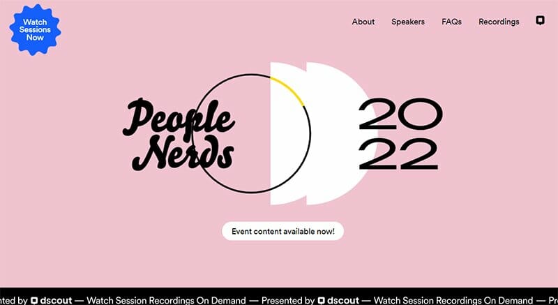
The People Nerds Conference website is an example of an effective conference website, displaying a bold animated feature to capture visitors' attention.
I love how the clever and bold CTA button stands out at the top of the homepage, prompting visitors to watch sessions now.
An FAQ section is visible close to the footer section on a Tea Rose-colored background, providing visitors with all the critical information about its annual event.
I love the colorful animated icons displayed over bold-colored backgrounds on the homepage, adding to the site’s design aesthetics.
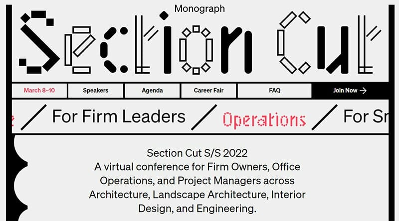
Session Cut is a virtual conference for firm owners, office operations, and project managers across architecture, landscape architecture, interior design, and engineering.
This top conference website, Session Cut’s website displays drag-and-drop features in a predominantly black-and-white color scheme. A list of upcoming conferences is visible on the site’s homepage, each accessible from clear CTA buttons.
I love the unique typography displayed throughout the Session Cut website, making it stand out as one of the outstanding conference website designs.
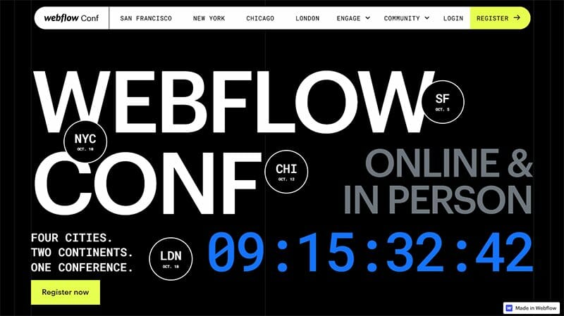
Webflow Conf is Webflow’s annual conference aimed at bringing together the best in visual development from designers, to developers, marketers, agencies, businesses, and the community.
One of the top conference websites, the Webflow Conf website uses a creative and modern design to convert event attendees.
Displayed in Golden Fizz as a sliding announcement feature beneath the hero section is a list of locations of upcoming conferences. Consistent with the Golden Fizz color is the background for CTA buttons, standing out throughout the homepage.
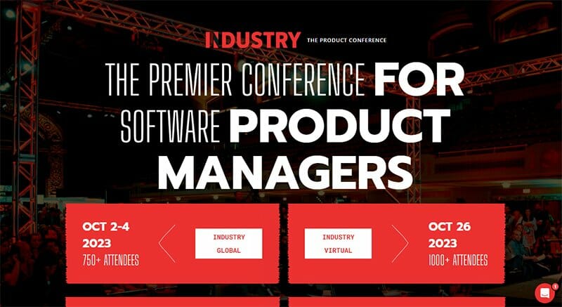
Industry Conference is the premier conference for software product managers with catchy event program templates visible in its site’s hero section.
Listed in a centralized layout over the site’s full-width hero image background are the Industry conference's upcoming conferences in a Deep Carmine Pink and White color scheme.
A chat feature pinned to the homepage in a Deep Carmine Pink and White color scheme serves as the site’s online communication channel. I love the centralized layout on which the Industry Conference website is built, one of the top conference web designs.
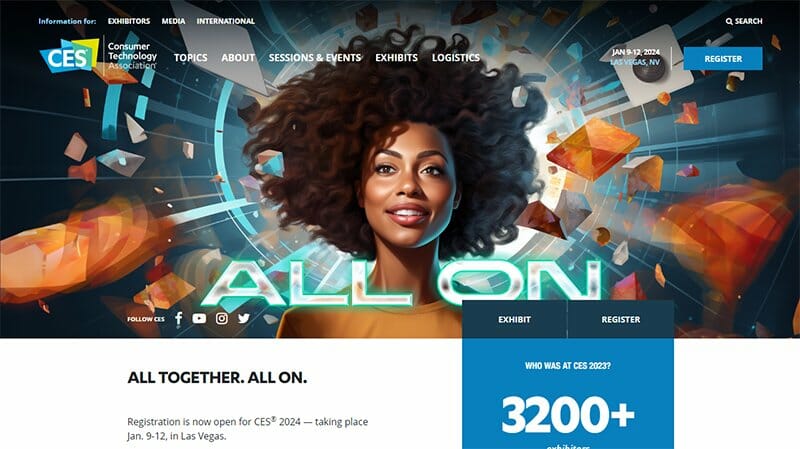
Consumer Technology Association is home to CES, the most powerful tech event in the world, providing ground for breakthrough technologies and global innovators.
One of the top conference websites, the CES conference page displays several innovative content designed to impress visitors.
Welcoming visitors to its site is an animated hero image, displaying several bold colors and shapes that are visually engaging to site visitors. A good conference website design, the CES website is consistent with its centralized layout, making its content engaging for visitors.
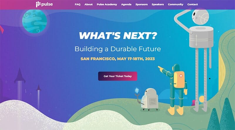
Pulse over the past ten years has been the heartbeat of the customer success industry, offering a product experience and a variety of community professionals. This great conference website resonates in the hearts of visitors through its colorful and catchy website design.
You will find colorful animated icons displayed consistently throughout its site’s homepage, adding an artistic touch to its website design. I love how the Pulse website displays bold colors throughout its website, giving it a visually appealing look.

Create Upstate ADK is built on fonts and foliage forever, as boldly displayed on its website, offering people the opportunity of a retreat in Lake Placid.
This simple and single-page website treats visitors to a full-width aerial-view image of Lake Placid as its site’s background image.
Displayed over the hero image are bold texts in White and CTA buttons in their uniform Brink Pink background color, consistent with the logo color. Visible at the bottom of the homepage are white-colored social media icons.

UX Sofia is an annual conference organized by Lucrat to expand skills and build knowledge in the field of design and user research. This top conference website design is straightforward, displaying all its content on a consistent White Smoke-colored background.
The arrangement of its content makes this website one of the great conference websites, making it easy for visitors to scan through the website. I love the display of logos of partners close to the site’s footer section, helping build visitors’ confidence in the brand.

Fronted Design Conference has one of the best conference websites, with a bold website design catching visitors' attention throughout. Several interactive features are visible as visitors scroll through the website, including sliding texts and rotating images.
Pinned to the top right-hand corner of the homepage is a CTA button labeled “I Want In” on a Terracotta-colored background, prompting visitors to join. Displayed in a centralized three-column, alternating between texts and images are reviews, serving as social proof.

Front is brought by Ben Peck, Andrew Branch, and Wade Shearer, experienced designers and product managers hyper-focused on extraordinary content. This leading design festival creatively uses different bold color shapes in its web design.
Attached to the hero section is a video feature playing in between bold arrow-like features, adding a unique touch to the plain white background.
Standing out on the homepage’s plain white background are CTA buttons, standing out in their Artyclick Orange-colored backgrounds.

ACM SIGGRAPH is an international community of researchers, artists, developers, filmmakers, scientists, and business professionals with a shared interest in computer graphics and interactive techniques.
This top conference website example is straightforward, sticking to a consistent centralized layout for its website design. Consistent on the ACM SIGGRAPH website are its CTA buttons, standing out in the logo’s Vivid Burgundy color.
I love how the ACM SIGGRAPH website lists its upcoming conferences in a separate section on the homepage, making it easy for people to keep track.

Reactor School believes that entrepreneurship education is key to helping youths discover and use their capabilities to create impactful solutions to the world’s greatest problems.
One of the best conference website designs, the Reactor School website is neat, displaying White, Black, and lightning Yellow as the site’s predominant colors.
You will find testimonials with logos displayed in a centralized three-column layout on an extensive Lightning Yellow background. I love how the logos reveal texts when the mouse cursor hovers over them, one of the site’s interactive design features.

WaysConf is the largest conference in CEE for designers, researchers, developers, and leaders dedicated to digital products. One of the most inspiring conference websites, WaysConf wears a modern look, sticking to a neat layout for its website design.
Beneath the hero image is a display of bold numbers in White, providing huge insight into its annual conference. Displayed in a centralized five-column display are logos of tech industry leaders headlining its global conference in predominantly White colors.

Digital Neurosurgery is building a digital future for neurosurgeons, tearing down the silo walls that hinder collaboration, leading to a better future for its patients.
One of the best conference website designs, the Digital Neurosurgery website is well-structured, capturing visitor’s attention immediately with its half-width hero image.
The Persian Green color adds a unique touch to its website design, visible as font colors and background colors for CTA buttons. Displayed throughout the site are animated images, helping keep visitors engaged as they scroll through the homepage.

Speak Conference is hosted by Louie Giglio, a visionary architect and director of the passion movement, where he showcases the art and heart of preaching.
Welcoming website visitors to its website is a bold text labeling Speak displayed in bold black fonts, matching the hero section's black-and-white color scheme.
One of the top conference websites, the Speak conference website is visually appealing, displaying bold colors throughout its site’s homepage. Displayed throughout the site are different bold and stylish typography, making the site’s content engaging.

Confab is a program designed to help connect the dots between the different fields of practice that focus on all kinds of digital content. This top conference website example is captivating, displaying images from past events as background for its hero section.
Consistent in its website design is the Sunrise Orange color from its logo, serving as the background color for its site’s CTA buttons.
Displayed in a centralized three-column layout are accolades from attendees, standing out in White on an extensive Deep Saffron-colored background.
Best Conference Website Examples FAQs
A conference website is a useful platform to generate buzz around your conference and boost ticket sales and attendance. This major promotional tool helps present information about a previous event or upcoming conference in a credible manner.
Conference websites are important marketing tools that help create awareness and deliver necessary information about an event. A conference website is an invaluable tool for disseminating information about your conference location, date, keynote speakers, and links.
Creating an eye-catching conference website like the Startup Grind Global Conference is easy with a WordPress theme inspiration for you to incorporate into your conference website design. With or without prior coding knowledge, you can create an eye-catching conference with Wix, and Squarespace, the top website builders in the software market.
A conference website is a major promotional tool that helps you build credibility about your event by showcasing important information. On the other hand, an event website is a platform event organizers use to help improve registration numbers while providing event attendees with important information about an upcoming event.


